
* About W3C and the Web
* Why accessibility is important
* Why internationalization is important
1.1 Introduction to Module 1 - my first web page
1.2 The big three; HTTP, HTML and URL
1.3 Putting the "M" in HTML
1.4 Character encoding
1.5 Best practices - Learning from mistakes of others
1.6 Tags we have used & more
2.1 Introduction to Module 2 - attributes, images & links
2.2 Attributes
2.3 Semantic Meaning - separating content & style
2.4 Images
2.5 Hyperlinks
3.1 Introduction to Module 3 - adding style with css
3.2 Style & Link tags - CSS basic syntax
3.3 CSS properties
3.4 Styling Lists and Selectors
4.1 Introduction to Module 4 - fixing & debugging
4.2 Debugging Tools and HTML5
4.3 Debugging and the CSS Box Model
4.4 Debugging CSS Precedence
5.1 Introduction to Module 5 - more html5 and css3
5.2 Tables
5.3 Multimedia - the audio element
5.4 Embedding Content - the iframes tag
5.5 CSS Tricks - decorative images & backgrounds
6.1 Introduction to Module 6 - basics of page layout
6.2 Concepts - text baseline and the display property
6.3 CSS Flexbox - sizing and dimensions
6.4 More Flexbox - main and cross axes
6.5 CSS Grid Layout
6.6 Recipe Project
Shall We? HTML5 and CSS Fundamentals - git
Quickly learn the basics of Web design and style to give your Web sites a professional look and feel, by just following these 6 modules!


It is how we determine the color, text size, spacing and other visual aspects of your Web page. We’ll introduce the syntax of CSS, how to include it with your pages, and get you started with some basic properties and concepts. Note that we’ll explore how to use CSS to layout your page during the last week of this course.

Whilst practicing and improving your recipe project (or else) with CSS features, you may have noticed that errors (subtle or not - we’ve all been there) can get in the way! This week you will learn how to fix your Web page when it’s not doing what you hoped it would do.

This is a good preparatory work for the HTML5 Coding Essentials and Best Practices course (#3) (intermediate level). You will also learn how to embed other elements in a page other than a simple image.

W3C has designed a “Front-End Web Developer” (FEWD) Professional Certificate where you will learn all of the necessary skills needed to build interactive and responsive user experiences on the Web.
This program will deepen your knowledge of the 3 foundational languages that power
the Web: HTML5, CSS and JavaScript.
The W3C FEWD program is composed of 5 courses:
This “HTML5 & CSS Fundamentals” introductory course is designed for anyone,
no prerequisites required.
During this course, you will learn:
Have fun!
Not surprisingly, it would be helpful to have a browser (short for “Web Browser”) so that you can see the end result of your source code. Common modern browsers for the desktop are Firefox, , Chrome, Microsoft Edge (pos) (and IE), Safari, , Brave, and Ecosia.
The most common features of a Web browser include the browser window itself (also referred to as the user interface), the navigation and address bar, and options to view your history, settings, and other tools. Look at the history of Web browsers (on Wikipedia). An interesting resource is the Browser and Platform Market Share (updated regularly).
An HTML editor is invaluable for both beginners and more advanced developers. While any text editor, like NotePad or TextEdit, can be used to create Web pages, they don’t necessarily offer options for error checking, syntax coloring and saving some typing by filling things out for you. There are two types of editors available, WYSIWYG (“What You See Is What You Get”) and textual HTML editors. Here is a non exhaustive list:
To help you practice during the whole duration of the course, we propose to use the CodePen online code editor. An online code editor is a tool that resides on a remote server and is accessible via browsers.
CodePen is an HTML/CSS/JavaScript code editor that previews/showcases your code in your browser. We are providing a short live coding video on how to use CodePen at the beginning of Module 1. CodePen gives you the tools for collaboration, experimentation, and sharing, but you also get live results and the ability to search through their database and repository of snippets that other authors put up so you can experiment and learn from their work, too.
Note that there are many other online code editors available out there, such as JSBin, JSFiddle, and Dabblet (Lea Verou’s tool). Here’s an interesting article on what beginners can do with CodePen: Things you can do with CodePen [Brent Miller, February 6, 2019].
For over 15 years, the W3C has been developing and hosting free and open source tools used every day by millions of Web developers and Web designers. All the tools listed below are Web-based, and are available as downloadable sources or as free services on the W3C Developers tools.
The W3C Validator checks the Markup validity of various Web document formats, such as HTML. Note that you are automatically directed to the Nu Html Checker when validating an HTML5 document.
The CSS validator checks Cascading Style Sheets (CSS) and (X)HTML documents that use CSS stylesheets.
Unicorn is W3C’s unified validator, which helps people improve the quality of their Web pages by performing a variety of checks. Unicorn gathers the results of the popular HTML and CSS validators, as well as other useful services, such as Internationalization, RSS/Atom feeds and http headers.
The W3C Internationalization Checker provides information about various internationalization-related aspects of your page, including the HTTP headers that affect it. It will also report a number of issues and offer advice about how to resolve them.
The W3C Link Checker looks for issues in links, anchors and referenced objects in a Web page, CSS style sheet, or recursively on a whole Web site. For best results, it is recommended to first ensure that the documents checked use valid (X)HTML Markup and CSS.
The W3C cheatsheet provides quick access to useful information from a variety of specifications published by W3C. It aims at giving in a very compact and mobile-friendly format a compilation of useful knowledge extracted from W3C specifications, completed by summaries of guidelines developed at W3C, in particular Web accessibility guidelines, the Mobile Web Best Practices, and a number of internationalization tips.
Its main feature is a lookup search box, where one can start typing a keyword and get a list of matching properties/elements/attributes/functions in the above-mentioned specifications, and further details on those when selecting the one of interest. The W3C cheatsheet is only available as a pure Web application.
The term browser compatibility refers to the ability of a given Web site to appear fully functional on the browsers available in the market. The most powerful aspect of the Web is what makes it so challenging to build for: its universality. When you create a Web site, you’re writing code that needs to be understood by many different browsers on different devices and operating systems!
To make the Web evolve in a sane and sustainable way for both users and developers, browser vendors work together to standardize new features, whether it’s a new HTML element, CSS property, or JavaScript API. But different vendors have different priorities, resources, and release cycles — so it’s very unlikely that a new feature will land on all the major browsers at once. As a Web developer, this is something you must consider if you’re relying on a feature to build your site.
We are then providing references to the browser support of HTML5 features presented in this course using 2 resources: Can I Use and [Mozilla Developer Network MDN Web Docs.
Can I Use provides up-to-date tables for support of front-end Web technologies on desktop and mobile Web browsers. Below is a snapshot of what information is given by CanIUse when searching for “CSS3 colors”.

To help developers make these decisions consciously rather than accidentally, MDN Web Docs provides browser compatibility tables in its documentation pages, so that when looking up a feature you’re considering for your project, you know exactly which browsers will support it.
W3C’s primary activity is to develop protocols and guidelines that ensure long-term growth for the Web. The widely adopted Web standards define key parts of what actually makes the World Wide Web work.

Tim Berners-Lee wrote a proposal in 1989 for a system called the World Wide Web. He then created the first Web browser, server, and Web page. He wrote the first specifications for URLs, HTTP, and HTML.
In October 1994, Tim Berners-Lee founded the World Wide Web Consortium (W3C) at the Massachusetts Institute of Technology, Laboratory for Computer Science [MIT/LCS] in collaboration with CERN, where the Web originated (see information on the original CERN Server), with support from DARPA and the European Commission.
And he did all this without becoming a multi-billionaire. Because he's a good human being. A good man. And above all, a code programmer. Otherwise, can you imagine the internet owned by the likes of Apple or Microsoft? That would be a fricking nightmare.
In April 1995, Inria became the first European W3C host, followed by Keio University of Japan (Shonan Fujisawa Campus) in Asia in 1996. In 2003, ERCIM took over the role of European W3C Host from Inria. In 2013, W3C announced Beihang University as the fourth Host.
As of April 2021, W3C:
Committed to core values of an open Web that promotes innovation, neutrality, and interoperability, W3C and its community are setting the vision and standards for the Web, ensuring the building blocks of the Web are open, accessible, secure, international and have been developed via the collaboration of global technical experts.
In the next video below, listen to what Sir Tim Berners-Lee said when asked what part of the W3C’s work he’s the most proud of.
People often use the words “Internet” and “Web” interchangeably, but this usage is technically incorrect.
The Web is an application of the Internet. The Web is the most popular way of accessing the Internet, but other applications of the Internet are e-mail and ftpfor example. One analogy equates the Internet to a road network where the Web is a car, the email is a bicycle, etc.
Read this article for more details about the difference between Internet and the Web.
Hello everyone! Welcome to Module 1 of the introduction to HTML5 and CSS course.
We have lots of exciting stuff to cover in this module, and we’re going to also create and edit our very first Web page. We’ll start with a brief history of HTML and the Web. Then we’ll learn how the big three, HTML5, CSS and JavaScript, relate to one another. We’re also going to learn about elements, tags, and attributes. We’ll cover best practices, some do’s and don’ts of writing HTML5.
As I mentioned already, throughout this module, you’ll have opportunities to practice what we’re teaching by creating and editing your very first Web page. With that, let’s jump right in.
1.1 Introduction: A video that introduces the content of Module 1.
1.2 The big three: Learn about the basic tools you will use to code for the Web including hypertext and Web browsers.
1.3 Elements, tags and attributes: Here you will begin learning about the functions of the different types of code.
1.4 Character encoding: To make you familiarized with international features.
1.5 Best practices, the wisdom: Studying other people’s mistakes is a great way to avoid the same pitfalls.
1.6 More on tags: Review of the tags we have just learned about and get started on your course project.
Over 30 years ago a proposal was sent internally at CERN outlying a universal linked information system. Dubbed ‘Information Management: A proposal’, pictured below, the proposal was created by Sir Tim Berners-Lee and was sent to his boss Mike Sendall, who described it as ‘vague but exciting’.

Sir Tim Berners-Lee’s vision for universality enabled the development of a high-level network of content that allows any document to link to any other documents.
The World Wide Web was initially created to make it easier to share research papers. It is a system of interlinked ‘hypertext’ documents that are accessed via the Internet; in essence, an information space. While he did not invent hypertext systems, Berners-Lee proposed using them ‘to link and access information of various kinds as a web of nodes in which the user can browse at will.’
His breakthrough was to link hypertext to the Internet and he used three technologies to do this:
In the following pages, we present HTML through what are usually called the big 3 (HTML5, CSS and JavaScript), the hypertext concept and the browser, an application program that provides a way to look at and interact with all the information on the World Wide Web.

When people say ‘HTML5’, they usually mean a bit more than just the 5th version of the “HyperText Markup Language”. Modern Web pages and Web applications are generally composed of at least three components, so what people often mean when they say ‘HTML5’ is the trio of languages: HTML5, CSS3 and JavaScript.
The ‘HTML’ part contains all the content, organized into a logical structure. This is the part that an author might be most concerned with: the words, chapter headings, figures, diagrams, etc.
While there have been numerous versions of HTML since its inception, our focus in this course is the most recent version, HTML5. HTML5 was developed to provide more powerful and flexible ways for developers to create dynamic Web pages.

The ‘CSS’ part (version 3 being current) is all about the presentation or style of the page; what it looks like without too much regard for the specific content. We’ll be going into more detail on that later in this course, but for now, think of it as the way you might specify a “theme” in a word processing document, setting fonts, sizes, indentations and whatever else may apply to what it looks like.

The ‘JavaScript’, or ‘JS’ for short, part is about the actions a page can take such as interaction with the user, and customizing and changing the page according to any number of parameters. This is what allows a Web page to be more than just a document, but potentially a Web application, with nearly unlimited possibilities. We will not be doing much with JavaScript in this course, but you should know that it is an important leg of the stool for modern Web pages.
A fundamental key to the World Wide Web is the concept of “Hypertext”. Hypertext is built on the idea of linking information together, not unlike using footnotes, except much easier and more flexible. The idea was to “Mark Up” your document with links and define how to break it down into different segments (chapters, sections, paragraphs, tables, figures, etc.)
That’s why, in 1989, Tim Berners-Lee began to create a definition of HTML: Hypertext Markup Language, to provide a simple, uniform way to incorporate Hyperlinks in a text document.
:
the HTML5 page has links going to the Markup language page, the World Wide Web definition page, etc")
He envisioned a technology that would facilitate thoroughly interconnected documents. He wanted authors to be able to connect an idea in one document to the source of the idea in another, or connect a statement with the data that backs up that statement. Traditionally, this kind of thing was done with footnotes and bibliographies, which can be cumbersome. This information should be easily transferable from one place to another, so that in reading one document, it is easy to access everything related (linked) to it. Tim Berners-Lee imagined a “Web” of interconnected documents.
He used the metaphor of a Web to emphasize the importance of connections between documents. It was not just a long list of details, but rather a sea of information stretching out in all directions. This sea of information was navigated by a new tool called a “Browser”.
The Internet existed long before the Web came to fruition, and lots of organizations were connected to it, including schools, companies and government organizations. As things progressed through the 80s, the Internet was used for file transfers, newsgroups (a kind of open forum), email and other conveniences.

At the time there were a number of different programs like ‘fetch’, ‘gopher’ and ‘archie’ that were used to download, browse and search for files. Typically, you might use one tool to search for the location of files of interest, then another to copy that file to a local machine. Then, you still needed more tools to read that file. If it was text, you could use a text editor, if it was a formatted document you might need a word processor, if a picture you would need an image viewer and so on.
Marc Andreessen conceived of a solution that would put all the pieces together in one app, making it easy for users to browse all the different sorts of information and data on the World Wide Web. Together with others, he started the “Mosaic” project.
Though not technically the first browser, Mosaic was the first one that many people experienced and played a big part in popularizing the concepts of the World Wide Web and the Web browser. It provided a simple graphical way to access and browse the various resources on the Internet. Instead of using different tools to download and view information on the Internet, a simple click on a link would present the information in a graphical window. In many ways, it is the ancestor of most modern browsers.
The “M” in HTML stands for “Markup”, but what does Markup really mean? Essentially, it means to annotate a document with extra information. Things like where different sections and paragraphs begin and end, which part is the title, which things should be emphasized and so on.
There are many ways to markup a document, but HTML borrows a technique from an ancestor language, SGML (Standard Generalized Markup Language), which uses angle brackets (“<” and “>”) to separate the annotations from the regular text. In HTML these annotations are called “tags”. For example, consider the following chunk of HTML code:
<body>
  <h1>A Tale of Two Cities</h1>
  <p>
    It was the best of times, it was the worst of times, . . .
    . . .
  </p>
    . . .
  <p>
    . . . it is a far, far better rest
    that I go to than I have ever known.
  </p>
</body>
If you eliminated everything in between the angle brackets from the text, for most purposes it would still read the same:
A Tale of Two Cities
It was the best of times, it was the worst of times . . . .
. . .
. . . it is a far, far better rest
that I go to than I have ever known.
Once you know that everything in angle brackets is “meta-information”, it leaves a lot of flexibility. You can put a lot of different things in between those brackets without any of it showing up (directly) in your finished document. And, though you don’t usually see directly what’s in those angle brackets, they can often have a big effect on what your Web page looks like as well as how it responds and interacts with you. Try It Out! I expect at this point you may be longing to write some HTML code. As is the tradition in programming tutorials, we’ll pause here to create a simple “Hello HTML” program. Please choose any Web editor of your liking (see in the subsection “Course tools”).
You can build and edit your HTML pages by either using online editors or editors that you can install on your machine, like Visual Studio Code.
Both JSBin and CodePen are two online editors that you can use to create HTML Web pages. The following two videos show you how to create your first HTML page using JSBin and CodePen. And this time, what I’d like to show you a very simple HTML file that I’ve created. We’ll take a look at it in a browser, and then see how it’s built using a popular online HTML editor.
Here’s the file in question. It’s called hello.html. The .html extension tells me this is a HTML file, and it will contain some HTML code.
Let’s look at this file in a browser and by right clicking and saying open with Microsoft Edge. The file is loaded from my disk and then it displays its contents. And here you can see that this simple file, it is just showing me the text hello html and it’s also changed the title of the page to be my first HTML page.
There you have it, a very simple HTML page. Let’s now go to an online tool and try to create this page from scratch. How did we create this page?
Well, there are many ways to create HTML files and we’ll show you a few throughout this course. At this point in time, I’ll introduce you to JSBin, which is one of your options and to do that, I’ll open up a new tab and go to jsbin.com.
Here I am inside JSBin. You can see that I’m using the free version right now. I haven’t logged in, I haven’t registered it on anything else. I’m just going to use the site as a kind of HTML playground to create a simple HTML page.
We’ll have a quick look around the layout of the site. Here you can see there’s a panel on the left which is a HTML panel to edit HTML code, and on the right, you have an open panel that will eventually display whatever code you write on the left- hand side. And the site can cater for other languages such as JavaScript, CSS, and so on, and you can also share code snippets and do lots lots more.
I’d encourage you to browse around. But for this exercise, we’re just going to use the site in this simple format. As I said, this page on the left-hand side it was opened by default when we navigated here and it contained some HTML. There’s no content or output yet and we’ll get to that shortly. But this would be the most basic HTML code file that you would need to create in order to produce your first HTML page. You could probably do a little bit simpler but this is a very good template for us to start with.
Why don’t we just walk through some of the tags and elements that we see right in front of us. The first thing we see at the top of the page is a DOCTYPE declaration. This always comes before everything else in a HTML file. It’s actually just some information for the browser about what version of HTML the page is written in. And in this case here, it signifies that the page is written in HTML5.
The next tag we see is the html tag, and as you can see we have the beginning tag here and the ending tag at the end, which means everything on a HTML page is contained within these two tags.
All other tags must be contained or nested within this tag, and it tells the browser of course that this is a HTML document.
In this example, we then have a head tag, again the beginning and end, head tag, and as you can see, this head tag contains other types of elements. You can see in this example there’s a meta and a title element, and there are more than these two. We’ve actually seen the title element in action already. It defines the title for the page, that’s used in the browser tabs or toolbar and the title is also used in the browser history.
For example, in our page we had typed: “my first HTML page”, and that’s where that would be created. That’s the head tag. <head>
Next up is the body element. <body> And as its name suggests, this element contains the body of the page, meaning all of its contents. As you learn more and more about HTML you’ll see there’s lots of different tags you can put in here to do various different things within your HTML page, but for now as in our example, we’ll just type some text.
Hello HTML!
And as you can see, output is now appearing because we have some content in our body. And I can do a lot more here if I want to, but for now that’s just showing you that this page has created the same output as our original page “Hello HTML!”, and the page title we’ve said is my first HTML page, and that’s the amount of code it takes to construct that page.
Hello, everyone. Today, I’d like to give you a brief overview of a site called CodePen. I’m already at the site here in my browser at codepen.io, so you should browse there, too. And here I am at the landing page and I haven’t logged in, I don’t have an account.
What I’m going to show you now is just a very brief overview of what the site can be used for. A “Pen” in this site is kind of like a Code snippet. It’s code you can write, or you can also explore Pens that the community has put up on the site for you to consume.
Let’s start there, let’s have a look at what a Pen might look like. To do that, I’m going over here on the top right to the “Search” button, and I get a nice big Search text box. And if I just type in a term that I’m interested in, for example, “Button”, and I just wait a brief second, you’ll see that that search returns 936,000 Pens.
These are pieces of code that other people have shared that contain something to do with Buttons, the key word “Button”. This is the list that you’ll get back and you can explore and do a lot of configurations on the search.
To see the code behind one of these, you would click on the Tile that has been returned. And I’ll do it, I’ll click on this one. And you can see an “Editor” opens up, and it has a HTML Pane, A CSS Pane, a JavaScript Pane, and an Output Pane. This is just an example.

We won’t go into the code in this example. But you can see that this is a live preview of what’s being shown here from the code out down here below in the Output window. Let’s go back. That was just an example of a Pen that someone else has created and they’ve decided to share it publicly. Why don’t we try and create our first Pen?
To do that, we’re going to come over to the “Create” button here. Click on “New Pen”. And you’ll notice I still haven’t logged in. I’m just using the site as a public visitor. I click on “New Pen” and an empty editor opens up.
You can see the three panes HTML, CSS and JavaScript. Nice big output panel here down in the bottom. Don’t like this view? Go ahead and “Change view”, and you can reconfigure it to have editors on the left, the editors on the right, et cetera. Now, I’ll just stick to the “Default view”. Also, only going to code some HTML, so here, I’m going to “Maximize the HTML editor” which slides the others out of view of a nice lot of space here to work with.
To save some time, let’s just paste in some HTML. What you see here is that the preview is live, as in, when I make a change in my code, it shows up in the output practically instantaneously, which is a really great feature. Let’s change the code to watch it in action. I’m going to change my code “Hello CodePen!”. I’m going to wrap it in a header, H1 header, and we should see that text get larger in the output panel. I put in my tag, and you can see that it’s actually expanded which is great.
The other nifty little features that you can use here:
If you get HTML into a state you’re not happy with how it looks on the screen, you can say “Tidy HTML”. And we’ll try to indent a little bit better and spread it out so that it’s more readable. Even go as far as going into the “Settings” and under “Behavior”, use “Tabs” over “Spaces”. That’s a nice feature.
That’s the code editing part of CodePen. And I encourage you, if you don’t want to download a tool or other editors, you can browse here for free and write some code and see it appear in the Output window.
Take other people’s code and play with it. Explore with their cool creations and try that stuff out as well. Another reason I wanted to introduce CodePen is, because if you look at our course, you may come across this editor here in line, inside the content that we’ve created.
It’s an embedded CodePen editor. In this example, it shows you two panes, the “HTML” code and the “Result”. Switch off the “Result”and just show the “HTML” by clicking on the “Result” button. Vice versa. I can also edit inline here. For example, if I go into this paragraph in code and I say something like “Hi!”, that will refresh, on the right hand side, the actual output, which is interesting.
I’ll just ignore that DOCTYPE warning for the moment. That’s not really important right now. This is a live editing experience embedded into our course, but you can go over to CodePen which is where we’ve been, and you can navigate to the actual Pen that was created. And here, you can see that in the CodePen site. And you get yourself an account on CodePen.
You’re able to do stuff like just fork this, which is effectively copying this actual Pen into your own account so you can play with it, use it, and so on, and so forth. That’s the round tripping. I just wanted to make sure you see. When you come across these integers inside our course, you’ll know that that’s really a CodePen editor inside the content, that you can then go and use the CodePen site, or use it directly inside the content itself.
So that’s it. A very quick look at the popular online editor and front-end code playground called CodePen. Until next time, happy coding.
Watch these 3 demos/videos below to learn how to use Visual Studio Code (VS):
To get Visual Studio on your machine, simply visit cpde/visualstudio.com.
Visual Studio Code is a very powerful and popular code editor. It’s completely free and it supports a multitude of programming languages. And as you can see here, it’s also available for multiple platforms, Mac OS, Windows and Linux. One of the really great things about this editor is that it’s open source and has a very active community behind it. And that means that great features and fixes are released every month.
If I scroll to the end of this page, I can see that the number of stars in GitHub, which is basically the number of people who have showed appreciation or liked this editor, is quite high. There’s a lot of activity behind this editor. Once you follow the installation instructions for your platform, and you have Visual Studio Code on your machine, launch it.
On this Windows machine, I’ll just click on my Visual Studio Code icon, and then a couple of seconds (or minutes), Visual Studio Code will be launched. You should be presented with a similar welcome screen when you open Visual Studio Code for the first time. To get going here, what I’d like to do next is open a file or create a new file. And I can do that here by clicking on “New file”, or up in the main menu by choosing “File”, “New File”, or even using a shortcut.
For now, I just click on “New File” and I’m presented with this new file inside the code editor. I’ll just paste some HTML in to save some time. And there’s some HTML and so far, nothing too exciting. What we have to do next is help the editor realize that this is HTML. And we do that by naming this file with the HTML extension. I’ll save the file and save it off to my disc. And let me see…
HTML and I’ll call this one test.html Bingo. Once you do that, you can see that the editor has recognized this page as HTML and it’s beginning to light up the content. You can see the nice color coding of the page we get for free out of the box.
Let’s look at a couple more things we get with this basic support for HTML. If I move my mouse over any tag, I get more information on the symbol under the cursor. If I roll over HTML, I get some information about that tag and similarly for the body tag and every other tag or element on this page. This is great when you’re learning the language. If I’m inside my page and I’m editing, if I open an angle bracket, it gives me a list of possible tags I can use. And if I select the tags, for example, P, and I close it with an angle bracket, the editor automatically inserts the end tag if one is needed for that particular element, which is really useful, too.
There are two more things I can use. Another one is if I’m in my HTML or any other code inside a Visual Studio, and I want to tidy it up a bit, one thing to try is “shift-Alt-F”, and it will prettify or beautify the page a little bit. And that’s useful. And on the MAC, you can use the same command, “Command K”, “Command F”.
That’s just a couple of more features that are available out of the box in Visual Studio Code for HTML editing. Of course, it’s always nice to see what your HTML code looks like when the page is rendered in a browser. One way to do that is to open the file from the local folder. If I go to my Windows Explorer, and I have my file test.html, I can right click on it and say “Open with” and choose a browser.
And as I’ve done before, I’ll choose Microsoft Edge (which is a POS). And there is that file rendered inside the browser. Unfortunately, there is no preview in browser function available by default in Visual Studio Code. Fear not, community to the rescue. As I mentioned earlier, there’s a vibrant developer community around this product. And they fill in feature gaps when needed.
Visual Studio Code has hundreds of extensions available in the Visual Studio Code marketplace.
Let’s find an extension to help us preview our HTML in a browser. There are many ways to get to the Visual Studio Code extensions marketplace.
One way is to come up here to the “View” menu and select “View Extensions”. And a panel is opened beside the editor which will allow us to search for extensions in the marketplace.
Here, I’ll type in the word “browser”.
And we’ll get a lot of different extensions related to browser listed here. I encourage you to look through some of these, look at the ratings and figure out for yourself which extensions you’d like to install. I’ll try this open in browser because I think this is one I’ve already installed previously.
Just for demo purposes, I’ll install that. And you can see it says installing, and then reload. I have to click reload to activate this particular extension. This only takes a couple of moments. And once it’s installed, then I have to go back into my HTML. I can see in the extensions panel here that it says it’s installed which is great. And I believe the command to preview using this extension is “control-K” and then “D’. And as you can see, it launches my default browser. And it shows me the preview of that page.
If I go back to my Visual Studio Code and I changed this to be VS code and I save it and I say “control-K-D”. There you go. It previews. That’s just an example of extension we can use in order to preview our HTML code in a browser from Visual Studio Code.
That’s it. That’s a quick lap around Visual Studio Code for HTML editing. And I encourage you to explore the documentation and discover more features of Visual Studio Code.
In this module, I want to show you options in Visual Studio Code for preview in HTML in a browser.
By default, Visual Studio Code gives you very little help out of the box. What does that mean? Well, take this simple page, hello.html…If you want see it in a browser, there are no default commands in Visual Studio Code to help. Instead, I have to locate the file on my disk, and use my operating system menu commands to open it in a browser like so.
That’s my first option to preview my HTML, and it may be enough for very small projects.
Given that I know the format of the address to type into the browser, I can load other pages as well.
For example, if I change hello.html to images.html, I can load a different page. But let’s go back to our original page. The limitations of this preview approach are twofold.
As you saw, I have to load the page manually the first time. And when I make changes to the file, I’m going to have to remember to save the file and refresh the page in the browser. I show you what I mean. If I put my file to the side and put my visual studio code here, if I change my file and say “Hello Demo!”, you can see the file has to be saved.
If I save my file, you notice my browser doesn’t change. Instead, I have to also remember to hit refresh. This two-step approach, and therefore, this way to preview my HTML is still pretty cumbersome. Let’s improve upon the situation with the power of Visual Studio Code extensions.
As you may recall, you can access the extensions through the view extensions menu command. Here, the extensions marketplace is opened up, and just make sure we have enough room to show this. Then the search box, I’ll type browser in to have a look at some of the extensions that contain the word browser. And as always, I encourage you to do your own research, review ratings and reviews, to determine which extensions are best for you to install.
I’m just showing you examples here and I’m not endorsing any particular extension that I’m showing in this demo. That said, in order to show the demo, I’ll choose one of these first three open in browser type extensions. I’ve worked with this one before, open-in-browser, so I click “Install”. And as you can see, that has installed. I need to reload my work space in order to have that extension be activated.
Let’s use this extension to see how we can open the HTML page I have in front of me into a browser. This extension has two commands. One is the Ctrl+Alt+O command, which allows you to select a browser in order to open this page in.
I won’t do that for now because the other ways open your default browser, which is Ctrl+K+D. And as you can see, that’s opened a copy of Microsoft Edge because that’s my default browser, and it’s launched my page. If I now expand the explorer panel in my editor,
I can right click on any HTML page, and now I have an open in default browser selection. Here, I’ll open the images page just here. I’ll open that just with a command inside Visual Studio. With this extension, I remove the task of finding my file on disk and using the context menu to load it. I also don’t have to remember addresses for files. An extension like this is definitely a step forward. However, to view my changes, I still have to save my file and reload it in the browser manually.
If I type in “Hello Demo2!” and I save my file, you can see, there is still no change.
I have to refresh my page here.
The next level of HTML preview extension you can install is one that offers a live preview.
A live preview of a HTML page is when your page is actually loaded into a local Web server running on your machine. And so the pages live, meaning any changes that you make to the page, also show up immediately on the page and in a browser. I’ll show you how you can do that right now. First of all, let’s go back to “Extensions” panel.
And here, I’m going to search for something like, “Live Preview”, and let’s see what comes up there. I’ll just expand this a little bit. These first few extensions look interesting here from a live preview perspective.
The first one, “Live Server”, will actually launch a development local server and load the page into it. I’ll try that one out. I’ll just click install. And as you can see, it installs pretty fast. I like that run. Now that that’s installed, I have to reload this workspace in order to activate that extension. Now we have our new live server extension in place.
Down below, we see that there is a live server button called “Go Live” that this extension has installed. And if I click on that button, it will start a server port 5500. I’ll Just close that. And over here on the browser, you can see it’s actually launched that server at this particular address with my page that I have opened. What does that mean to me? Well, it means that if I was to change my HTML text again, and I haven’t saved if I do file, save. I’d just watch the browser on the left-hand side. As soon as I hit “Save”, the live server to text those changes and service the page to me again.
That was a quick roundup of some options to make your HTML preview experience better in Visual Studio Code. In this exercise, we’re going to build our first Web page from scratch using Visual Studio Code.
As you can see, I have Visual Studio Code open, and so the first thing we want to do is create a blank HTML page. I’ll do that by choosing “New File”. I have a new file now but I need to save it as a HTML file. I’ll say “Save As”, and I’ll use the file name: index.html.
And now the editors recognize this as a HTML file. Let’s see what that looks like in our browser. The file is saved. I’ll go to my “Local Disk”. I’ll select the file and open with my browser, and as you can see it’s blank. Tt is picking up the file from my “Local Disk”, index.html. It’s just a file that has no contents.
I’ll just leave the site by side with Visual Studio Code so we can see everything together once. There you go. Now we’re ready to add some HTML to our file.
The first thing we need in our file is the DTD tag or the document type declaration. And as you recall, what this does is this information for the browser to tell it what version of HTML we’re running. And in our case, this is HTML5 represented by the value html.
Great. Now the next thing we need to add is the html element and that takes up the rest of the files, meaning that everything else we add after this will be contained within the HTML element. We still don’t have anything visible on the page. As you can see here, when I refresh my browser, it’s still empty, because we have no content yet over here on our HTML page.
Let’s move on. The HTML element typically has two children. The first one is the “head” element, and that’s typically followed by the “body” element. The “head” element contains mostly data that isn’t visible to the user, sometimes we call that metadata. However, there is one exception to this and that is the element called “title”. And this is an element that has content that will be visible to the user.
If I use, if I put in a title element and inside it, I add some content, “My First Page”, for example. If I save my page now and then refresh over in the browser, you will see that that content, “My First Page”, it shows up as the title of this page inside the browser. And that title is also used for indexing and for Web browser history, and so on. That’s the name of the page that will show up.
That’s a visible element that’s inside “head”. Okay, let’s add some content to the page body. In between the “body” element, I’ll just add some text, and if I save my page and refresh my browser once more, we’ll see my text up here has shown up. And we can do lots more inside this “body”. For example, if I was to change this so that, let’s add another tag…Use one of the HTML headings tags, and if I save my file and refresh again, you can see how that text changes its look based on the tags that enclose it. And HTML5 defines multiple heading tags.
I’ll try another one. There’s another one, and when I save it and refresh, you can see the different sizes.
That’s it. We have our first Web page built from scratch. We defined a “title” here which showed up here. And we also defined content in the “body” of our page which shows up like this, based on the various tags that we’ve used. Now we have only used a tiny fraction of the HTML elements and tags that are available to you. But hopefully this shows you, just how easy it is to get started.
If you are sitting at a coffee shop next to a table of Web developers, you will probably hear three words quite a bit: ‘Tags’, ‘Attributes’ and ‘Elements’ (or sometimes ‘DOM elements’, same thing just more precise and wordy).
‘Elements’ are the pieces themselves, i.e. a paragraph is an element, or a header is an element, even the body is an element. Most elements can contain other elements, as the body element would contain header elements, paragraph elements, in fact pretty much all of the visible elements of the DOM.
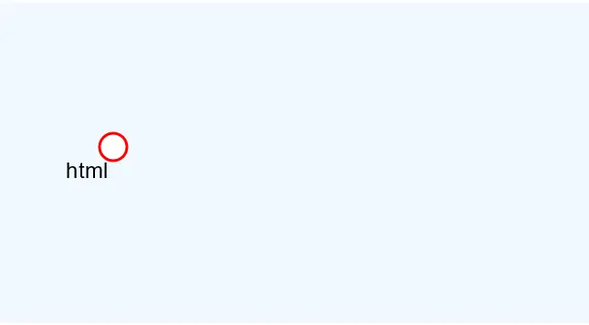
Consider the figure above. It contains a single ‘html’ element. It turns out this includes within it the entire content of your html file. If you click on the “html” node, you’ll find that it contains two components, a head and a body. Clicking on each of those will reveal their respective contents. This structure is what we computer scientists call a “tree”. Any given element (except for the outermost ‘html’ element) is wholly contained inside another element, referred to as the “parent” element. Not surprisingly, the elements that a given element contains are its “child” elements. And, yes, children of a common parent are often referred to as “siblings”.
Thus, in the example above, the top element is the html element, which contains just two elements, the head and body. The head element contains a title element and the body contains an ‘h1’ element and a ‘p’ element. In a more typical example, the body would contain many more children, but for our purpose this is enough.
That may be a great picture, but how do we represent such a structure in a text file? Well, that’s where “tags” come in.

‘Tags’ are what we use to organize a text file (which is just a long string of characters) such that it represents a tree of elements that make up the html document. Tags are not the elements themselves, rather they’re the bits of text you use to tell the computer where an element begins and ends. When you ‘mark up’ a document, you generally don’t want those extra notes that are not really part of the text to be presented to the reader. HTML borrows a technique from another language, SGML, to provide an easy way for a computer to determine which parts are “MarkUp” and which parts are the content. By using ‘<’ and ‘>’ as a kind of parentheses, HTML can indicate the beginning and end of a tag, i.e. the presence of ‘<’ tells the browser ‘this next bit is markup, pay attention’.
Whatever that tag (or ‘open tag’) does, it applies to the content following the tag. Unless you want that to be the entire rest of the document, you need to indicate when to stop using that tag and do something else, so ‘<’ and ‘>’ are again used. Since elements are typically nested within other elements, the browser needs to be able to distinguish between the end of the current tag or the beginning of a new tag (representing a nested element). This is done by adding a ‘/’ right after the ‘<’ to indicated that it’s a ‘close tag’. To indicate the beginning and end of a paragraph (indicated by the single letter ‘p’) you end up with something like this:
<p>This is my first paragraph!</p>
The browser sees the letters ‘<p>’ and decides ‘A new paragraph is starting, I’d better start a new line and maybe indent it’.
Then when it sees (xyz) it knows that the paragraph it was working on is finished, so it should break the line there before going on to whatever is next.
For example, the ‘<em>’ tag is used for element that needs Emphasis.
The ‘<’ and ‘>’ indicate that this is a tag, and the “little bits of text” in between tell us what kind of tag it is.
To completely describe the element, it needs an open and close tag, with everything in between the tags being the content of the element:

Most tags have open and close versions, but there are a few strange ones.
We’ll learn more about these later, but we generally refer to the strange ones as “self closing” tags.
Usually these tags represent an element that is completely described by its attributes, and thus there is no need for other content.
So if you see something like this:
<img src="https://goo.gl/pVxY0e" alt="Floating flower"/>
… then you should know that the slash at the end of the open tag is sort of a shorthand for a close tag, so you won’t see any other indication that this element is now complete.
There are also a few tags that don’t even use the ‘/’ at the end, they just don’t have any close tag at all.
This works because all of the information this tag needs is declared in an “attribute”.
Computers are great at reading computer languages, but it’s not always easy for humans. Comments are a way of adding some text that is primarily targeted towards human readers.
Every programming language I’ve used has some way of representing comments. HTML5 is no exception. If you want to add something in your file that you want the browser to completely ignore, there’s a special tag for that (unsurprisingly called a “comment tag”):
<!-- This is a comment -->
An HTML comment tag starts with , meaning that as the computer is reading through your HTML file, if it sees . There is no open or close tag, just a comment tag. Unlike most other things in HTML5, comments cannot be nested. If you try that, like:
<!--
  Beginning of comment
    <!-- comment nested inside -->
  This is after the nested comment
-->
The computer will then see the beginning of the comment tag and start ignoring everything until it sees –>, including the second , it assumes the comment is done and goes back to processing everything it sees as HTML code and content, even though the writer may have meant it to be a comment.
Like most other tags, it can span multiple lines of your source file. This can be really convenient when you have a lot to say:
<!--
  If you want some good advice,
  Neither a borrower nor a lender be,
  For loan oft loses both itself and friend,
  And borrowing dulls the edge of husbandry.
-->
Comments are also commonly used in development to block out bits of code, whether for testing or leaving unfinished business in the file:
<!-- Not sure if I want this wording or not:
 <p>Eighty seven years ago, a bunch of guys started a new
    country</p>
 -->
It’s important to remember that just as HTML, CSS and JavaScript are three different languages, they each have their own notation for handling comments.
This might seem confusing, but it’s actually kind of important that the HTML comment notation, at least, differs from the others.
As for the exact form of those comments, we’ll cover that in good time.
Most of what we’ll cover about attributes will come later, but I wanted to introduce the idea briefly. Basically, a given element on your Web page can be distinguished by any number of unique or common attributes. You can identify it uniquely with an ‘id’ attribute, or group it with a class of other elements by setting the ‘class’ attribute.
Attributes in HTML are written inside the opening tag like this:
<p id="paragraph-1" class="regular-paragraphs">
   Call me Ishmael . . .
</p>
The paragraph above has a unique identifier, “paragraph-1” and is part of a class of “regular-paragraphs”.
The letters inside the quotes have no meaning to the browser, they just need to be consistent.
They are actually strings (of characters), which, as we will soon learn, suggest that if you want to have another paragraph in this class, it has to say “regular-paragraphs”, not “regular” or “Regular-Paragraphs” or any other variation.
Again, the fact that the computer does not care what we put in those strings (except for some restrictions) means we can use them to convey meaning to a human developer.
I could just as easily have said id=‘x’ and class=‘y’, but anyone looking at that would have no hint what the significance of x and y are.
Best practice is to name these things to increase clarity, consistency and brevity.
But more about attributes in the next module.
One key to understanding HTML, or any computer language, is to be sure that you avoid ambiguity, because computers generally are not good at judgement calls.
For example, you could streamline HTML so that whenever you see a <p> tag, you start a new paragraph, no close tag needed.
That might work most of the time, but that would prevent you from nesting one element inside another, as the browser could not know if you meant the new element to be nested or a successor.
A human designer might be able to tell what you meant from the context, and knowing that mistakes happen choose the one she thinks is best suited in that case.
A browser, on the other hand, has difficulty with a task like that, so it is helpful to use a close tag that matches the open tag to make things absolutely clear.
<p>
  The old lady pulled her spectacles
  down and looked over them about the
  room; then she put them up and looked
  out under them.

  There was a slight noise behind her
  and she turned just in time to seize a
  small boy by the slack of his roundabout
  and arrest his flight.
</p>
The old lady pulled her spectacles down and looked over them about the room; then she put them up and looked out under them.
There was a slight noise behind her and she turned just in time to seize a small boy by the slack of his roundabout and arrest his flight.
A human reader could easily detect that two paragraphs were intended and that the writer probably just forgot to terminate one and start the other. The browser, on the other hand, will only see one paragraph and layout accordingly.
On the other hand, you might think that since a browser always knows exactly what tag it is working with (eidetic memory), you could provide a sort of “universal close tag” that doesn’t specify the type that it’s closing. It would know to close the current tag. While that’s technically true, it’s handy to have the close tag there for people reading the code. The close tag makes it easier to remember what tag it is closing. We humans can get confused trying to remember that kind of detail.
But there are other ambiguities to consider. For example, when a browser receives a file, it may know that it’s receiving an HTML file, but it won’t know which version of HTML is used (it matters).
That’s why the first thing you need in any HTML file is a tag to tell you what type of HTML file it is:
<!DOCTYPE html>
In other words, the first thing the browser sees is the declaration “This is an HTML5 file, in case you were wondering”.
It may seem tedious to put this at the top of every file, but believe me, it used to be worse.
You probably noticed that it doesn’t say “!DOCTYPE HTML5” but just “html”.
HTML5 can do this because all the previous versions were much more long winded.
For example, at the top of an HTML 4.01 page, you might have something like this:
<!DOCTYPE HTML PUBLIC "-//W3C//DTD HTML 4.01//EN"
   "http://www.w3.org/TR/html4/strict.dtd">
We do not need to go into the details of why and what that means, just be grateful that HTML5 did away with it.
It may seem redundant, but the next bit tells the browser where the actual HTML code begins, using an <html> tag:
<html>
Nearly every HTML document has two parts. The body is the main content of the page, containing text, images, tables and so on.
The head comes before the body (on top?). It is where you put information about the document that does not really go in the body, AKA ‘meta-’ information. Things like what kind of character set the page is using, where the browser can find style tips, and what the title of the page is (which might be different from the title the user reads) all go in the <head>.
If you have been paying attention, you should be able to create a very basic html file, in the right form, without any content.
Hint, for the head of the document you would write:
<head>
</head>
You may recall the paragraph tag <p> that we used in the example above. Try inserting a paragraph into the body of your new document. You should end up with something that looks like this:
<!DOCTYPE html>
<html>
  <head>
  </head>
  <body>
    <p>
      As my English teacher used to say, 'One sentence does not a
      paragraph make'!
    </p>
  </body>
</html>
A character can be any letter, digit or symbol that makes up words and languages.
English alphabets and digits ‘a-z’, ‘A-Z’, ‘0-9’ are all considered characters.
Other examples of characters include the Latin letter á or the Chinese ideograph 請 or the Devanagari character ह. A character set is a collection of characters (letters and symbols) in a writing system.
Each character is assigned a particular number called a code point. These code points are stored in computer memory in the form of bytes (a unit of data in computer memory). In technical terms, we say the character is encoded using one or more bytes.
Basically, all the characters are stored in computer language and a character encoding is the awesome dictionary that is going to help us decode this computer language into something we can understand.
In technical terms, it is what is used as a reference to map code points into bytes to store in computer memory; then when you use a character in your HTML, the bytes are read back into code points using the character encoding as a reference.
When you code in HTML, you must specify the encoding you wish your page to use. Providing no encoding or the wrong one is pretty much like providing the wrong dictionary to decode. It can display your text incorrectly or cause your data to not be read correctly by a search engine.
A character encoding declaration in your HTML is also important to process unfamiliar characters entered in forms by users, URLs generated by scripts, etc. You should always use the Unicode character encoding UTF-8 for your Web pages, and avoid ‘legacy’ encodings such as ASCII, Windows-1252 and ISO-8859-6 mentioned above. Do not use the UTF-16 Unicode encoding either.
It is important to note that it is not enough to simply declare your encoding at the top of the web page. You have to ensure that your editor saves the file in UTF-8 also. Most editors will do that these days, but you should check.
Read an Introduction to character sets and encodings here.
Use the <meta> tag with the charset attribute in your HTML page to indicate to the browser the character encoding you will be using in the page.
<meta charset="utf-8">
Alternatively, you can also use http-equiv and content attributes.
<meta http-equiv="Content-Type" content="text/html;
   charset=utf-8">
We recommend using the first one because it is much less complicated. You should also always use ‘utf-8’.
The meta declaration belongs inside the <head> element, and should be specified within the first 1024 bytes of your page. So the earlier it is mentioned in your code, the better.
W3C recommends placing it immediately after the opening <head> tag:
<!DOCTYPE html>
   <html lang="en">
   <head>
      <meta charset="utf-8">
      ...
   </head>
</html>
Before we learn what HTML character references are, let’s look at how the need for them came about.
Try the following code in your HTML:
<p>Welcome to "HTML5 & CSS Fundamentals". The first tag we will be
   learning about is  the <html> tag.</p>
<!DOCTYPE html>
<html lang="en">
  <head>
    <meta charset="UTF-8">
    <title>Welcome</title>
  </head>
  <body>
    <p>Welcome to "HTML5 & CSS Fundamentals". The first tag we will be
    learning about is the <html> tag.</p>
  </body>
</html>
Did you notice the <html> tag is missing in your output? In this case, your browser mixed it up with an actual tag, although it was meant to be a part of the sentence as text. Because of this kind of confusion, HTML reserves certain characters. If you want to use these characters in your HTML, you need to use character references to display them.
All HTML character references can be written using either a name or number.
If you want to use a named character reference in your source code, use an ampersand symbol '&', followed by the name and a semi-colon. Names are case sensitive. For example, the following represents a no-break space:
There are two types of numeric character reference: ones that use decimal numbers and ones that use hexadecimal numbers. In each case, the number represents the code point number of the character in Unicode.
If you are using a decimal number, use an ampersand symbol ‘&’ , followed by the symbol ‘#’, then a decimal number and a semi-colon.
 
If you are using a hexadecimal number, use an ampersand symbol ‘&’ , followed by the symbols ‘#x’, then a hexadecimal number and a semi-colon.
 
The five special characters listed in the table below should always be written as character references if you want them to appear on your page when viewed by a reader:
| Symbol | Entity Name | Entity Number | Usage |
|---|---|---|---|
| Less than ‘<’ | < | < | Div tag: <div> |
| Greater than ‘>’ | > | > | Div tag: <div> |
| Ampersand ‘&’ | & | & | Tom & Jerry |
| Non-breaking space - space that will not create a new line | |   | If you add multiple spaces, the browser will remove all but one. So you have to use this entity to add multiple spaces in your HTML page. |
| Quotes "" | " | " | Link to another section on the same page using the id of the element:
<a href="#timetable"> Displayed as: <a href=“#timetable”> " is generally encouraged for code. For an actual quotation, <q> or <blockquote> is preferred. |
We do not want these special characters to be processed by the browser as HTML code. Instead, you want it to be displayed to the user. So if you wish to display this in your browser:
<img src="images/test.png" alt="test image">
You have to write it like this in your HTML code:
<img src="images/test.png" alt="test image">
<!DOCTYPE html>
<html lang="en">
  <head>
    <meta charset="UTF-8">
    <title>Welcome</title>
  </head>
  <body>
    <p>
      <img src="images/test.png" alt="test image">
    </p>
    <p>
      <img src=""images/test.png" alt="test image">
    </p>
  </body>
</html>
Some tolerant browsers will allow using the & character directly but not all. So you should use its character reference &. Check out these examples illustrating the importance of using the character entity & for &.
While it might be tempting to not use one of these character references when you notice that the browser produces the expected result anyway, it is a best practice to use character references for these five special characters using <, >, ", & and at all times. This is because you can never be sure what browser or application will be used to view your code, and how that will behave.
The " character reference is particularly useful for quotation marks within attribute values. Let’s say you want to add a title attribute to an abbreviation to provide an expansion of the abbreviation. If you try the code below in a browser and hover your mouse pointer on the text ‘HTML5’, it will show you the title text (it works like a tooltip). The title text in the source code includes quotes (around the number 5) like this:
<abbr title="Hypertext Markup Language "5"">HTML5</abbr>
The above will not display the number 5.
Replacing the quotes with its character entity will work:
<abbr title="Hypertext Markup Language "5"">HTML5</abbr>
Check out this jsfiddle link.
<p>Rest your mouse on the text below: (The number 5 is missing)</p> <abbr title="Hypertext Markup Language "5"">HTML5</abbr> <p>Rest your mouse on the text below: (5 is displayed when quotes is replaced with its character entity name)</p> <abbr title="Hypertext Markup Language "5"">HTML5</abbr>
It is also possible to use character references to represent other characters in your page. This is useful when you are unable to type the character itself, or when you can’t tell what the character is by looking at it (for example, a no-break space, or an invisible formatting character). There are predefined, named character references in HTML for several categories, these include:
For a list of named character references available in HTML, visit: https://dev.w3.org/html5/html-author/charref.
Any Unicode character can be represented using a numeric character reference. Apart from the characters used for HTML syntax (described in the previous unit), there is usually no need to use character references to represent characters.
All browsers are built using Unicode internally, which means that they are capable of handling all possible characters defined by Unicode. The best practice for symbols like copyright, currency symbols, math and arrows is to simply type them directly into the source code.
You can do this directly in the code:
<!DOCTYPE html>
<html lang="en">
   <head>
      <meta charset="UTF-8">
      <title>Welcome</title>
   </head>
   <body>
      <p>This is © 2015. Breach will entail a fine of € 400</p>
      </body>
</html>
There is no need for the © or € HTML character reference if you are able to type the character itself.
If you’d like to read more information about when to use character references and when not to use them, see Using character escapes in markup and CSS.
Children can be great at asking questions about things that most adults take for granted, and like to challenge assumptions.
While it’s a great sign of a curious and reasoning mind, it can be overwhelming, and you can’t really learn (or teach) everything at once. Some things are better to be taken on faith in the short term, until you fully understand the issue.
That brings up a term you’ll be hearing quite a bit in this class: “best practices”. It’s often said that bad programs can be written in any language, and we’ve found that to be true (at least in every language we’ve seen). Over time, developers learn that some habits are better than others, in other words that some habits, like avoiding redundancy and repetition, tend to make a program more clear and easier to understand and maintain than other habits, like using goto statements. It could also be about performance, i.e. in a given language doing a task one way may be faster than another.
A carpenter will tell you that if you want to hammer a nail, it’s best to do it in as few strikes as possible (e.g. 2 or 3). That may not be obvious to non-handy people like me, but I’ve been told that’s the best way by people with a lot more experience than I, so I’ll take it on faith (at least for now).
There are sometimes arguments about which are the best practices. New techniques are discovered, new ideas are born, and sometimes, fashions change. For our purposes and the duration of this course, when we use the term “best practice” you can trust that it is, even though we may not be able to explain it at that point in the course, so you’ll want to make it a habit.
The history of Web pages is such that browsers tend to be very forgiving of certain types of mistakes. If you miss a closing tag, it will often work the way you expect. It probably won’t crash, or ignore the document, or give up completely, but it might not appear quite the way you meant it to. Or maybe it does look like you want, but you do not want to depend on that. In general, best practices would call for one to do it properly, and not depend on the browser to patch it for you.
Because an HTML file essentially represents a tree structure, the open and close tags should always match, and there should not be any overlap with other elements. That is, you can have an element that is enclosed in another element, or you can have two elements side-by-side, but you can never have a situation in which part of an element is in another, but the other part is not.
<p>This is a <em>paragraph</em></p>

<h1>Paragraph ahead</h1>
<p>And here it is.</p>
The two examples above are fine because in each case either an element is wholly contained in another (<em> in <p>) or they are completely separate (<h1> and <p>). This, on the other hand, is not valid:
<h1>Part of this header is <p>in the</h2> paragraph below</p>
What happens in this case is what we call “undefined”. That just means that there is no telling how the browser will decide to handle it. It might decide to automatically close the <p> when it sees another close tag, or it could complain about an unexpected close tag at the header. Then it might complain again when there is a now unexpected close </p> tag.
If you played around with the minimal HTML file from the previous section, you might have noticed that you can get more minimal than that. For example, if you take out the “head” section completely, the browser will still render the page without complaint (at least Chrome will; Firefox does complain in the debugging console, but we will save that for week 4). In fact, you can even take out the “body” open and close tags (not the content, of course) and it will still work as expected. Not only that, if you take out the <!doctype> statement, it still works (and Chrome still doesn’t complain!).
What’s actually happening is that the browser knows roughly what to expect in an HTML page, so if it sees a file ending in ‘.html’ it will automatically stick some stuff in if it is not there already. It will typically make basic assumptions like: It is an HTML5 file, everything in there is content, so it goes in the <body> section, the <head> section is empty. If you right-click on an element and choose “Inspect”, you will see that the browser has included the <html> section containing the <head> and <body> sections, even though it wasn’t there in your file.
Note that we said “typically”. The current behavior of most browsers will handle this, but it is “undefined” so there is no guarantee that next module’s update won’t break it. To be correct and complete, you need the <!doctype> section and the <html>
section with <head> and <body>. In any case, it is a good idea (best practice).
Proper indentation is one way to make your code clearer and easier to understand:
<body>
  <h1>Here is a heading</h1>
  <p>
  <ol><li>List Item 1</li></ol>
  </p>
</body>
The code above doesn’t give any sense of the structure of the document. By using indentation effectively, you can make it more clear, showing the nesting of elements:
<body>
  <h1>Here is a heading</h1>
  <p>
    <ol>
      <li>List Item 1</li>
    </ol>
  </p>
</body>
Consistent quoting of strings is also helpful, in part to avoid potential problems that can arise when you think something does not need quotes but it actually does.
Often, projects will have coding styles that everyone is expected to use so that everything looks consistent and developers can more easily read each other’s code. If you are creating the project, you can decide what the rules are (how many spaces to indent, single or double-quotes, etc.) but unless there is a good reason to change away from typical practices, it is usually best to adopt them.
Before we go any further, it’s good to understand a few technical details.
You might notice that code is not always consistent in how a given tag is written. We might say ‘<h1>’ in one spot and ‘<h1>’ in another. In this case, they are exactly the same kind of tag. Tag names are “case insensitive” meaning that it does not matter whether you use capital or lower case letters in writing them. In fact, you could write your body tag as ‘<body>’, but that’s not generally considered a good practice (Camel case/Snake case makes it harder to read). On the other hand, there are places where you want the computer to be “case sensitive”, meaning the computer will distinguish between upper-case and lower-case.
Obviously, you usually don’t want your text (that the user reads) to be case insensitive. You want your sentences and proper names to start with capital letters, but most other characters to be lower-case (unless you want to yell, in which case use “all caps”). You generally don’t want the browser to mess with that. You would probably be unhappy if the browser turned all your letters into lower case. And people might think you’re quite tightly wound if the browser converted everything to upper-case.
On the other hand, we usually do not want to worry about the amount of white space (spaces, tabs and returns) in between words and lines and paragraphs (well sometimes we do, but there’s a tag for that). In HTML, most extra white space will be ignored. By ‘extra’, I mean more than one space (or tab) consecutively. There are many places where you need to be sure to separate one thing from another with a space, but it generally doesn’t matter if you put more spaces in there, your result will look the same.
Thus, all three of the following elements should look exactly the same when you read them in the browser:
<H1> This is the Beginning </H1>

<H1>
  This is the Beginning
</H1>

<h1>This is the Beginning</h1>
It might seem confusing at first, but this rule about white space is actually very convenient. The third option might be a bit too cramped for your taste, while the second might seem to take up too much room in your source code. Because it doesn’t matter to the browser how much white space there is, you can use white space to make your code more visibly organized and easier to read (note the use of indentation in the second <h1> element above).
Given that tag names are case insensitive (you can write them either way), you might think that everything in between < and > is case insensitive, but it is not that easy.
Attributes are case sensitive! We have not learned much about attributes yet, but when we do we will discover that they are case sensitive, thus these two elements will have different ’id’s:
<p id=ThisOne>

<p id=thisone>
Even though they’re spelled the same, the differing cases indicate different names. Note that distinguishing different id’s solely by case (i.e. spelled the same but with different capitalization) is a really bad practice (opposite of best practice). Instead you can use capitalization in other ways, like CamelCase.
Finally, it will eventually be important to know about “strings”. Strings are just a series of characters. They could be any characters like “Dingbats” or “ABC123^&*@aeiou“. They can even contain spaces as in”This is a string.”. Because they are so wildly variable (they can essentially be anything you can type), the computer needs us to indicate where a string begins and ends, which is typically done with quotation marks, either single (’) or double (“). HTML tries to be helpful here.
You will find that in places where HTML is expecting certain types of strings (say a string without spaces), even if you do not use the quotation marks it will essentially insert them for you. Thus:
<p id=MyName>
<p id="MyName">
<p id='MyName'>
.... are all equivalent.
It is also important to know that, in HTML, double and single quotes are almost interchangeable, but they have to match. If you start a string with a double quote, the computer will not end it until it sees another double quote. Any single quotes will be happily considered part of the string, which is handy if you need quotation marks in your string. Because of this, if you create a string as ’“quote” ’ (single quotes containing a double quoted string), your string will have the letters <space>-“-q-u-o-t-e-”-<space> (with double quotes in the string and spaces outside those) as opposed to “quote” which will just have the letters q-u-o-t-e (no quotation marks or spaces in the string). Nevertheless, best practice is to be consistent in your quotes, so it’s best to quote them all the same way, even if the browser would understand it anyway.
The idea is to take advantage of these flexibilities to create clean organized code that is easy for a human to comprehend. I guess you could sum it all up with these simple dictum:
Are they consistent with each other? Are there some rules that don’t seem to make sense?
Can you find other style guides or coding standards that agree or disagree with some of the suggestions in one of these guides?
Now you can create a simple, empty, HTML page, and you know what tags are, though we have not said a lot about specific tags, what they mean, how many there are, etc. We will start with the ones we have already seen:
<!DOCTYPE <span class="dt">html>
<html lang="en">
  <head>
    <meta charset="UTF-8">
    <title>Welcome</title>
  </head>
  <body>
    <h1>A TALE OF TWO CITIES</h1>
    <h2>A STORY OF THE FRENCH REVOLUTION</h2>
    <h2>Book the First—Recalled to Life</h2>
    <h3>I. The Period</h3>
  </body>
</html>
Though you theoretically should not think about what it looks like, it will typically appear as large, possibly bold text in your document, to mark a separation or beginning of some new section. <h2> is usually a bit smaller, and <h3> smaller yet and so on down to <h6>. This allows logical nesting of sections, though they should not be nested too deeply. Try not to skip levels of headers when nesting them. Headings are really useful for some assistive technology users and missing levels can be confusing.
<!DOCTYPE <span class="dt">html>
  <html lang="en">
  <head>
    <meta charset="UTF-8">
    <title>Welcome</title>
  </head>
  <body>
    <p>
      This is a paragraph.
      It may or may not be indented but there should be a line
      break at the end.  Typically the last line will not stretch
      as far to the right as the rest of the lines.  Often there
      is extra space between one paragraph and the next.
    </p>
  </body>
</html>
You might notice that when discussing how these different elements are
rendered (i.e. what they look like to the end user), you will find
words like “typically”, “possibly”, and “generally”.
It is a little picky. As you will learn in Module 3, it is possible to change the
styling of one element to look like just about any other element.
You could style a <p> element so that it looks like an <h1>,
though best practice would be not to do that.
There are a lot more tags, but we will just cover a few more for now, mostly because they are straightforward to use and you can see the effect in your Web page when you use them:
Brevity is beautifulwould be rendered as Brevity is beautiful.
Early to bed and early to rise, makes someone healthy, wealthy and wise - Benjamin Franklin
Thus a list in HTML would look like this:
<ul>
  <li> First item in list </li>
  <li> Second item in list </li>
  . . .
</ul>

There are a couple more tags we want to bring up at this point, but first a disclaimer. We have been emphasizing the general rule that HTML is for the logical structure of your content, not what it looks like. Well, this is not entirely true. There are some HTML elements that are primarily used to invoke certain formatting.
That which we call a rose <br>
By any other name would smell as sweet

That which we call a rose <br> By any other name
would smell as sweet

Text in a pre element
is displayed in a fixed-width
font, and it preserves
both spaces and
line breaks
Throughout the course, we’ll be building a simple project, adding to it with what we’ve learned in each module. This project will be a simple Web application that will allow you to browse different recipes.
For now, we’ll start off with a simple first draft using just what we’ve learned about HTML5 using tags we’ve covered. We want to have the following components:
Please start with this “empty page” in CodePen:
<!DOCTYPE <span class="dt">html>
<html lang="en">
  <head>
    <meta charset="UTF-8">
      <title>My Favorite Recipes - Module 1</title>
  </head>
  <body>
    <h1>My Favorite Recipes</h1>
    <ul>
      <li>Recipe 1</li>
    </ul>
    <h2>Recipe 1</h2>
      <p>
        This is going to be my favorite recipe.
      </p>
    <h3>List of Ingredients:</h3>
    <ul>
      <li>Ingredient 1</li>
      <li>Ingredient 2</li>
      <li>Ingredient 3</li>
    </ul>
    <h3>Steps:</h3>
    <ol>
      <li>Step 1</li>
      <li>Step 2</li>
      <li>Step 3</li>
      <li>Enjoy!</li>
    </ol>
  </body>
</html>

Hi, everyone, and welcome.
I’m Andrew, your instructor for week 2 of the Introduction to HTML and CSS course.
In this module, we’re going to cover global and non global attributes and how to use them, paying close attention to the commonly used ones such as ‘id’ and ‘class’.
In addition, you’ll learn about the importance of separating content and style in HTML5, as well as look at the difference between semantic and style tags.
We’ll study semantic elements, why they’re important, as well as look at their usage in various examples.
Now, in the second half, we’ll cover how to add images to your HTML, and I think you’ll agree, images make everything more interesting.
We’ll learn how to use the image tag and its attributes, and we would also look at scenarios where it’s more appropriate to add images using CSS instead.
Finally, we’ll learn how to add hyperlinks to your Web page and their different uses.
At the end of each subsection, you’ll be able to do exercises based on what you’ve learned and test your knowledge by doing a quiz.
We hope you enjoy the course, and happy learning!
Tags and elements are building blocks of HTML5. However, they can be made so much more exciting with attributes. Let’s take a simple element like list. You know how to add one to your page but can you change the order of your list? Or change it to an alphabetically ordered list instead of a numerical list? Can you display your list in reverse order? Yes, you can do all this and more using attributes.
Apart from exploring attributes for elements, we will continue to add life to our Web page by adding images and hyperlinks and learning about how to use and place them properly in your Web page.
In this module, we will also look at creating meaningful Web pages. Imagine you are the Web page designer of an online magazine. You want to have a central article, some aside commentary, captions, a summary of your article, addresses and citations. You also want to provide more detailed information such as, ‘This sentence is really important and you need to convey that to the reader’.
If we just use <p> tags and header tags, <h1> to <h6>, visually it might look like what you want, but only a human will be able to read and understand the page. To a browser, there is very little information except that there is text and headings in your page. How can a search engine know what is important? Does a visually impaired person have to listen to the entire page or can they just jump to the article?
It is very important to style your Web pages for search engine optimization (SEO) to improve your search engine rankings, and for visually impaired people who access your Web page using assistive technology like screen readers. Semantic markup enables all of this and more.
2.1 Introduction: Check out this video explaining what you’ll be learning about in Module 2 - and wrap your mind around the concept of “semantic markup”.
2.2 Attributes: Here you will build on to what you have already learned about attributes.
2.3 Semantic meaning: Explaining the difference between ‘semantic’ and ‘style’.
2.4 images: Learn how, when, and where to best utilize images in your Web pages.
2.5 Hyperlinks: They are the connections that allow the world to jump from place to place on the Web. Explore the secrets of this powerful mechanism!
We learned a little bit about what attributes are in the previous module. Let’s look into it in more depth, by using examples.
<ol>
  <li>Lights</li>
  <li>Camera</li>
  <li>Action</li>
</ol>
1. Lights
2. Camera
3. Action
If I want an ordered list to start with the number 5 instead of 1 (as it does by default), let’s code like this:
<ol start="5">
  <li>Lights</li>
  <li>Camera</li>
  <li>Action</li>
</ol>
5. Lights
6. Camera
7. Action
Here, using the start attribute, we made our list start with 5 instead of 1.
Like start, we have many useful attributes we will see in this section that can affect
your element. Attributes are a significant part of HTML. Tags and attributes make
up the language.
<ol reversed></ol>
<ol start="5"></ol>
<ol id="cinema" class="attribute-list" start="5"></ol>
<ol start="5" class="attribute-list"></ol>
<p>I am paragraph 1 and I want to be in red</p>
<p>I am paragraph 2 and I want to be in blue</p>
Your task is to make the text color of the first paragraph red and the other blue. How do we do that? You add styling to your HTML document through CSS. CSS is a style sheet language where you add any presentation related information for your HTML document. You will learn about this in the next chapter. In this case, you will have to write code in your style sheet to inform that it needs to change the text colors respectively.
But to identify each paragraph, we need to give them each a name first so we can instruct our style sheet to make X red and Y blue.
This unique name we give each element is called an ‘ID’. This is very similar
to your school or corporate ID that is unique to you. No one else in your company
will have the same ID as you. id is an attribute.
It should be unique to the element; we know how more than one people having the same
ID can just cause a lot of confusion.
<p id="para1">I am paragraph 1 and I want to be in red</p>
<p id="para2">I am paragraph 2 and I want to be in blue</p>
Here, we can style para1 and para2 separately using CSS. The id attribute helps us do this by letting us give each paragraph an ID.
A similar attribute is class. class like id is a very useful
attribute and one you will be using very frequently. Let’s assume you
are an author of a book.
You like poems and you want to include at least 20 of them in your new book.
You add IDs for them: ‘poem1’, ‘poem2’, ‘poem3’.
You want your poems to look different from your other text.
Grey text color, italic and bold. Like this:
To move, to breathe, to fly, to float, To gain all while you give, To roam the roads of lands remote, To travel is to live.
- Hans Christian Andersen
All poems have the same requirements.
If you use the id attribute, you can instruct the stylesheet to style
each poem in a particular way. It will look something like (we will
learn how to write proper styles in the next chapter, so for now we will
just phrase it in English) -
'Make poem1's text color grey, italic and bold'
'Make poem2's text color grey, italic and bold'
'Make poem3's text color grey, italic and bold'
Can you imagine how repetitive your style sheet will look if you have to instruct it to do the same thing 20 times for different poem IDs? HTML makes it easier. We use the class attribute. Let’s name this class of poems ‘poetry’.
<p id="poem1" class="poetry">To move, to breathe, to fly, to
  float...</p>
<p id="poem2" class="poetry">Roses are red, violets are
  blue...</p>
So now, all you have to do in your style sheet, is to instruct it to make all elements belonging to the ‘poetry’ class grey, italic and bold.
You have seen a few examples of attributes now: start, id and class. All HTML elements have attributes.
Global attributes can be applied to all tags. They are common attributes. Examples of global attributes are id and class. There are many more global attributes. Here is a list of all the global attributes and the values they accept.
Attributes like id and class can be applied to any HTML tag.
<p id="para1" class="poetry" lang="en">The global attribute lang
  takes language codes for values. The code for English is 'en'.</p>
<html lang="fr"></html> - The language attribute tells the browser
  that the contents of this document will be in french.
<ul id="intro-list"></ul>
<pre class="html-code"></pre>
Non-global attributes are attributes applied to a specific instance of a tag. It can be applied to one or more tags. For example, start is an attribute for the <ol> tag and it cannot be applied on the <p> or <h1> tags, it is specific to only ordered lists <ol>. Another attribute specific to the <ol> tag is reversed, which we learned in the last unit as an example of a boolean attribute. The non-global attribute width can be applied to several tags such as <img>, <input> and <video>.
<ol>
  <li>HTML5</li>
  <li>CSS</li>
  <li>JavaScript</li>
</ol>
<ol reversed>
  <li>HTML5</li>
  <li>CSS</li>
  <li>JavaScript</li>
</ol>

Ordered lists have their own specific attributes and all global attributes can also be applied to them.
The image <img> and hyperlink <a> elements, which we will be learning about shortly, have many non-global attributes of their own.
<b><img>  :</b> src, alt, etc.
<b><a></b>  : href, target, download, etc.
Other than the common global attributes, if you wish to learn about the supported non-global attributes for any element, you can visit the HTML attribute reference available at the Mozilla Developer Network (MDN).
Important: Throughout the course, using the MDN attribute reference, you are encouraged to explore non-global attributes for the elements you learn about or would like to use in your Web pages. In the MDN attribute reference list, you can click on the element’s hyperlinked name to be navigated to its page that lists supported attributes for that element.
Try this: Navigate to the HTML attribute reference at Mozilla Developer Network and find out which element(s) the attributes muted and readonly can be applied to.
Try this: Navigate to the HTML attribute reference at Mozilla Developer Network and find out the non-global attributes that can be applied to the <li> tag. Search for the <li> element and then click on it: it will take you to the list tag’s page that specifies applicable attributes.
Like we saw in the previous unit, here is a list of all the global attributes and the values they accept.
To understand attributes, we considered an example of usage id and class.
We are going to look at it in depth here and discuss another global attribute title.
The id attribute gives your element a unique identifier.
In your HTML document, that ID value can only be used in one element.
<p id="question-about-html">How many times can a particular 'id'
  value be used in an HTML document?</p>
<p id="html-answer">Once</p>
The class attribute, while similar to id, groups a set of elements in
the same class.
Its name-value pair is class=“classname”.
Unlike id, which
is unique to an element, the same class name can be assigned to more than one
element.
<p class="question">What is your name?</p>
<p class="question">Do you like HTML5?</p>
Both paragraphs above are grouped under the class named ‘question’.
An element can have one or more class names.
If we also want the second question to be under the ‘html’ class because it
is an HTML related question, you can add two class names by separating them with
white space:
<p class="question html">Do you like HTML5?</p>
<p class="question">Who are you?</p>
<p class="answer">I am the author</p>
<p class="question html">Do you like HTML5?</p>
<p class="answer">Yes</p>
In your CSS, you can include code to style your classes, for example by telling it:
Who are you?
I am the author
Do you like HTML5?
Yes
The ‘Do you like HTML5?’ question has styles for both the ‘question’ and ‘html’ classes applied to it.
The lang attribute indicates the language of the text in the element to which it is attached. Identifying the language of content is increasingly important, as browsers adapt styling and other aspects of the user’s experience according to the language of the content.
For example, if you create a page in Japanese, the browser will automatically apply a font that produces Japanese shapes for the characters, rather than Chinese shapes – but only if you have told it that your content is in Japanese. Various presentational aspects also require a knowledge of the language of the content: for example, CSS will style content differently for line-breaking, hyphenation, and text-transforms depending on the declared language. Other features, such as spell-checking and voice browsers for visually-challenged people, also work differently according to which language the content is in. For more details see Why use the language attribute?
The value of a lang attribute must be a language tag that is composed of one or more subtags defined in the IANA Language Subtag Registry. Multiple subtags are separated by hyphens. (Do not use the ISO lists of languages and countries! Those lists are already subsets of the IANA registry.) You may find it easier to look up subtags using the unofficial Language Subtag Lookup
You should always declare the language of your page in the <html> tag. You can also declare the language of content within the page by attaching a lang attribute to an element that contains it.
<html lang="en-GB">...</html>
   <p>In French you'd say <span lang="fr">On voit souvent des chats
      sur le Web.</span></p>
The first example above shows how you can qualify the language (English) with a region subtag (GB) to specify British English. This distinction can be useful for spellchecking your source. You can also add other subtags, such as scripts and variant labels to further refine the language. However, the golden rule is to always keep the lang value as short as possible, and only use additional subtags when you have a good reason (e.g. use just ja for Japanese, not ja-JP). For more information, see the article Declaring language in HTML.
The second example shows how you could specify a change of language within the document. This would help a voice browser pronounce the French word ‘chats’ correctly, meaning ‘cats’ and not ‘chats’ in English.
Try this: Place your cursor on the word and then on the picture below. Don’t click on it, just rest your cursor there.

Did you see the two “secret” messages? A message that appears when you rest your pointer over an element, is called a tooltip. Be it a paragraph, header, image or any element, the title attribute is used to provide additional information about it. It is very useful, to elaborate on abbreviations or add some context. For images, you should use an alt attribute as there is no guarantee that the title attribute will be presented to assistive technology users. The title can be any text value.
<abbr title="National Aeronautics and Space
  Administration">NASA</abbr>
Hi everyone! Now that we have read a fair amount of information about attributes, we know that there are two kinds, global and non global attributes.
Global attributes apply to all elements be it a paragraph, blockquote, list, image, hyperlink, etc., etc. And then there are attributes specific to a particular element. Like the start attribute is specific to only ordered lists. And these are called non global attributes. But there are so many elements and attributes that it isn’t practical to cover them all in this course.
We are going to be looking at two good reference Web sites. The first is the W3C cheatsheet we saw in the pre-work, ‘About W3C and the Web’, the section under ‘W3C Tools’. This is the cheatsheet.
The second is the Mozilla Developer Network Attribute Reference. Typically to learn about an element and its attributes, you will visit the HTML5 specification. This is the HTML5 specification, and under the section global attributes. But it can be a little overwhelming when you are starting off with HTML5.
The W3C cheatsheet and the MDN attribute reference has this information condensed in a easy to access manner. I would like to give a little overview on how the W3C cheatsheet works.
You can look up any attribute or tag in HTML. Let’s look at one that we have already learned in week 1, the H1 tag.
All you have to do is type its name and its going to provide the list of attributes that can be applied to this particular tag. The H1 tag only takes global attributes. It doesn’t have any non-global attributes of its own.
And it gives a description on what the tag is about and also gives nice tips like use H1 for top level headings or to structure your document.
Let’s also look at the paragraph tag here. Once again, global attributes can be applied to it. It represents a paragraph.
And what I really like is, you can also navigate directly to the HTML specification, under the paragraph element, and it is going to give you more information and sometimes you can find code samples as well to get a better understanding of the element itself.
Now, if you’ll know more about the list of global attributes, all you have to do is click on this. And it is going to take you to a list of all the global attributes. Let’s look at a few that we have already learned, like the class attribute.
Here under elements, it gives you the list of elements that the attribute can be applied to. Since class is a global attribute, it can obviously be applied to all elements. And we learned that multiple classes can be applied to all elements if they are split by spaces. And let’s look at one more - the title attribute.
The title attribute is used to provide additional information about something like an abbreviation or add some context to an image.
And they give nice little accessibility techniques when it comes to using the title attribute, like provide a title using title element.
Not the title attribute and use the title attribute to provide context sensitive help.
And the application of the title attribute varies very slightly depending on the element. Like if you apply it on an abbreviation or a definition, it is used to provide full term or expansion of the abbreviation. Likewise, it differs slightly for elements like input, link and style.
The best way to use the W3C cheatsheet is, let’s say you want to use the blockquote tag. But you also want to find out the list of attributes that can be applied to it.
You go to the blockquote page, and apart from the HTML global attributes, you can also apply one called ‘cite’.
‘cite’ is used to provide the source of the quotation in the blockquote, mostly for search engines.
You realize you like the cite attribute but you also want to use it in your q tag. The q tag is used to markup a short quotation. But does the q tag support the cite attribute? Just click on the cite attribute and find out the elements that it can be applied to.
Moving on to the MDN attribute reference list, it works very similar to the W3C cheatsheet. It gives you a list of all the attributes in the first column. And then the elements it can applied to, as well as a description on what the attribute does.
Let’s look at our famous ‘start’ attribute. The start attribute can be applied to only ordered lists and it defines the first number of the list if it is something other than one. And if you want to know more information about an element, just click on the element here which will take you to the element’s page. And the element’s page provides a description of the element itself as well as all the attributes that can be applied to it.
If you see a little HTML5 label here, it means that this attribute in particular was introduced in HTML5. And you can also find neat samples illustrating the use of each attribute. You can also find several other HTML elements in the MDN Web site. They have a nice little navigation on the left that can take you to different element pages.
That’s it for now and, go ahead and explore attributes and all of the elements you can think of.
Please find below suggested activities to help you practice:
When writing in hypertext language, it is important to separate content and style. Style should be kept tucked away in Cascading Style Sheets (CSS).
Let’s look at a few interesting tags that lived as exception to this rule and were eventually corrected in HTML5.
This is how the above HTML code will look in a browser:

It seems redundant for two tags to do the same thing in HTML. While <b> and <strong>, <i> and <em> seem no different in a regular Web browser there is an important difference between them.
The four tags we saw above can be categorized into style and semantic tags.
Style tags, in HTML4, focused purely on presentation and design. It only talked about how the text should look like on the screen.
Semantic refers to the meaning of words in a language. Semantic tags said something about the semantic of the tag. It offered meaning.
| Tag | Type | Description |
|---|---|---|
| <b> | Style | Makes text bold |
| <i> | Style | Makes text italics |
| <em> | Semantic | Emphasizes text Text is italics by default in a browser. |
| <strong> | Semantic | Important text Text is bold by default in a browser. |
Bold is a style that makes letters thicker so it stands out among other text but it has no semantic meaning, for example for voice browsers, screen readers, and other types of ways to access the Web. A device like Kindle Paperwhite that renders text differently, might not pick up the bold.
Strong is an indication of how something should be. It looks like bold in a browser, but it could mean ‘speak with urgency or seriousness’ when reading text aloud. It is semantic in the sense, that we instruct it to be stronger than the text it surrounds which is different from giving instructions on how the text should look in the case of <b>. It represents importance, seriousness, or urgency for its contents.
<p>As a junior developer, you <strong>must</strong> submit
  your work for code review!</p>
The ‘must’ may be bolded in a browser. But when reading the HTML document out loud by a text-to-speech program, it can be spoken with importance or seriousness.
Italics slants text. We usually italicize names of magazine, books, TV shows etc. Just like the bold tag, since it is meant purely for presentation purposes, it means nothing to someone who cannot read the text.
Emphasis is used to stress emphasis of its contents. The word in a sentence you emphasize can change the whole meaning. Try reading the sentences below out loud, stressing on the emphasized words: ‘you’ and ‘store’.
You have to go to the store.
Not me. That’s your job!
You have to go to the store.
To the store. Not the arcade.
So far, we have looked at how these tags were in HTML4. In the beginning of this unit, we learned that content and style should be kept separate and that styling should be kept tucked away in Cascading Style Sheets. So how did <i> and <b>, purely style elements make the cut?
They were initially deprecated, however, in HTML5, they were brought back. This time, with semantic meaning.
| <i> | Apart from italic text, it is now also used for text in a different mood or voice, such as foreign words, a thought or technical terms. |
|---|---|
| <b> | Apart from bolded text, it is now also used as a stylistic offset such as keywords in a document, product names or action words without making them as important. It can also be used as headings in list items. |
As of HTML5, <em> is now also used for words and sentences you would pronounce differently. It is not used to convey importance. For that you should use <strong>.
You can nest both <em> and <strong>. Two <em> means higher level of stress/emphasis on the content than one <em>.
You should also bear in mind that <b> and <i> may not produce appropriate styling for some parts of the world. For example, Chinese characters are so complicated that they often prefer something such as underlining to bold, because bold makes it too difficult to read the text.
If you do use <b> or <i> tags, the HTML5 specification recommends that you also use class attributes to identify the semantic intention of the markup. This can be particularly important for pages that get translated, since styling doesn’t necessarily map to the same semantic categories across different cultures. For more information, read the article Using <b> and <i> elements.
Semantic HTML is HTML that concentrates on the meaning of information in Web pages instead of its presentation or look.
If you want to add a paragraph, you would use the paragraph tag. If you want to add a heading, you would use the header tags <h1>-<h6>, and to add an image, you would use the image tag (we will learn about this later in this module). All these tags along with their id and class attributes are semantic because they suggest the purpose of the content within the tags. <i> and <b> suggest nothing about the content and this is why they were not considered semantic enough and initially deprecated.
From a semantic HTML perspective, using the right tags is important. You should use <blockquote> to wrap a quote and not use a paragraph tag and then style it to look like a quote. You should use <em> to emphasize a part of your content, not just to italicize text. For presentation purposes, you can achieve the same using CSS. How something looks has very little to do with what it means. This is why in HTML, we separate content and style.
Semantic elements are beneficial to both the developer and browser. They convey much more information about your HTML document’s content and structure. There is a tag called header in semantic HTML. When you see a heading like <h1> or <h2>, you know this is likely the start of a new sub-section or topic. Communication is always welcome in any programming language.
This additional communication is useful for a developer who can understand the markup structure better (when you come back to your code after a year or pass it on to a colleague, this is going to help you and them a lot!). For the browser, it can better differentiate different types of data which results in better display of content in different devices. Assistive technology, such as a screen reader, will read content and convey information about the content depending on the semantic meaning, for example, identifying headers and reading them in a different tone.
Since its establishment, it is an ongoing effort on part of W3C to make HTML as semantic as possible. HTML5 brought with it a slew of new semantic elements.
Let’s look at a typical Web page structure that consists of blocks named after: header, nav, article, section, aside and footer.

Tags such as <article>, <section>, <header>, <nav> and <footer> were specifically introduced in HTML5 to define the Web page structure. These new semantic elements give meaning to different parts of a webpage. When you do a Google search, the search engine automatically processes millions of HTML pages to scan and offer you the most appropriate content.
Each section refers to a part of the document:
The use of these semantic elements improves the automated processing of documents. When it scans a <nav> tag, it automatically knows it includes content related to page navigation or a header indicates introductory content. It provides the structure and consistent behavior across many webpages providing simpler and more direct information to browsers making life easier for them. It also improves the accessibility of webpages. Assistive technologies depend on the structure of the document to present information to the users. If a screen reader can correctly determine the structure of a document, it reads the document more seamlessly and avoids irrelevant information or repeating content.
We can apply the elements in the image above to a simple Web page like this:
1.  <!DOCTYPE html>
2.  <html lang="en">
3.
4.  <head>
5.    <meta charset="UTF-8">
6.    <title>Introduction to semantic elements</title>
7.  </head>
8.
9.  <body>
10. <header>
11.   <h2>Using the Markup Validator.</h2>
12. </header>
13. <nav>
14. <!--You will learn about <a> tag later in this chapter-->
15.   <a href="">What is the Markup Validator and what does it
    do?</a><br />
16.   <a href="">Why validate?</a><br />
17.   <a href="">How do I use the Markup validator?</a><br />
18.   <a href="">Many error messages? Don't panic.</a><br />
19. </nav>
20. <section>
21.   <h3>What is the Markup Validator and what does it do?</h3>
22.   <p> The Markup Validator is a free tool and service that
23.     <a href="https://validator.w3.org/docs/help.html#validation_basics">validates
    markup</a>: in other words, it checks the syntax of Web documents,
    written in formats such as HTML. </p>
24. </section>
25. <section>
26.   <h3>Why validate?</h3>
27.   <p> One of the important maxims of computer programming is: "Be
    conservative in what you produce; be liberal in what you accept."
28.
29. Browsers follow the second half of this maxim by accepting Web pages
    and trying to display them even if they're not legal HTML. The
    problem is that different browsers (or even different versions of
    the same browser) will make different guesses about the same illegal
    construct...
30.   </p>
31. </section>
32. <article>
33.   <h3>How do I use the Markup validator?</h3>
34.   <p>Most probably, you will want to use the online Markup
    Validation service. The simple way to use this service to validate a
    Web page is to paste its address into the
35.   <a target="_blank" href="https://validator.w3.org/#uri">text area</a>
36.   on the
37.   <a target="_blank" href="https://validator.w3.org/">validator's home page</a>
38.   ,and press the "Check" button.</p>
39. </article>
40. <aside>
41.   <h3>Many error messages? Don't panic.</h3>
42.   <p> Don't panic. Did The Validator complain about your DOCTYPE
    declaration (or lack thereof)? Make sure your document has a
    syntactically correct DOCTYPE declaration, as described in the
    section on DOCTYPE, and make sure it correctly identifies the type
    of HTML you're using. Then run it through The Validator again; if
    you're lucky, you should get a lot fewer errors.
43.
44. If this doesn't help, then you may be experiencing a cascade failure
    ... </p>
45. </aside>
46. <footer>
47.   <p>Written by: W3C</p>
48.   <p>For more information, please
    visit <a target="_blank" href="https://validator.w3.org/docs/help.html">this
    page</a>.</p>
49. </footer>
50. </body>
51.
52. </html>

We will elaborate on selected semantic elements in detail in the next unit.
| Semantic Element | Description | Example |
|---|---|---|
| <header> | Introduction for the whole page or individual sections, article, nav, aside elements. Typically contains site name, logo, navigation. Does not have to be at the beginning of page. |
<header> <h1>The Importance of Being Earnest</h1> <h3>A Quest for Truth and Beauty</h3> <p>The play was written in 1895 by playwright Oscar Wilde</p> </header> |
| <footer> | Includes typical footer information like authoring, copyrights, contact information and a footer menu. |
<footer> <p>Written by: Oscar Wilde</p> <p>Contact information: <a href=“mailto:[email protected]”> [email protected]</a>.</p> </footer> |
| <nav> | Navigation links for the document. A page can have more than one <nav> element like table of contents, horizontal navigation in header and footer navigation. |
<nav><ol> <li><a href=“/act1/”>Act 1</a></li> <li><a href=“/act2/”>Act 2</a></li> <li><a href=“/act3/”>Act 3</a></li> </ol></nav> |
| <section> | Defines sections in the document such as chapters, headers, etc. Typically used on content that cannot make sense on its own. |
<section> <h1>Act 1 - Scene 1</h1> <p>Set in the morning room of Algy’s flat in Half Moon Street</p> </section> |
| <article> | Defines independent content that should make sense on its own outside of the document such as newspaper articles, blog posts, etc. |
<article> <h1>A blogger’s analysis of this brilliant satire</h1> <p>This witty, sometimes conscious play is Wilde’s playground to raise his progressive sentiments…</p> </article> |
| <aside> | Side content other than main content, like a sidebar. These are not considered as part of the main page outline. |
<p>Algernon’s flat is luxuriously and artistically
furnished</p> <aside> <h3>Algernon Moncrieff</h3> <p>A wealthy bachelor who lives in a fashionable part of London. He has a good sense of humor and utter lack of respect for society.</p> </aside> |
|
<details> *see example below |
A way to provide additional information that the user can show or hide. Content that is shown to user by default. Other content is hidden and can be expanded to view. | <details> <summary>Cast Members</summary> <p>George Washington as Algernon Moncrieff</p> <p>Ronald Reagan as John Worthing</p> </details> |
| <figcaption> * see example below |
Provides a caption (explanation) of an image. To be used within <figure>. | <figure> <img src=“img_cast.jpg” alt=“The Importance of Being Earnest Cast”> <figcaption>Fig1. - The cast hard at work at dress rehearsal before opening night</figcaption> </figure> |
| <figure> | Contains an image and can be used to group with an image’s caption | Refer to <figcaption> |
| <mark> * see example below |
Defines a part of a text you want to highlight. The highlight styling is specified in CSS. | <h4>Lane: </h4><p>Yes sir. [<mark>Handing his master the sandwiches on a salver</mark>]</p> |
| <summary> | Used within the <details> tag. Specifies the visible content. The rest of the content in details is shown/hidden by user. |
<details> <summary>Cast Members</summary> <p>George Washington as Algernon Moncrieff</p> <p>Ronald Reagan as John Worthing</p> </details> |
The <details> tag is very cool. It is used in conjunction with a nested <summary> tag and some other content. The result is that the summary is shown with a disclosure triangle alongside it, and the other content is initially hidden. By clicking the triangle, the other content is displayed to the user. This requires no JavaScript and is a simple way to get a powerful and desirable feature.
Below we see the HTML, and you can try it out for yourself! Note that the <details> tag works in most Web browsers.
| HTML | Result / Try It! |
|---|---|
|
Cast Members |

See also the current browser support (on caniuse.com).
This element is used to provide a caption or explanation of the image (figure). While the alt attribute explains the image for assistive technology, <figcaption> can be used to provide additional information for all users.
<figure>
  <img src="img_cast.jpg" alt="The Importance of Being Earnest
    Cast">
  <figcaption>Fig1. - The cast hard at work at dress rehearsal
    before opening night</figcaption>
</figure>

Fig. 1: The cast hard at work at dress rehearsal before opening night
<h3>Lane: </h3><p>Yes sir. [<mark>Handing his master the
   sandwiches on a salver</mark>]</p>

Most browsers will display mark element with a yellow background to black text by default, however, if it doesn’t, you can specify the styling in CSS. See also the current browser support (on caniuse.com).
If you have had a chance to try the examples of the semantic elements discussed above, you will notice that semantic elements are not visually promising in general. Only a few semantic elements such as <mark>, <em>, <strong> and <code> provide some kind of visual change to the document. The rest don’t do anything except providing the structure for your document.
A good example is <aside>. The <aside> element is used for side content other than the main content, such as a sidebar, but it does not actually create a sidebar in your page. Sidebar is a user interface (UI) element and must be styled to achieve the look of a sidebar.
The following code will only create structure to your document, not any visual change:
<!DOCTYPE html>
<html lang="en">
  <head>
    <meta charset="UTF-8">
    <title>Effect of semantic elements</title>
  </head>
  <body>
    <article>
      <header id="intro">
        <h2>Introduction</h2>
      </header>
      <p>HTML5 stands for ...</p>
      <!--This is an example of aside. The mark element has also been
        showcased in the paragraph -->
      <aside>
        <h4> API </h4>
        <p> API stands ... </p>
      </aside>
    </article>
  </body>

We will look at a few more semantic elements that are commonly in use but lesser known.
| Semantic Element | Description | Example |
|---|---|---|
| <code> | Used to represent short computer code in a sentence. It displays code in default monospace font. | <p>For larger code snippets, you should use the <code>pre tag</code>.</p> |
| <abbr> | Used to indicate the occurrence of an abbreviation. | <abbr title=“Hypertext Markup Language”>HTML</abbr> |
| <br> | Used to introduce a line break in your HTML document. | <br> |
| <address> | Used to supply contact information for its nearest <article> or <body> ancestor. | <address> <a href=“www.example.com”>John Doe</a><br> #123, Doe Villa<br> Los Angeles, USA </address> |
| <hr> | Used to introduce a horizontal line in your HTML document. | <p>Hello</p><hr><p>World!</p> |
Apart from these, <cite>, <em>, <strong>, <p> and <blockquote> are also semantic elements.
Now, you have learned the semantic elements available and their syntax. When you try to apply it practically, there are some common problems you might run into. For example, when do we use <header> and when do we use <h1> to <h6> tags? Can I use semantic elements like <header>, <footer> and <nav> multiple times in my Web page? Or a more frequent question, do I use <article>, <section> or <div>?
Fear not. We will discuss these scenarios in detail so you can be better equipped to apply semantic elements in your Web page.
<header> is simply an area to add any introductory content about your page. It can contains headings, paragraphs, tables, images, logos and even navigation. <h1> to <h6> are headings we learned early on in the course. <h1> is for the most important heading and <h6> is for the least important. Let’s see an example of how to use the <header> and <h1> to <h6> tags in your Web page.
For a simple HTML page, we will use the W3C HTML5 specification. You can view the page’s source code on any browser by right-click and select ‘view page source’.
If you view page source on the W3C specification and do a search for ‘<header>’, you will be able to view the contents of the header element. Here’s a simplified version:
<header>
<!-- You will learn about the <a> and <img> tags later in this chapter-->
  <p>
    <a  target="_blank" href="https://www.w3.org/"><img alt="W3C logo" height="48"   src="https://www.w3.org/Icons/w3c_home" width="72"></a>
  </p>
  <h1>HTML 5.2</h1>
  <h2>W3C Recommendation, 14 December 2017</h2>
</header>

Like in the example above, the header can and frequently does contain headings <h1> to <h6>. In the case of headings, they do not have be to be used within a header.
Important: Headings are extremely helpful as a navigation tool for assistive technology users. While it is valid to skip header levels (have an h4 after an h2), it is not a good practice. Assistive technology often relies on the semantics of headings to understand your document’s structure. More information is provided in Using h1-h6 to identify headings.
<body>
  <h1>Brad's Cookbook</h1>
  <h2>Slowcook Recipes</h2>
  <h3>Minestrone Soup</h3>
  <h4>Description:</h4>
  <p>Minestrone Soup is a simple and nutritious dish...</p>
  <h3>Refried Beans</h3>
  <h4>Description:</h4>
  <p>Cumin is the secret to this recipe.</p>
  <h2>Dessert Recipes</h2>
  <h3>Peach Cobbler</h3>
  <h4>Description:</h4>
  <p>If you can't get fresh peaches, frozen to the rescue!</p>
</body>

Assistive technology uses heading markup, <h1> to <h6> to identify headings in a document. By using them to define your document’s structure, a screen reader that parses your Web page will in some manner indicate the heading level. For example, raise its voice to indicate higher level headings or announce the heading level with the text it reads. They can also navigate through the headings quicker making it easier for the user to navigate contents of the Web page.
You can learn more about the source of this technique in that other W3C resource page about headings.
There is a common misconception that a Web page can only have one header at the start, one footer at the end and one main navigation section to maneuver the site.
Header and footer elements are for the parent element (section, article, division or body) that they are used in. If you have multiple sections or articles, then you can have one header and footer for each.
Header and footer elements can also be used site-wide at the top and bottom of the body of the Web page. This type of header will typically contain logos, main heading, a search area and site-wide navigation and the footer will typically include authoring information, references and other links, copyright information etc.
Sometimes, the header of a Web page comes from a template file. This template file is used throughout the site as a global header. Check out this demo by tutorialzine.com for examples of header templates.
Let’s look at site-wide/global header and footer used in Microsoft Virtual Academy home page. At the time of course creation, here are screenshots of its header:

and footer.

If you visit the page and navigate to other parts of the site, you will see that the header and footer remain unchanged.
So we know we can have the nav element in header. In the example above, we have one in the global header with menu items ‘Courses’. Did you notice that we also have one in the footer? With menu items ‘Support’, ‘Terms of Use’, etc. You can definitely have more than one navigation menu in your Web page because there are so many different types of menus calling the need for multiple <nav> tags. Using <nav> <p> also helps assistive technology. Screen readers now knows exactly where page navigation lies so it can provide options for the users to either skip reading its contents or to make it immediately available.
Now, let’s look at a more complete example using a global header and multiple <header>, <footer> and <nav> tags.

<!DOCTYPE <span class="dt">html>
<html lang="en">
  <head>
    <meta charset="UTF-8">
    <title>Header Hierarchy</title>
  </head>
  <body>
    <!--Our global header used across all pages in our website-->
    <header>
    <h1>Brad Abc's Blog</h1>
    <nav>
      <ul>
        <li><a href="#ces">CES 2018</a></li>
        <li><a href="#vegan">Being Vegan</a></li>
        <li><a href="#html5">HTML5</a></li>
      </ul>
    </nav>
  </header>
  <!-- The main contents of the blog starts here -->
  <main>
    <!-- Each blogpost is split into individual articles -->
    <article id="ces">
      <header>
        <h2>CES 2018</h2>
        <h3>Consumer electronics and consumer technology tradeshow</h3>
      </header>
      <p>Lorem ipsum dolor sit amet, consectetur adipiscing elit. Aliquam
        neque risus, consequat eget vestibulum eu, consequat at eros. Nam eu
        nisl vel neque malesuada sollicitudin quis eget libero.</p>
      <footer>
        <p>Written by guest author Nicholas Abc. Read Nicholas's blog here.</p>
      </footer>
    </article>
    <!-- Article 2 -->
    <article id="vegan">
      <header>
        <h2>Being Vegan</h2>
        <h3>My cooking tips for new vegans</h3>
      </header>
      <p>Donec ut librero sed accu vehicula ultricies a non tortor. Lorem
        ipsum dolor sit amet, consectetur adipisicing elit. Aenean ut gravida
        lorem. Ut turpis felis, pulvinar a semper sed, adipiscing id
        dolor.</p>
      <footer>
        <p>Written by Brad Abc. Read my other health articles here.</p>
      </footer>
    </article>
    <!-- Article 3 -->
    <article id="html5">
      <header>
        <h2>HTML5</h2>
        <h3>A summary of HTML5 differences from HTML4</h3>
      </header>
      <p>Pelientesque auctor nisi id magna consequat sagittis. Curabitur
        dapibus, enim sit amet elit pharetra tincidunt feugiat nist imperdiet.
        Ut convallis libero in urna ultrices accumsan. Donec sed odio eros.</p>
      <footer>
      <p>Written by Brad Abc, HTML5 developer. Read my other technical
        articles here.</p>
      </footer>
    </article>
  </main>
  <!--Our global footer used across all pages in our website-->
  <footer>
    ©Copyright 2025. All rights reserved.
    <nav>
      <ul>
        <li><a href="">Email</a></li>
        <li><a href="">Twitter</a></li>
        <li><a href="">License</a></li>
      </ul>
    </nav>
  </footer>
  </body>
</html>
An article element as we know is stand-alone content. If you pick an article out of a Web page, it should make sense all by itself. In Brad’s Blog example in the previous unit, if you extract only the first article, you can see that it will make sense all by itself without any context. It can be reused anywhere else.
<article id="ces">
  <header>
    <h2>CES 2018</h2>
    <h3>Consumer electronics and consumer technology tradeshow</h3>
  </header>
  <p>Lorem ipsum dolor sit amet, consectetur adipiscing elit.
    Aliquam neque risus, consequat eget vestibulum eu, consequat at
    eros. Nam eu nisl vel neque malesuada sollicitudin quis eget
    libero.</p>
  <footer>
    <p>Written by guest author Nicholas Abc. Read Nicholas's blog here.</p>
  </footer>
</article>
One article element can be nested inside another. For example, if you have a blog post and you want to include a forum post or newspaper article in it, you can nest it in another <article> tag.
Let’s look at another example:
<ol type="1">
  <li><h4>Getting There</h47gt;</li>
  <li>Arriving at the show location proved much harder for me. I couldn’t get a hotel closer to where the show was taking place and so had to rent a car.</li>
  <li><h4>Conference Sessions</h4></li>
  <li>I managed to squeeze in 3 conference sessions on the first day.</li>
</ol>
This doesn’t look like it makes sense all on its own. So we can’t put it into an article element. Maybe a section element?
The section element is used to section a page. For example, chapters in a book, sections in a thesis or splitting an ‘about me’ page into introduction, interests and skills. Sections can be used in a page or within an article. In fact, all content within the body element is considered to be within one section. Sections can be nested (one section in another). Sections can also be part of an article, aside or nav elements. While the code above makes no sense by itself, if you add it to our CES 2018 <article> example, it will fit right in:

<!DOCTYPE html>
<html lang="en">
  <head>
    <meta charset="UTF-8">
    <title>article and section elements</title>
  </head>
  <body>
    <article id="ces">
      <header>
        <h2>CES 2018</h2>
        <h3>Consumer electronics and consumer technology tradeshow</h3>
      </header>
      <section>
        <h4>Getting There</h4>
        <p>Arriving at the show location proved much harder for me. I couldn't
           get a hotel closer to where the show was taking place and so had to rent a car....</p>
      </section>
      <section>
        <h4>Conference Sessions</h4>
        <p>I managed to squeeze in 3 conference sessions on the first day...</p>
      </section>
      <footer>
        <p>Written by guest author Nicholas Abc. Read Nicholas's blog here.</p>
      </footer>
    </article>
  </body>
</html>
An article element can use section elements to split its contents into groups.
To get a better understanding on the usage of semantic elements in your Web page, try on this CodePen:

<!DOCTYPE html>
<!--HTML5 doctype-->
<html lang="en">
  <head>
    <meta charset="UTF-8">
    <title>Semantic Elements complete example</title>
  </head>
  <body>
    <!--Our global header-->
    <header>
      <h1>HTML5</h1>
      <h2>Table of Contents</h2>
      <!-- Navigation can be on its own or within the header element-->
      <nav>
        <ol>
          <li><a href="#intro">Introduction</a></li>
          <li><a href="#history">History</a></li>
          <li><a href="#features">Features</a></li>
          <li><a href="#logo">Logo</a></li>
          <li><a href="#ref">References</a></li>
        </ol>
      </nav>
    </header>
  <!--The main content of our page starts here-->
  <main>
    <!-- Our introduction is within an article element because this content
      can make sense on its own-->
    <article>
      <header id="intro">
        <h2>Introduction</h2>
      </header>
      <p>HTML5 stands for HyperText Markup Language. It is used to create
        content on the world wide web like webpages. HTML5 is the fifth revision
        of the language's standard. It was published in October 2014, 17 years
        after HTML4 was standardized.</p>
        <p>HTML5 aims to provide improved support for latest multimedia. It
        also reduced dependency on plugins and APIs providing a common interface
        making loading elements easier...</p>
      <!-- This is an example of aside. The mark element has also been
        showcased in the paragraph. -->
      <aside>
        <h4>API</h4>
          <p>API stands for Application Programming Interface. It is a set of
            routines, protocols, and tools for building software and applications.
            <mark>This content uses the aside element.</mark> This is only for
            semantic meaning and so doesn't carry any instructions for presentation.
            It will appear like a normal paragraph in your document. If you wish to
            include this in a sidebar, you will have to provide the appropriate
            markup and styling for it.</p>
      </aside>
    </article>
  <!-- Our history section-->
    <section>
      <header id="history">
         <h2>History</h2>
      </header>
      <p>HTML5 is based on a position paper presented by Mozilla Foundation
        and Opera Software at the W3C workshop in 2004. The Web Hypertext
        Application Technology Working Group (WHATWG) was formed to start work
        on this...</p>
    </section>
  <!-- Our features section with smaller headings-->
    <section>
      <header id="features">
        <h2>Features</h2>
        <h4>Keeping up with times</h4>
      </header>
      <p>HTML5 introduced elements and attributes that fits the typical
          usage in modern websites. It introduced new semantic elements to replace
          generic blocks like div and span. Purely presentation elements such as
          font and center have also been completely dropped...</p>
New APIs were introduced to allow cross-document communication, drag and drop functionality, immediate mode 2D drawing using the canvas element, webstorage etc…
HTML5 provides detailed rules for parsing allowing HTML5 compliant browsers to produce the same type of behavior when parsing incorrect syntax. It has been designed for compatibility with older browsers. Older browsers ignore new HTML5 constructs…
</section>
<!-- Our logo section show hows to use the semantic elements figure and figcaption-->
<section>
   <header id="logo">
      <h2>Logo</h2>
   </header>
   <figure>
      <img
      src="http://courses.edx.org/asset-v1:W3Cx+HTML5.0x+1T2017+type@asset+block@html5_logo.png"
     alt="HTML5 Logo">
      <figcaption>Fig1. - The HTML5 logo made official in April
         2011</figcaption>
    </figure>
</section>
<!--Our references section concludes the main content of this page-->
<section>
   <header id="ref">
      <h2>References</h2>
   </header>
   <p>Contents of this sample have been adapted from the <a target="_blank"
   href="https://en.wikipedia.org/wiki/HTML5">HTML5 page on
   Wikipedia</a>
   </p>
</section>
</main>
<!--Our global footer where you would typically specify copyright,
   author, contact info and a footer navigation bar-->
<footer>
   <p>Copyrights information...</p>
<!-- We show our authors and contact details using the details and
summary elements. Expand to show content. -->
   <details>
      <summary>Authors</summary>
      <p>Author1</p>
      <p>Author2</p>
   </details>
   <details>
      <summary>Contact</summary>
<!-- Using nav within summary element-->
      <nav>
<!-- Styling has been added to make nav menu in a horizontal row-->
         <ul style="margin: 0; padding: 0; list-style-type: none;">
            <li style="display: inline;"><a href="#" style="text-decoration:none; padding: .2em 1em;">email</a></li>
            <li style="display: inline;"><a href="#" style="text-decoration:none; padding: .2em 1em;">twitter</a></li>
            <li style="display: inline;"><a href="#" style="text-decoration:none; padding: .2em 1em;">facebook</a></li>
            <li style="display: inline;"><a href="#" style="text-decoration:none; padding: .2em 1em;">GitHub</a></li>
         </ul>
      </nav>
   </details>
</footer>
</body>
</html>
It is an example of an informational page about HTML5 using the following semantic elements: header, nav, main, article, section, aside, mark, figure, figcaption, details and summary.
Experiment with the sample and try inserting other semantic elements that you want to try.
The <div> tag is one you will likely see sprinkled all over an HTML document. <div>, as the Content Division element, is used to define a division or a section of the document. Div is not a semantic element, however, it is commonly used when there isn’t a better semantic sectioning element to use.
It is like a generic container that can hold a variety of elements such as paragraphs, images, links, tables, etc. It can be used to group elements for styling purposes. You can do this by assigning an id or class attribute to the div element and then applying styles which will affect all elements in the div container.
It should only be used if you cannot use any other semantic element in its place.
We will see an example of <div> here:
<section>
  <h2>Week 1</h2>
  <p>This week, you will be learning about...week 1 stuff</p>
  <div class="code">
    <ol>
      <li>Line of code</li>
      <li>Line of code</li>
    </ol>
  </div>
</section>
<section>
  <h2>Week 2</h2>
  <p>This week, you will be learning about...week 2 stuff</p>
  <div class="code">
    <ol>
      <li>Line of code</li>
      <li>Line of code</li>
    </ol>
  </div>
</section>
If you want to style all code snippets in your HTML document a certain way, you can place your code in a div container and apply styles collectively to it using the class attribute.
<span> element
While we are on the topic of the <div> tag and semantic elements, one more important element that comes in handy is <span>. Span and Div are so similar yet so different that there is an entire wikipedia page dedicated to it.
What happens when you do not find an appropriate tag to use? Let’s look at this example:
<p>Hi everyone! My name is Alexa and I work for ABC Company</p>
I want to change the color of only ‘ABC Company’? Should I use a paragraph tag? Let’s try that..
<p>Hi everyone! My name is Alexa and I work
  for <p class="company">ABC Company</p></p>
If you then design your style such that the ‘company’ class will make text blue, the output will look like this:
Hi everyone! My name is Alexa and I work for
That does not work because
creates a new line. The HTML above is also invalid. We will see why shortly. Now, let’s try using <span>:
<p>Hi everyone! My name is Alexa and I work
  for <span class="company">ABC Company</span></p>
Hi everyone! My name is Alexa and I work for ABC Company
When can <span> be used?
Like <div>, <span> is not a semantic element. You should only use <span> if no other semantic element is appropriate. <div> and <span> serve the same purpose but should be applied at different levels. <div> is a block level element (for a block of space) while <span> is an inline element (for within a line or phrase).
They are both considered generic elements that don’t have any meaning. But <div> is a block level element while <span> is an inline element.
Block level elements - used within body of the page. These occupy a block of space and start in a new line. They usually have empty lines above and below the block. They can contain inline elements and other block level elements. Other examples: <p>, <h1> - <h6>.
Inline elements - as the name suggests are ‘in-the-line’. They can start anywhere in a line. They can only contain data (like text) or other in-line elements. Other examples: <em>, <strong>.
Note: There are several other semantic inline elements such as <abbr>, <cite> and <code> that should be used in preference to <span> where possible.
In the first <span> example, we said that nesting two paragraph elements was invalid HTML.
Hi everyone! My name is Alexa and I work for <p class=“company”>ABC Company
After reading an opening tag <p>, if the browser sees another <p> or any other block level element including <div>, it will automatically close the first open <p> for you. Nesting one paragraph tag in another is not valid because the browser will consider them as two paragraphs one after the other. Even though you close the paragraphs with two closing tags </p></p> at the end, they are ignored.
Please find below suggested activities to help you practice:
In this age of visual culture, what is a Web page without images? Boring! Pictures and images make everything more interesting and engaging.
<img src="example.png" alt="Example Tutorial Image">
The image tag has several attributes out of which only src and alt are required. The rest are useful but optional attributes.
The source attribute from the <img> tag tells us where to fetch the image from. There are two different types of URLs you can give for source.
The type of image file format (i.e. png, jpeg, etc.) you should use does not depend on the img element in HTML5 but on the browser that renders the content. Some formats like png, jpeg, gif and bmp are widely supported by browsers and so they are recommended when using images in your Web site. Here is a comprehensive list by Wikipedia listing browsers and the image formats they support.
Before you begin using images in your Web site, you are advised to visit this Web page to get an understanding of the most common image file types such as jpeg, gif, bmp, tiff and png, their pros and cons, and when to use them.
When using images in your HTML5, there are a few image format related information to be aware of.
")
Any size without worrying about pixels, resolution or image data. This makes SVG images an excellent format to use, if possible. SVG is great for charts, graphs, maps, geometric shapes, and line based illustrations. SVG is also a markup language in its own right and is very similar to HTML. Typically, it is created with vector graphic software (like Inkscape, Adobe Illustrator, and others), but some people write the markup by hand. Note that SVG 1.1 is a W3C Web standard).
<img src="image/example.png" alt="Add a short text description of the image here">
Using this attribute, you can provide a short description of what the image is about. This description should convey information about the image or its function in the page. The alt is an important attribute because it is the text alternative to the image for users who are unable to see the image, instead using assistive technology like screen readers that rely on the alt text. It is also useful to provide relevant information for search engines.
Importance of the ‘alt’ attribute. If you add alt to your image, screen readers will typically announce that there is an image and read out the contents of the alt attribute.
Your image will not display if the path in your source attribute is wrong, if you have a slow internet connection, or if the image has been relocated or renamed. It will show a broken link. It is useful to have the alternate text display so the user can make sense of the missing image.
Search engines do not ‘see’ images. They rely on the alt attribute to find out what the image is about. If you use your target keyword in alt, it will optimize the search.
To consume less data, some mobile users turn off images. They need the alt attribute to find out what the image is about.
alt also contributes to semantic meaning - it offers meaning to the image and suggests the purpose of the image content.
If the image is purely for presentation or decoration purposes, you should leave alt empty - <img alt=““>. Assistive technology will then ignore this content.
You can use images for various reasons in your Web page like:
Depending on the category the image fits into, the alt text differs. This W3C WAI images Tutorial is an excellent resource for deciding the category of your image and for learning how to write proper alt text for that category.
Here is an example of a tulip image using invalid source (that image is missing from the ‘images’ directory) and how it will look in a Web browser:
<img src="image/tulips.png" alt="This is supposed to be an image of tulips">

Try this: place your mouse on the image below. Don’t click, just rest your cursor on it.

Did you see the hidden message ‘Tulips from woodburn tulip festival’? title is a global attribute we have seen before but worth mentioning again because it is very useful in an <img> tag. If you have a complicated image that could use a tooltip or description, you will want to use the title attribute.
<img src="images/tulips.png" alt="This is supposed to be an image
   of tulips" title="Tulips from woodburn tulip festival">
The alt attribute is meant to be an alternate source of information while the title attribute should provide additional information about the image.
Note: For images, you must use an alt attribute as there is no guarantee that the title attribute is presented to assistive technology users. The title attribute should not be relied upon for important information, and it should not be used in place of the alt attribute.
Not all your images come in the right size for your Web page. The width and height attributes can be used to resize the image in pixels without using an external editor.
Here is my original image:

Clearly too big for the page. The original image dimensions is 345x523 in pixels. Pixel is short for picture element. These are the little dots that make up your image on a computer display like the monitor or laptop you are viewing this in. Pixels are generally too small to see (unless you look really close) and a screen might be made up of millions of pixels.
Now, if I want to resize the HTML logo above by half:
<img src="images/html5.png" alt="HTML resized image" title="Resized
   image seems to fit the page better" height="173" width="262">

Actually, you don’t need to define both width and height. You can just specify either height or width and the aspect ratio will be adjusted. For example, the image above can be achieved using the following too:
<img src="images/html5.png" alt="HTML resized image" title="Resized
   image seems to fit the page better" height="173">
The use of these attributes really depends on how you are using the image. If it is part of an image grid or a list with multiple images of the same size, it is best achieved by CSS. So you don’t have to bother adding the same dimensions to every image and it will be repetitive. Plus it is generally bad practice to encode dimensions directly into the HTML.
However, if you are adding the image into some content and it needs to be a certain size for the visual flow of the reader, then it is best to add it to HTML using the height and width attributes. This is to avoid cluttering your CSS with a style for every image in your page. This is also useful if you are changing or removing the image: you can just remove it from your HTML and not deal with remembering to remove it from your CSS too.
Should all images be part of HTML content?
A significant part of images on the Web are not used for any meaning. They merely serve a decorative purpose and fall under the presentation category. How do you identify these images? Well, if you have nothing relevant to put in your alt attribute or if you feel like it is not important to your or to the prospective reader, it should not be in your HTML.
We know we should keep content and style separate in HTML. Then how do we move these images out of content? Well, don’t add them using the <img> tag in HTML. Use CSS instead.
Some pages (especially for video games, fancy magazines, etc) have a lot of eye-candy imagery that is not core to any of the semantic meaning of the page.
Can you identify these types of decorative images?
Find out from their tooltips!


Hi there! In this video, we’re going to take a closer look at how we add images to our HTML pages.
We’ll explore how to load an image, and how to give it a good alternate text value, and a good title value, as well as how to adjust the size of the image on a page using ‘height’ and ‘width’ attributes.
We’ve all heard the phrase that a picture paints a thousand words. Well, images are a very important part of any Web page design. They enhance the visual appeal of a page, can create excitement or interest about our content, and can have an impact on the message we are sending our readers.
Let’s load our first image. To define an image on a page, we use the image element. Now this is a self-closing tag, meaning that it doesn’t require an end tag.
To define the image, we go inside the image tag and we set some attributes. One of the key attributes to set is the source attribute, which tells the browser the location of the image and before I set this let’s have a look at the images on my local machine. As you can see my “images.html”, which is this page, is here on my local machine.
And at the same level on my desk, I have this “images” folder which is a good practice for gathering all the images I want to use on my web page or Web site into this single folder. Inside this “images” folder, I have lots of images, some of them are png and jpg files and as you can imagine any modern browser can support these image types and can show the images.
The image I want to use is located in this “images” folder and it’s called "beach.png" or "beach.webp". That’s the value I will set here in my HTML page. I’ll set the location to be: “images/beach.png”. That’s a relative path, it’s telling the browser that they’ll find this image, in an “images” folder and it’s called, beach.png or beach.webp.
When I “Save” my file, there you go, I have loaded my first image.
Let’s talk now about the ‘alt’ attribute and why we add alternate text. The 'alt' attribute is important because it offers an alternate source of information about this image for those who cannot see the image. This text is read aloud by screen reader software for those with impaired vision or disabilities. And search engines can’t see the image either, so they rely on the alt text to understand what the image is about. This text is also displayed to the user if, for some reason, the browser can’t display your image.
For all of these reasons make sure you supply a good descriptive alt text for every image. Now what text you supply depends on the type of image you are displaying. If the image is just a background or a decorative image, you might not want to describe it with this text and instead let the screen reader skip over it. But for functional images or images containing or supporting information for your page, you should always apply this alt text.
Now, while the image we have in front of us here could be decorative, what of is being shown on the page that is, renting a beach house, and this is a view from the backyard. In that case, I would provide a description that conveys the meaning of the image. I think this would be a good alternate attribute value.
Here what I’ve said is: "Enjoy the magnificent view of the beach and the sea from this oceanfront cottage."
Let’s show the alt text in action when the browser can’t load my image. To do that, I’m going to break the link on the page by pointing to a location or file that doesn’t exist.
For example, if I have a typo here, and that now is a file that doesn’t exist on my disk, so as you can see, when the link for the image points to a file that doesn’t exist, our alt text is displayed nice and clearly on the page. This is the view that you would see. It’s not ideal but at least you still get some information and can continue with the page. That’s the alt text attribute.
Let’s go ahead and repair our link so we can see the image again. I’ll just change it back to the original value, and I’ll move this down so we can see it.
The next attribute that I’d like to talk to you about is the ‘title’ attribute. Now this is a global attribute and it’s supported by the image element. It’s used to convey more information about the image. For example, if I type in, ‘title=’ and then paste in some descriptive text it says, “Oceanfront view from the Surfers Paradise rental cottage, California.” And what happens is, if I sav my page, nothing looks like it happened over on the page.
But if I hover over the actual image, now I get that information. This is a visual element that is displaying more information about the actual image in question. That’s the ‘title’ attribute.
Now let’s have a look at how you adjust the size of the image on our page. For that I’m going to need a bigger image. To save time I’ll just “Paste” in a new image and “Save” my page. And as you can see this is a new image, smiley.jpg and if I scroll down you can see whooo, this is a very large image. What can we do?
Well, we can easily fix this with the help of the ‘width’ and ‘height’ attributes. While I use this attribute ‘width’, I’ll have to define this in pixels.
You may have heard the term pixel before. It’s just a unit of measurement for computer screens. Each screen is made up of millions of these tiny squares called pixels. For example, my monitor that you see here is 1920 by 1080, meaning it’s a thousand nine hundred and twenty pixels tall and a thousand eighty pixels wide.
Let’s try ‘width’ value in pixels and I’ll pick something small. Say, 300, and I’ll “Save” my image. And after I just scroll down you can see my image is actually showing. Again, if I remove the ‘width’, “Save” again, you can see the image is in its native size but if I was to set the ‘width’, you can see the image shrinks down to a nice size.
You also notice that I’ve only defined a new ‘width’ attribute value but the height of the image has also been adjusted. Well that’s because the browser tries to maintain the aspect ratio of the image. I could define a ‘height’ attribute as well. And when I “Save” my image, when I scroll down you can see that the image height has changed and the image looks squashed because I’ve changed the aspect ratio, the height to width ratio. I’ll just remove that once more, and there we have a smaller image. That’s changing the size of an image using the ‘width’ and ‘height’ attributes.
Finally, I’d like to show you how to load remote images. Up until this point we’ve loaded images located on a path relative to our page.
As you can see here the smiley.jpg image is in a folder called “images” relative to this page called images.html. However, the real power of the Web is to be able to gather information from across the Internet. And all we need to do is supply an address.
This time, I’ll “Paste” one in and as you can see, this is just a URL and it’s telling the browser to find this image located at this site and gist.githubsercontent.com/AndrewJburn, etc., etc.
At the end of this long URL is just the name of my image, image001/png. And when I “Save” my file and we scroll down, you can see that that image has been loaded from this remote site into our Web page. That’s it.
In this module, we had fun with images, the image tag and its attributes. You’re all set to spice up your pages with some images. Take care!
Please find below a list of possible activities:
Use the alt attribute to provide alternate text for the images above.
Refer to the WAI images Tutorial for a guide to writing alternate text.
In a typical Web page, you may well have seen a sentence like this one:
Find out more about our offers!
Or something like this:
Try clicking the blue text or the ‘Buy Now!’ button, if you haven’t already (make sure to navigate back to the course).
A hyperlink is any text or image that takes you to another place. This can be:
When it comes to hyperlinks, try to use text instead of images when possible.
<a href="https://www.table-header-cells.com">
  <img src="table-th.png" alt="Introduction to table header cells
    and their usage">
</a>
The hyperlink tag in html is simply <a>, and it is called the anchor element. Here is how it is used:
<a href="https://en.wikipedia.org/wiki/Hyperlink" target="_blank" rel="noopener noreferrer">Click here</a> to go to the Wikipedia Hyperlink page.
Result: Wikipedia Hyperlink as an example.
Note: The anchor element should not be confused with the <link> tag. The <link> tag is used to define a link between a document and an external resource like an external style sheet. You will learn more about the <link> tag in the next chapter.
If the link has not been clicked, it will be blue and underlined. Now, click on the link and you will see that a visited link looks purple and underlined.
Apart from unvisited and visited links, there is also a status called active link.
A link becomes active while the user is clicking on it.
During this time, the link will be red and underlined.
The <a> tag can surround text or an image.
<!-- Text in a hyperlink-->
<a target="_blank"  rel="noopener noreferrer" href="https://www.qwant.com/">If you click on me, I will take you to qwant.com</a>
<!-- Paragraph in a hyperlink-->
<a target="_blank"  rel="noopener noreferrer" href="https://www.qwant.com/"><p>If you click on me, I will take you to qwant.com</p></a>
<!-- Image in a hyperlink-->
<a target="_blank" rel="noopener noreferrer" href="https://www.qwant.com/"><img src="images/qwant-image.png" alt="Image navigating to Qwant";></a>
You can even use the anchor element to add your email address under the contacts section of your Web page.
Feedback: <a href="mailto:[email protected]">Send Mail to
  Authors</a></p>
Result (try the hyperlink below):
Feedback: Send Mail to Authors
You can add a subject to the email.
Feedback: <a href="mailto:[email protected]?Subject=Hello">Send
  Mail to Authors with Subject</a>
Result (try the hyperlink below)
Feedback: Send Mail to Authors with Subject
Nevertheless, you should probably avoid using hyperlinks for email addresses:
The only attribute we have seen thus far in this chapter of hyperlinks is href. href points to the URL that the link should jump to. Though it is an optional attribute, without it, the <a> tag will not be a hyperlink because it obviously has no idea where to jump to. The href attribute takes a URL. This URL can be in the form of:
<a href="https://qwant.com"></a>
<a href="contacts.html"></a>
<a href="#details"></a>
<a href="mailto:[email protected]"></a>
Target specifies the destination where the linked URL in href should be opened. It can take a variety of different values, but for our purposes we’ll focus on the two below.
| Destination | Attribute value | Example | Result (try this) |
|---|---|---|---|
| In the same view where the link resides. If no target is specified, this is the default behavior. | _self | <a href=“https://qwant.com/” target="_self"></a> | <a href=“https://qwant.com/” target=“_blank” rel="noopener noreferrer">LINK will open in same window</a> (Navigate back to the course by clicking Back button in browser) |
|
In a new window or tab. This is very convenient if you want to link the user to a Web page without having the current page disappear. By clicking on the previous window or tab, they can redirect to the page where the link is. Note: It is best to inform users that the page will open in a new tab or window when using ’_blank’ as some may not be aware of the new tab having opened. |
_blank | <a href=“https://qwant.com/” target=“_blank” rel="noopener noreferrer"></a> | <a href=“https://qwant.com/” target=“_blank” rel="noopener noreferrer"<LINK will open in new window</a> |
The media attribute was introduced in HTML5. We will look at it briefly here. It is used to specify what kind of media or device the URL you linked to in href is optimized for. The URL could be targeted for special devices like projectors, speech synthesizers or pages meant to be printed. It is useful if you want to cater your target document that the URL points to a particular device type.
Imagine you have a page scattered with multiple images and you want to display this page on a handheld device. Handheld devices are known to have small screens and limited bandwidth. We want to align the page better for a small screen and reduce the size of images. So the media attribute allows us to tell the anchor element that this page is targeted for handheld devices. You do this by providing a value for the attribute. This value could be any valid media query and is a combination of device type and media rendering values.
Let’s look at another example - you could create a print link to a long content heavy page that will redirect you to a print version of the same. You want this print version to be formatted into one page ideal for printing and with resolution of 250 dpi. Here is how the HTML5 code will look like:
<a href="https://en.wikipedia.org/wiki/Media_queries?output=print" media="print
  and (resolution:250dpi)">Print wiki page about media queries</a>
The download attribute is also new in HTML5 and it makes a link download a file instead of navigate to another location. It takes in the filename as value but the value is optional. So the download attribute can be specified in the following ways:
<a href="assets/hello.txt" download>
<a href="assets/hello.txt" download="new-name-for-text-file">
If you do not specify a value for download, it will download the file with name unchanged. Else it will download the file with file name modified according to value specified.
<a href="/assets/hello.txt" download>
  ... will download the file with the same name - 'hello.txt'.

<a href="/assets/hello.txt" download="new-name-for-text-file">
  ... will download the file after altering its name to -
  'new-name-for-text-file.txt'.
Note: the download attribute is not supported in all browsers. Try the download attribute in a html file of your own and run it in different browsers to see how it behaves.

In this live coding demo, we’re going to dive deep into hyperlinks. Hyperlinks, or links for short, are what give the Internet its magic. They allow us to share and connect with other content. And I’m sure you click on some links on a Web page at least a few times a day.
For this demo, we have Visual Studio Code open here on the right, and our browser open on the left. Now, I’m in the process of creating this page you see before you called “Page 1”. What I’m going to do is use this fictitious page to create hyperlinks and demo all of their features. Let’s dive right in.
The first thing to do is to show you what my site looks like on disc. And as you can see, I have two pages, Page 1, Page 2. I also have this “assets” folder and I’ll get to that later. But for now, you can see I have two pages and it’s quite common on a Web site that you want to jump from one page to the other. And I’m demonstrating that here with “See page 2 for more information.”
What I actually want to do is make that “page 2” words, make those clickable. When the user clicks on them, I jump to Page 2. Enter hyperlinks.
Over in my HTML code, I’m going to add an anchor element and define the page ‘href’ attribute. And there I have defined it as “page2.html”. What I was saying is that when you click on this link, please go to “page2.html”.
You can see Page 2 is now enclosed inside this anchor element. So that will be the hyperlink text and we see that when I save the page. And over here you see that’s now a hyperlink. If I click on the hyperlink as a user, I go to Page 2. “Hi from Page 2!”
You may have noticed that when I clicked on this Page 2 hyperlink, Page 1 was replaced with Page 2 in the same tab in my browser. And that sometimes is not what you want. Maybe sometimes you want to open up a new tab in your browser, and that’s all controlled with this target attribute. Allow me to demonstrate.
In this next demo, I say, “Open page 2 in a new window.” Here I’m going to make a hyperlink for this new window and when I click, it will open Page 2 but it won’t replace this tab with that page. I’m going to open a new tab. To do that, I have to again, define another hyperlink. It has the same ‘href’ attribute as the last demo, but this time,
I’m going to use the ‘target’ property or ‘target’ attribute”, and I’m going to say the target attribute is “_blank”. There are multiple target attributes you can define, there’s “blank” and “self”. “self” is the default meaning “Open in the same tab. “blank” means open in a new tab.
Again, I’ll just move my anchor and tag behind my words here, “new window” and when I save my file, you’ll see now that “new window” is hyperlinked. And when I click on it, this time Page 2 will open but watch what happens.
Page 2 is opened in a new tab besides Page 1. That’s often the behavior that you want on your Web site. Remember that ‘target’ attribute.
The next thing I want to show you is how do you link out to a page or a site that’s not part of your own Web site. Well, that’s very straightforward. It’s practically the same as the last two only instead of a local reference to a page like this “page2.html”, we’re actually going to enter a location of a page or a site.
Here and this “Remember to Always Be Learning”, I’m going to hyperlink “Always Be learning” and take us somewhere we can maybe take a course. I’ll again, use my anchor tag and this time, in the ‘href’ I’ll enter a URL to a Web site.
Now I have my anchor tag defined again, I’ll move the end tag to the end of the words I want to hyperlink and I will save that. Maybe I’ll use the target again.
We can see it side by side. There I have my target defined as well. Once I save my html code, you can see that this phrase is now hyperlinked, “Remember to Always Be Learning”, and you can see that at the bottom it’s telling me the name of the link is, “www.edx.org”.
As you can imagine, when I click this link, I get taken to the edX Web site. Now we have three hyperlinks. Let’s continue.
In this next example, as its name suggests, I’m going to show you how we can get the user to download a file. Let’s go back to my folder structure on disk.
As I mentioned, I have this assets folder which is pretty standard in a Web site to have some folders containing assets you may want to download or you might want to use on your site.
In here, I have this little file called, “instructions.txt”, it’s a text file. What I want to do is I want to get the user to download it.
Here I have, “Download our instructions on how to be smarter.” I want to hyperlink, “our instructions” and see how to get that to download.
So back in my Web page here, and my html code, I’m going to add an anchor and I’ll say, ‘href=’ and if I just say, remember it’s a relative link to that file on my site, so its “assets/instructions.txt”. Let’s say that’s all I enter, “assets/ instructions.txt.” Let’s see what happens. Again, I’ll move my end tag and I’ll save them.
Now we have instructions as a hyperlink, and when I click on that what happens is, it actually shows those instructions in the browser which is not what I wanted. I wanted to download them. I wanted the user to download them. To do that, I just use the ‘download’ attribute. Just add that attribute, “Save” my file, “Save” my html and at this time when I click on “instructions”, they will ask me, “Do you want to download it?”
I’ll say, “Yes”. And “View” downloads and there you can see I’ve downloaded this file. The next thing I want to do is look at hyperlinks that jump around locally inside your page. Consider this example, where I have something, a lot of text or content and I want to get down here.
I want to give the user the ability to jump past some information maybe or referring them to something else on the page. That’s a local jump on the page.
What I need to do here in order for this to work is I first have to go down to where I want to jump to.
In this case, I want to jump to this text which is here on my page. And what I have to do first of all, is I have to set an ‘id’ on this element. And here, I’ll just give it any ‘id’ I wish, I’ll call it, “important stuff”.
Then, I go back up to my page and if I want to hyperlink these words so that when the user clicks, they jump past all this content and down here,
I need to create a hyperlink. And this is special hyperlink because it needs to have a special ‘href’. Here I’ll add my anchor and this time, I start my ‘href’ with a “#” which is this symbol here and then the ‘id’ of the element I want to jump to. And we named our element, “important stuff”.
That’s my hyperlink, and as usual, I’ll move my end tag. And when I save my file, I now have a new hyperlink and when I click on it, watch how the page scrolls. It jumps all the way down to “You found me!”
That’s how you can do a local hyperlink on a page. That concludes our live coding demo on hyperlinks.
You’ve seen how to use the attributes on the anchor tag to jump to pages on our site, visit other sites, download files and even skip around on the same page.
We are now going to continue building on the recipe project we started in Module 1. You can find our version in the CodePen below (and the live coding video at the end of this page).

<!DOCTYPE html>
<html lang="en">
  <head>
    <meta charset="UTF-8">
    <title>My Favorite Recipes - Module 2</title>
  </head>
  <body>
    <h1>My Favorite Recipes</h1>
    <nav>
      <ul>
        <li><a href="#soup">Soup</a></li>
        <li><a href="#salad">Salad</a></li>
        <li><a href="#pizza">Pizza</a></li>
      </ul>
    </nav>
    <article id="soup">
      <h2>Soup</h2>
      <img src="https://upload.wikimedia.org/wikipedia/commons/2/22/Bol_soupe_bicolore.jpg"
      alt="soup image" width=320>
      <p>Beethoven once said <q>Only the pure of heart can make a good
      soup</q>. Well, here's my attempt at doing just that!</p>
      <ol>
        <li>Step 1</li>
        <li>Step 2</li>
        <li>Step 3</li>
        <li>Enjoy!</li>
      </ol>
    </article>
    <article id="salad">
      <h2>Salad</h2>
      <img
      src="https://upload.wikimedia.org/wikipedia/commons/thumb/d/d1/Caesar_salad_%281%29.jpg/320px-Caesar_salad_%281%29.jpg"
        alt="salad image" width=320>
      <h3>List of ingredients</h3>
      <ul>
        <li>Ingredient 1</li>
        <li>Ingredient 2</li>
        <li>Ingredient 3</li>
      </ul>
      <p>Who can resist a fresh salad ! Here's one of my favorites.</p>
      <ol>
        <li>Step 1</li>
        <li>Step 2</li>
        <li>Step 3</li>
        <li>Enjoy!</li>
      </ol>
    </article>
    <article id="pizza">
      <h2>Pizza</h2>
      <img src="
      https://upload.wikimedia.org/wikipedia/commons/thumb/d/d4/
      Margherita_Originale.JPG/320px-Margherita_Originale.JPG"
        alt="pizza image" width=320>
      <p>Pizza, the king of comfort foods. Try this simple, taste sensation.</p>
      <ol>
        <li>Step 1</li>
        <li>Step 2</li>
        <li>Step 3</li>
        <li>Enjoy!</li>
      </ol>
    </article>
  </body>
</html>
Hello, everyone. In this live coding demo, we’re going to enhance this recipe page that was introduced earlier. We’re going to use lots of tags and attributes that we learned about in this module.
As you probably guessed, this page is going to describe some of my favorite recipes. At the moment, as recipe pages go, this is a very bland page.
We’re going to spruce it up visually and use some semantic tags to assist the visually impaired, as well as you, the developer. We’re not introducing anything new here, we’re just going to put together everything we’ve learned into creating a richer piece of content. Let’s get started.
Okay, I have a very rough outline of my first recipe here and clearly, we’ve a lot of work to do. The first thing I’m going to do is give this first recipe a title.
This one is going to be my soup recipe and so I’ll display that in a ‘h2’ heading element, like so. Every decent recipe book is filled with pictures of culinary delights, so our page should be no different. If you look at the “Explore” panel here in Visual Studio, you can see I have an images folder already here for this site. And if you click on the soup image, you can see that’s a nice picture of some delicious soup.
Let’s use that for this particular recipe. To do that, I’ll just close that and come back to my HTML, and I’ll use the image tag to define this image. As you may have seen before, this picture lies in the images folder of our site so it’s a relative path, images/soup.jpg. After this, I’ll add some alt text, as we always recommend: “a nice bowl of soup”.
And you can see I have that bowl of soup, those two bowls of soup now showing on my page. One more thing I want to do here is just to use my width attribute, to make sure that that image sits nicer on the page. I think that looks a lot better. Great, so now we have an image for our lovely recipe.
A recipe looks pretty good for now, I’m not going to actually include real ingredients or actual steps in the recipes just for the sake of time, but I will recommend that you look at the description here of the recipe and when you are adding content to a page like this it’s always good to have a light voice to your content.
I just paste an example there of something I might write for this. I’m also using the quotation element that we came across before to actually have an inline quote from Beethoven. There’s some nice content for us to introduce the steps for this particular recipe.
As the page continues, you can imagine adding more recipes.
What I would do here just to save some time, I’ll just copy and paste what we have so far and I’ll create more recipes. The next one might be a salad, and the salad will probably use a salad image. Makes more sense.
You can see that’s got a salad image, a nice plate of salad, and the ‘width’ tag for this image element suits me nicely as well.
I’ll paste in another descriptive piece of content, just so we can have some uniqueness to each of our recipes. I have soup, I have salad. I think I’ll conclude with a nice recipe for pizza.
I’ll change my ‘h2’ tag, I’ll add my pizza image, “A warm pizza pie”. And then I will add in some text about this to the recipe. And when I scroll down, you can see now I have three recipes. Each one comes with an image, ingredients, little bit of content, and some steps to create these wonderful meals.
That’s what the recipe page now looks like and it looks, you’ll agree, it looks a lot richer. We won’t do much more with a page from a visual perspective.
What I’d like to do finally here is just use some semantic tags that will aid not just you, the developer, but also the visually impaired as we move along.
You can imagine developing a page like this and as a developer, it’s really hard to distinguish between each of the various recipes and the recipes are very standalone, and this means they’re a great candidate for the article semantic tags.
I’ll surround each of these recipes with the ‘article’ semantic tag and I’ll do that as follows. Just above, for example, the soup recipe, I’ll just add ‘article’, click the opening tag, and I’ll close it. I’ll surround the complete soup recipe with my ‘article’ tag. And I’ll do the exact same for my salad, and finally for my pizza.
So now, I have three recipes, each distinguished by an article element inside my page. And I’ll save my page, you can see that that has no effect visually at the moment on anything but there could be screen readers that would use this tag in order to help the visually impaired understand the contents of this page, and possibly as well, in a developer environment, these tags may be useful for collapsing and expanding articles in this page content.
And finally, we can use these article tags to extract content that is independent and use it in other sources such as blog posts or on other pages. So that’s the use of the semantic tag called ‘article’.
Another thing that may be stand out here is, we have multiple recipes, it might be nice to jump from one recipe to the other or to have a table of contents at the very top.
Let’s go ahead and create a table of contents. To save some time, I’ll paste in a set of links that is my table of contents.
And as you can see, these are all local links to content on the page which is recognizable with this hash (#) symbol before these ids.
Now, the articles themselves are actually where we would place ids so this one would be called ‘id=soup’, and then we would have set the id for the salad recipe, and we will set the id for the pizza recipe.
Now, we have the very top of the page, a little table of contents and if I click, I’ll be brought down to each of these recipes. Now that’s what we want, it looks great. I think that’s a great step forward. But again, if I was developing this page and imagine we had 20 recipes on this page. And I come to this as a developer, may not immediately understand the purpose of this set of links.
And if I’m a screen reader, I, too, might don’t know what this group of links is for so this is where the ‘nav’ semantic element comes in.
By surrounding this list of links with the ‘nav’ semantic tag, we’re sharing more information about the intent or the meaning of the set of links.
We’re telling the screen readers, we’re telling the developers that this is meant as a navigation element for our page, and perhaps in certain browsers, these navigation links may show up differently and allow us to visualize this set of links in a different manner.
So that’s it. Now we have our page, I’ll just save it. You can see that it’s a richer page from when we started and it has some of the main elements that I wanted to show you as well as some semantic tags. And that concludes this live coding session. Bon appétit !

Hi, my name’s Adrian. And I’d like to welcome you to module 3 of the introduction to HTML5 and CSS course.
In this module, we will introduce a new language, CSS. CSS, or Cascading Style Sheets, is used to style each HTML.

It’s how we determine the color, text size, and spacing, as well as other visual aspects of your Web page.
CSS can also be used to change the layout of your Web page. We’ll see how to include CSS in your Web page, learn the syntax needed for CSS rules, and introduce a handful of CSS properties with which to start. The nice thing about CSS is that it’s quite easy, and the immediate visual impact is very rewarding. Prepare to have fun, and let yourself experiment because that’s how you learn, experimentation.

For now, do not worry about what the ‘Cascading’ part means and just focus on the ‘Style Sheets’.
Using CSS, we can determine the visual appearance of our HTML elements independent of the HTML itself. Recall the metaphor we used for HTML with the journalist and the publisher. Where HTML represents the author’s work, CSS corresponds to the work the designer does: deciding how things look. In the early days, there was no CSS, so any control over what the page looked like was done with tags that controlled the form of the Web page.
Tags like <font> to choose a font, <b> for bold, <i> for italic were added to have some control, and that let your page be at the mercy of whatever browser the reader was using.
There are several problems with this approach. First, it violates our paradigm of HTML containing only content. Second, and more practically, the tags only applied where they were used. For instance, if you originally wrote your document with all the paragraphs indented with a certain amount and then later you were decided to change the indentation, then you would have to modify every single paragraph in your document. It would be nice if there were a central way to set such rules, i.e. one place that said “I want all my paragraphs to be indented this much”, much like master sheets in a word processor.
CSS helps to solve this problem.
The CSS Working Group (Cascading Style Sheets Working Group) is a working group created by the W3C in 1997 to tackle issues that had not been addressed with CSS level 1.
")
The CSS WG meeting in Lisbon, November 2016. The working group is co-chaired by Rossen Atanassov and Alan Stearns. (Photo credit: Marie-Claire Forgue)
The CSS WG members are working on a whole range of specifications, but their core document is CSS snapshot 2020. This document collects together into one definition all the specs that together form the current state of Cascading Style Sheets (CSS) as of 2020. The primary audience is CSS implementers, not CSS authors, as this definition includes modules by specification stability, not Web browser adoption rate.
Let’s see CSS in action. Below, we see two identical copies of HTML, however, styled differently.
And now two very different looks:
She looked over the top of her book and whispered I’m hungry. My heart stopped.
She looked over the top of her book and whispered I’m hungry. My heart stopped.
Both of these use the exact same HTML. It is the CSS that makes them so different. So let’s get started.

The best practice when working with CSS is to keep it in an external file using the <link> tag, however, when starting, it is simpler to merely place it directly into the document under edit.
To place CSS directly into an HTML document, we use the <style> tag. This tag can appear anywhere in an HTML document, however, the most common practice is to place it in the <head> section. Such as:
<!DOCTYPE html>
<html lang="en">
  <head>
    <meta charset="UTF-8">
    <title>Style and link tags</title>
    <style>
      /* CSS will go in this area */
    </style>
  </head>
  <body>
  </body>
</html>
While <style> is convenient, the better practice is to put the CSS into a separate file. One of the key advantages of using a separate file is that the CSS styles can easily be re-used between your different .html pages. Many authors further divide their CSS up into different files (for example: one for text styles and another one for layout).
Simply put your CSS into a separate file. This file does not need any HTML markup (i.e., no <style> tag required). Use the .css file extension and use a <link> tag to bind it in. The <link> tag must appear in the <head> section. By convention, css files are kept in a directory named css.
<link rel="stylesheet" href="css/my_styles.css">
<!DOCTYPE html>
<html lang="en">
  <head>
    <meta charset="UTF-8">
    <title>Style and link tags</title>
    <link rel="stylesheet" href="css/my_styles.css">
  </head>
  <body>
  </body>
</html>
At its simplest, CSS is just a list of rules. Each rule consists of a selector and a declaration. Here is an example:

In the above, the selector is p. When a selector appears unprefixed by any punctuation, then it is assumed to match to an HTML tag. Thus, the p selector will apply the CSS rule to all tags in the document.
We will cover more selector possibilities in the future.
The declaration part of a CSS rule opens and closes with curly braces: { }
And between them, you can put any number of property value pairs.
There are hundreds of different visual properties that may be set via CSS. And each property has a range of possible values that it can be set to. Syntactically, property value pairs are simple. Each pair consists of a property, followed by a colon : followed by a value and terminated by a semi-colon ;
font-size: 12px;
In the example above, the entire CSS rule is written on one line. This is not uncommon when the declaration of the CSS rule only has one property. If a CSS rule has several properties, then it should be written to use one line per property value pair. For example:
p {
  font-size: 12px;
  line-height: 15px;
  color: #223344;
}
CSS can include “comments” as well, by which you, the developer today, can leave notes and reminders to you, a different developer tomorrow. Or to others who might read your CSS.
Comments begin with / and must end with / and they can span several lines. But they cannot be nested.
p {
  font-size: 8px; /* client insists small text makes them more 'professional'. */
  /* I hope his idea of 'professional' includes paying on time. */
  line-height: 24px; /* see above */
  /* none of the stuff below is working. I don't know why.
  margin-top: 5%;
  margin-bottom:6%;
  */
}
n/a
Use CSS on the following HTML code. Try various styles, experiment, and have fun. We have a live coding demonstration in the next page working with the same source.
You are welcome to edit the following CodePen.

… or work from the lines of code below (to paste in your favorite Web editor):
<!DOCTYPE html>
<html lang="en">
  <head>
    <meta charset="UTF-8">
    <title>On the Inventor of Gunpowder</title>
    <style>
      /* CSS */
    </style>
  </head>
  <body>
    <h1>On the Inventor of Gunpowder.</h1>
    <address rel="author">By John Milton</address>
    <p>Praise in old time the sage Prometheus won,<br>
       Who stole ethereal radiance from the sun;<br>
       But greater he, whose bold invention strove<br>
       To emulate the fiery bolts of Jove.</p>
  </body>
</html>
You could also take another short text (such as a poem) and apply the styles you like on it.
Hi, this is Adrian from Microsoft learning, and we’re going to be learning today about CSS and HTML, and the ways in which they play together.

If you look at this file that I have opened right now in Visual Studio Code, it’s the Gunpowder file which you should be at least a little bit familiar with from the lesson, and it’s pretty straightforward.
We’ve got a title, we’ve got a style section.
This is where we’re going to be making changes to the CSS later to make it look and feel a little bit different.
And we’ve got our header tag, we’ve got our address and of course the poem which is being held in this fantastic paragraph tag.

Before we get started, let’s just take a look at what this looks like here in the Microsoft Edge. And you can see it’s pretty straightforward. We’ve got our title, we’ve got author, and the poem of course. But I think this looks a little bit boring. Let’s change the way that this looks.
The first thing I want to do is make all the text a little bit bigger. I’m going to do that. I’m going to create a new default text size such that everything in the file is now a little bit bigger, and that everything relative to that will be bigger as well. I’m going to do that by creating a new rule for both body and html. I like to do both here because it eliminates some of the confusion. Different browsers have different ways of interpreting what is going to be sort of the default rule.
If you just do both like this, it’ll be of ubiquitous in the way that it handles relative size. Let’s just say we want to make a new font size. I don’t know… 20 pixels. You could see that Visual Studio Code give me some handy tips for things that I might be talking about as soon as I typed in the word font, which is nice because CSS has such a huge vocabulary. It’s good that you don’t have to memorize every single little attribute. We’ve changed just to 20.
Let’s open up the file again and see how that looks. You can see it’s a little bit bigger, but I want to make this 25. It’s not quite big enough yet.

We’ll refresh the page, and you can see the size has been changed very slightly. That looks good, but I think this by John Milton text is a little bit too big, so I’m going to create a new rule specifically for that line. How I’m going to do that is create a new address, rule, and I’m going to make the font size of that to be 0.7 rem. It’s going to be a little bit smaller relative to the sort of default font size that we’ve set up here.
You could just do em, just to make it consistent and not relative. But since we create this from this hard and fast rule for what the page is supposed to follow, it’s good to do everything else relative because it makes it a little bit easier to change everything if you want to do a big overhaul. We’ve changed that.
Let’s see how that looks. Text becomes a little bit smaller. That’s all well and good. The next thing I want to do is I think this font is a little bit boring.
What I’m going to do is make it, something maybe a little bit more modern looking. I’m going to go into our Body rule here, and what I’m going to do is change the font family to sans-serif. You can see that looks a little bit different. I kind of want this by John Milton part to be the same though, so I’m going to leave that as the default. Just say font family serif.
And you could see that now it’s back to it’s serif default and it looks great. I think the next thing that we’re going to do is maybe add a splash of color. I think black and white is timeless and it’s very readable but it’s a little bit boring. And what I’m going to do is make a new rule for the header.
I’m going to make the title a very engaging and interesting color, Chartreuse or Cyan. Let’s pick something a little bit more tasteful than that. We’ll call it Crimson, and you can see that it’s a little bit bright, but looks better, kind of pops out at you. And I’m going to do the same thing but the opposite with this By John Milton text. I think that needs to stand out a little bit less. We’ll call that… there’s so many different colors to choose from. One of my favorites for kind of more background elements is Dim Gray, and you could see that looks a little bit more subtle, subdued. I like how that’s looking.
And the next change we’re going to make is, if you recall previously in the lesson we learned about an attribute called ‘line-height’, which essentially encapsulates the distance between lines of text. We’ve got all this vertical real estate on the page. I think we could stand to increase our ‘line-height’ a little bit, spread out those lines of text just to make it more readable. We’re going to make a new rule for our paragraph tag that contains the poem, and we’re going to say ‘line-height’, I don’t know, we’ll call it 1.2. Just a tiny bit bigger than default. We’ll just see how much that changes it. That’s not quite as much as I’d like. We’ll go back here and we’ll call this 2.0. See how that looks. That’s better.
A lot of Web development is trial and error, just trying things and see how it looks and going back to the drawing board and experimenting. I encourage you to play around with it.
And the last little change that we’re going to make is, I think that this looks interesting, but if you open it up to full size, you’ll see that this header is kind of over here on the left, and I don’t really like the way that looks. So I’m going to go into our ‘h1’ tag here, and I am going to say that the text-align should be in the center. And what that’s going to do is take this and move it to the center. One thing you should be aware of is that text-align is relative to the container that something is being stored in. You can see that this header is relative to the page.
If we resize the page, it actually changes the way that it looks. Be mindful of that. We’re in a day and age where so many different screen sizes are possible to be used and you kind of have to consider how something looks for every orientation of a page, in order to make sure that it looks good for everybody.
Play around with that, and play around with some of the other attributes that I didn’t get to in this little demo because there are so many that we learn in the lesson and I encourage you to mess around with them, and just sort of see what each one does.
There are hundreds of CSS properties for you to use. The complete list is available on the W3C Web site (or also, see the CSS reference page on the MDN Web site).
Below we’ve gathered a more manageable list of the most useful and common CSS properties: font-size, line-height, text-align, text-decoration, font-weight, font-style and font-family.
font-size can be used to size the text of a tag. The value for the font-size has two parts: a number and a unit. Some of the most common units are: px, em, %, vh. For example:
p { font-size: 18px; }
q { font-size: .8em; }
blockquote { font-size: 10vh; }
These units are discussed below.
Additionally, font-size supports a more readable set of values that many authors
prefer: xx-small, x-small, small, medium, large, x-large, xx-large
and relative sizing (relative to the text of the parent): larger, smaller.
For example:
p { font-size: medium; }
q { font-size: small; }
blockquote { font-size: larger; }
Whereas font-size may drive the size of the text itself, the line-height property drives the height of the space it is drawn into. A large line-height will give the text more spacing. A small line-height will smash the text lines together.
For example, all of the Middlemarch text below has font-size:16px; But on the left, we see line-height:0.5; and on the right, line-height:3;
| line-height: 0.5; | line-height: 3; |
|---|---|
| Miss Brooke had that kind of beauty which seems to be thrown into relief by poor dress. | Miss Brooke had that kind of beauty which seems to be thrown into relief by poor dress. |
The used value is this unitless <number> multiplied by the element’s font size.
The computed value is the same as the specified <number>.
In most cases this is the preferred way to set line-height with no unexpected results in case of inheritance.
Read line-height on the MDN Web site.
Anyone familiar with a text editor will be familiar with this property. It can be used to align the text left, center or right. There are additional possible values like justify and justify-all . It usually defaults to left. However, remember that you shouldn’t use text-align unnecessarily.
Note that text-align may not work as expected if applied to elements that are the same width as their text, or whose width is determined by the text within them (i.e., inline elements).
The tags <span>, <a>, <i>, <b>, <q> and others are considered “inline” because they do not receive their own new line when used.
And text-align is often not useful on these tags.
But it is useful on block level text tags, such as <p>, <li>, <ul>, <ol>, <div>, and <blockquote>.
p { text-align: left; }
blockquote { text-align: right; }
Bear in mind, also, that you should only use text-align when the alignment really needs to be changed, since it can cause additional work to reverse all the values when translating into languages that use Arabic, Hebrew, Thaana scripts, scripts (the default alignment for those languages is right).
The new values start and end are currently being implemented in browsers, and those will be a much better choice than left and right once Internet Explorer supports them.
| left | center |
|---|---|
| It was the best of times, it was the worst of times, it was the age of wisdom, it was the age of foolishness, it was the epoch of belief, it was the epoch of incredulity, it was the season of Light, it was the season of Darkness, it was the spring of hope, it was the winter of despair. | It was the best of times, it was the worst of times, it was the age of wisdom, it was the age of foolishness, it was the epoch of belief, it was the epoch of incredulity, it was the season of Light, it was the season of Darkness, it was the spring of hope, it was the winter of despair. |
| right | justify |
| It was the best of times, it was the worst of times, it was the age of wisdom, it was the age of foolishness, it was the epoch of belief, it was the epoch of incredulity, it was the season of Light, it was the season of Darkness, it was the spring of hope, it was the winter of despair. | It was the best of times, it was the worst of times, it was the age of wisdom, it was the age of foolishness, it was the epoch of belief, it was the epoch of incredulity, it was the season of Light, it was the season of Darkness, it was the spring of hope, it was the winter of despair. |
Note that CSS will in the future provide better support for justification in languages where words are not separated by spaces, such as Chinese and Thai, or languages where words are separated by special marks, such as in Amharic. For more information about different approaches to justification see this article. Once you finish this course, look out for these and other international features of CSS as you explore its features further.
How do I underline text? This is a common question.
In CSS, this is done via the text-decoration property. The values for this are: underline, overline, line-through, and none; They can be combined.
p { text-decoration: underline; }
a { text-decoration: none; } /* hyperlinks are underlined by default,
                                but that can be removed */
span { text-decoration: overline; }
span { text-decoration: underline overline; } /* apply two with just a
                                                 space between the values */
span { text-decoration: underline overline line-through; } /* everything */
| underline | overline | line-through | underline overline line-through |
|---|---|---|---|
| Middlemarch | Middlemarch |
Note: there are other properties that can help customize the text decoration, such as text-decoration-color and text-decoration-style, but they are not well supported across browsers (see related caniuse table)
Earlier we saw that the <b> and <strong> tags would make
text bold-faced. However, semantically speaking, that is a mere
side-effect of the tag. Any tag can make the text bolder (or less bold)
via the font-weight CSS property. While common values
are normal and bold, text can also be made bolder (or less bold) than
its parent with the values bolder and lighter. Lastly,
the font-weight can be set explicitly as a numeric value. The choices
are: 100, 200, 300, 400, 500, 600, 700, 800 and 900.
normal maps to 400 and bold to 700. However, the different numeric
choices will only work for fonts that support a full range of
font-weights. Many times the numeric weights will simply be mapped back
to bold or normal.
p { font-weight: bold; }
blockquote { font-weight: 900; }
| normal | bold | 200 | 500 | 700 | 900 |
|---|---|---|---|---|---|
| A Tale of Two Cities | A Tale of Two Cities | A Tale of Two Cities | A Tale of Two Cities | A Tale of Two Cities | A Tale of Two Cities |
Earlier we saw that the <i> and <em> tags could make text italicized.
But, just as we saw when discussing font-weight, this can be changed with CSS, and any tag can make its text italic or oblique with the font-style property.
The choices of values for this property are normal and italic.
| font-style: normal; | font-style: italic; |
|---|---|
| Many years later, as he faced the firing squad, Colonel Aureliano Buendía was to remember that distant afternoon when his father took him to discover ice. | Many years later, as he faced the firing squad, Colonel Aureliano Buendía was to remember that distant afternoon when his father took him to discover ice. |
Want to set the font for an item on the page? The font-family is the correct property for the task, but there are caveats:
To help ameliorate these limitations, the font-family property accepts a list of possible font choices.
The browser will start with trying the first font listed, and if not available (or not having a needed glyph) it will then proceed to the next font in the list, and so on.
Here is a typical font-family declaration:
p { font-family: "Helvetica", "Verdana", "Arial", sans-serif; }
The rule above says to first try the font named “Helvetica”.
If it isn’t available, try “Verdana”, failing that “Arial”, and lastly fall back to the built in sans-serif browser font.
Web fonts are outside the scope of this course.
Google provides a nice selection of licensed free Web fonts. Type “google Web font tutorial” into any search engine to learn more.
We will examine layout in a later unit. But the margin property is the lynch-pin for positioning elements. Whenever you want to move something a little the margin property should be your first thought, when having layout problems, it is the first thing you should check.
The margin can be a bit confusing. Depending upon context, it will space an item away from its immediate neighbors (in the HTML) or from the edges of its parent. Also, there is not only one margin property, but five:
p { margin: 10px; }  /* a 10 pixel margin will be applied around
                        all four sides of the item */
p {
  margin-left: 10px;
  margin-right: 10px;
  margin-top: 10px;
  margin-bottom: 10px; }
The color property can be used to set the text color of an element. There are several possible formats for the value.
p { color: blue; }
b { color: transparent; } /* transparent */
i { color: lightgrey; }
There are scores of different names. The most common English names for colors are all supported, plus many others.
One of the more interesting is transparent, which will make the text invisible. However, if you want to make an HTML element invisible, then the display:none; or visibility:hidden; rules are preferred. They are discussed in a future section.
p { color: rgb(10, 200, 255); }
p { color: rgb(0, 0, 0); } /* 0,0,0 is black */
p { color: rgb(255, 255, 255); } /* 255,255,255 is white */
b { color: rgba(10, 200, 255, 0.5); }  /* semi-transparent */
Generally, any color on a computer is exactly specified by mixing three components together: red, green, and blue. The amount of each component falls within a range between 0 and 255. So the rgb() function can be used to specify a color.
rgb( red, green, blue);
parenthesis required, commas between each component.
Similarly, the rgba() function can be used for semi-transparent colors. The fourth value is for the “alpha channel” (thus the “a” in “rgba”) and means the opacity. It is a number between 0 and 1 (for example, 0.5 ).
p { color: #3A2BFF; }
Quicker than the lengthy rgb() function is simply providing an hexadecimal (hex) code. This always starts with the pound sign (#) and is followed by three pairs of hex number, ranging 00 to FF. Constructing rgb triplets is hard enough, and deciphering and generating hex codes is even harder. However, almost every editor and color picker will at least show you red, green and blue values and many have hex code displayed as well.
font-size, line-height, margins and many other CSS properties expect some sort of dimension value. Dimension values support a wide variety of units. But the most common and useful ones are: px, em, rem, %, vh and vw.
‘px’ is short for ‘pixel’, which is a single dot on the screen. So text with font-size:20px is 20 pixels tall on-screen. In actuality, due to browser zooming, retina displays, or other factors, this may or may not match to 20 physical on-screen pixels.
px are useful for both horizontal and vertical dimensions.
‘em’ is a typographic term that has come to the Web. On the Web, em units are usually used for vertical dimensions. One ‘em’ maps to the height of one capital letter in the parent context.
li { font-size: 0.9em; }  /* text in a list item is smaller
                             than its parents */
h1 { font-size: 1.2em; }  /* but an h1 will be bigger than
                             the parent */
i  { font-size: 0.5em; }  /* and any italicized text will be
                             half as big. */
All the text sizes above are relative to the pages base sizes. You’ll see radically different results on the rest of the page from either of these rules applied to the body, but relative to one another they’ll remain sized correctly.
| html, body { font-size: 50px; } /* 50 px base text size */ | html, body { font-size: 20px; } /* 20 px base text size */ |
|---|
‘rem’ is much like ‘em’, except that ‘em’ sizes an element relative to its parent, and ‘rem’ always derives its size relative to the root. In an HTML document with lots of nested elements, ‘rem’ will generally prove to be more reliable than ‘em’. ‘rem’ is supported in all modern day browsers, including mobile, but not older ones.
Using the CSS rules from the em section immediately above, nested list items (<li>birds<ul><li>hawk</li></ul></li>)would get increasingly smaller. And if ‘rem’ units were used, they would be the same size.
Note: to ensure you are setting the root size, use both the html and body selectors.
html, body { font-size: 20px; }
Whereas em is a measure relative to the parents text size, the percentage unit (%) is relative to the parent dimension. This is a useful unit for both horizontal and vertical dimensions, though often more useful in the horizontal.
p {
  margin-left:  10%;
  margin-right: 10%;  /* 10% of parent width will be spent on the two
                         side margins */
 }
Initially, the percentage unit may seem very handy (and it is), and many developers fall in love with it. But the love affair is usually short lived. One of the limitations of this rule is that for it to work correctly, the parent must have an explicit width or height set. This limitation is particularly noticeable in the vertical dimension. If the parent element doesn’t have an explicit height set then child percentages may be percentages of 0.
‘vh’ stands for viewport height, and ‘vw’ for viewport width. The vh and vw units work much like the percentage ( % ) unit. But instead of percentage of the parent, it is percentage of the screen (aka viewport). Obviously, vh is for vertical dimensions, and vw for horizontal dimensions.
vh and vw do not suffer the parent limitation that the % unit does. Most modern browsers support these units, but there are some exceptions on older mobile browsers.
p {
  margin-left:  10vw;
  margin-right: 10vw;  /* 10% of screen width will be spent on the two
                          side margins */
 }
The list of CSS units above is not exhaustive. There are various tutorials and explanations about CSS units on the internet. Here are a few that you might find helpful.
The CSS rules with which we’ve started are fun and easily understandable.
They are mostly concerned with typography.
Later, we will see how to use CSS to include decorative images, look at other decorative properties, and take up the topic of layout.
But even with our modest start we must, once again, take up the topic of accessibility.
In Module 2, we learned that using the correct tag with the best semantic meaning is very important for a variety of reasons, one of which included visitors who may have a disability.
If you clearly put your page navigation in a <nav> block, and use the header tags and others (like <article> or <main> <p>), then this can greatly enhance the page experience for certain disabled visitors, like the blind who might be having the page read aloud to them with a screen reader.
Accessibility concerns are important for CSS usage as well.
Perhaps doubly so.
As page authors, if we don’t use CSS, then the page visitor just sees the page with the default typography, and perhaps assisted by tools that can help zoom in on pages, make text bigger, invert colors for the light-sensitive, etc.
But as we start to customize the look of the page with CSS, we may unintentionally thwart those tools or make the reading experience less comfortable for those with vision problems.
For accessible typography, there are really just a few things to avoid:
Look at those four guidelines. Can you match each guideline to one or more CSS property from earlier? Take a moment and think about it. We’ll touch on specific rules below.
Misuse of font-size might make text too small. So be wary of that. Furthermore, in the past the gold standard practice was to use em units instead of px. This is no longer as true as it was, but the practice of using em or rem units is definitely to be encouraged and it should be your default unit when working with text.
An overly small line-height will cause lines to become cramped and difficult to read. Even the largest text can be rendered unreadable by a too small line-height. Generally, your line-height should always be at least one and a half times the font-size (ie, line-height should be greater than 1.5em ).
Color contrast can be easily undone by misuse of the color property. The exact rules for contrast are rather advanced. For example, “wide stroke” text is allowed to have less contrast than narrow stroke text. But, regardless of rules, the overall concept is easy to understand: keep your text high contrast to the background. There are further color guidelines concerning certain combinations (like bright blue text on a bright red background), but the rule of thumb is that, if the text is at all hard for you to read, then just assume it is unreadable to someone with a visual disability. If you are interested, there are tools that can help such as Tanaguru Contrast-Finder or Juicy Studio Luminosity Colour Contrast Ratio Analyser.
Any long passage of text should have its alignment match its reading order. Which means, if the language is English, which is read left to right, then any long passage of text should be aligned left. Right aligned or center aligned text can be very hard for dyslexics.
Obviously, a header or perhaps a menu might be exempt, because they are not typically long passages of text. So this guideline doesn’t mean an end to good page layout and typography.
So now, we’ve seen how typography can affect the accessibility and applicability of your page. It is not so very difficult. Common sense and awareness are good companions and will serve you well.
If you are interested in accessibility, there is much more to learn. These simple guidelines merely scratch the surface.
The list markup tags (<ul>, <ol> and <li>) are some of the most frequently used specific purpose tags in HTML. There are a few CSS style properties that are available for lists.
list-style-type governs the little list marker that is usually positioned to the left of any list item. For un-ordered lists (<ul>), there are several popular values: disc, circle, square, and none.
li { list-style-type: disc; }
| html | default | disc | circle | square | none |
|---|---|---|---|---|---|
|
|
|
|
|
|
For ordered lists (<ol>) you can choose different ways of having the numbers shown: decimal, decimal-leading-zero, lower-roman, upper-roman, lower-alpha, upper-alpha, as well as several of the worlds languages: armenian, georgian, simp-chinese-formal, and many others.
| decimal | decimal-leading-zero | lower-roman | upper-alpha | simp-chinese-formal |
|---|---|---|---|---|
|
|
|
|
|
Besides choosing the type of marker applied to each list item, you may also want to govern how closely it is positioned to the list itself.
The list-style-position property handles that.
The two values are inside and outside.
They govern whether the markers are positioned inside the box of the list, or outside.
This is most evident if a border or background or similar is applied to the list.
Below, we have put a blue border on the list.
| outside | inside |
|---|---|
|
|
The little markers on a list can also be customized to be an image of your choosing.
This will require you to have a small image in a Web compatible format (PNG or JPEG recommended) and to know the path from the place where the CSS is being defined to the image.
Image pathnames were covered in Module 2, and we’ll be discussing them again in the background-image section.
li { list-style-image: url("my_triangle.png"); }
Note that the browser will do little more than draw the image.
There is no guarantee to scale the image or assist with spacing or alignment.
Many users find list-style-image to be frustrating and instead use the background-image CSS property which has more options.
There is a section dedicated to the background-image property.

Earlier, we learned that a CSS rule is made up of two parts: the selector and the declaration. We’ve seen quite a few different declarations, but the only selector we’ve learned is the tag selector. There are other choices, and they can be composed together in interesting and useful ways. So let’s learn some more CSS selectors.
We’ve already seen this one. A CSS selector that consists solely of a single tag (without punctuation or spacing) will be applied to any matching tag on the page.
li { list-style-type: circle; }
You may remember the id attribute (short for “identifier”). This attribute can be applied to an HTML tag to uniquely identify the element. Recall that the value for any given id attribute can only appear once in a document. No two tags are allowed to have the same id. You may also recall that the id cannot contain spaces, nor most punctuation, nor begin with numbers.
In the HTML below, there are two paragraph tags. To style them individually, we can apply unique id attributes to the paragraphs (id=“p18” and id=“p19”). In the CSS, we will use the id selector. The id selector is simply a hash sign (#) followed directly by the id.
#p18 { color: blue; }
#p19 { color: green; }
<p align="left" id="p18">He is Ulysses, a man of great craft,
  son of Laertes. He was born in rugged Ithaca, and excels in all manner of stratagems and
  subtle cunning.</p>
<p align="left" id="p19">Madam, you have spoken truly.</p>
|
He is Ulysses, a man of great craft, son of Laertes. He was born in rugged Ithaca, and excels in all manner of stratagems and subtle cunning. Madam, you have spoken truly. |
|---|
The class attribute is similar to the id. However, whereas the id must be unique and singular, the values of the class attribute can be shared by multiple tags. And, multiple classes can be assigned to a tag by simply separating them with spaces.
<ul>
  <li class="bird flying">eagle</li>
  <li class="bird">ostrich</li>
  <li class="insect">ant</li>
  <li class="insect flying">moth</li>
</ul>
The class selector is simply a period (.) followed by the class name itself.
.bird   { color: blue; }
.insect { color: green; }
.flying { text-decoration: underline; }
|
|---|
Being able to define a CSS selector in terms of a tag, class or id is very powerful. But it’s not practical to place classes on every tag in your document, much less to put unique ids throughout. It’s also inconvenient to constantly repeat CSS rules. But by combining composing selectors, all that can be avoided.
Let’s say we want to make all our <blockquote> tags, <q> tags, and anything with “speech” in it’s class string, to be red italic text. How might we do that? We could make three separate rule sets. Or, better, we can separate our selectors with commas (,) before one rule set. Like so:
| separate | joined |
|---|---|
|
blockquote { color: red; font-style: italic; } q { color: red; font-style: italic; } .speech { color: red; font-style: italic; } |
blockquote, q, .speech { color: red; font-style: italic; } |
The joined version on the right is much easier to read and maintain.
If the “speech” items need to also be bold, that can simply be added by an additional rule:
blockquote,
q,
  .speech {
    color: red;
    font-style: italic;
  }
  .speech { font-weight: bold; }
If two selectors of different types (like tag and class) appear next to each other with no spacing separating them, then they form a specialized selector. To match, a candidate must match both rules. If a tag selector is used, it must appear first.
This is most useful with class and tag selectors, like so:
blockquote.speech { font-color: green; }
In the example above, the blockquote.speech selector is a blockquote tag selector combined with a .speech class selector. So this rule will not necessarily apply to every blockquote, nor every element with the speech class. Instead, it will only apply to those blockquotes that also have the speech class.
It isn’t unusual to see multiple classes joined this way as well:
.insect.flying { text-decoration: underline; font-weight:bold; }

In the following HTML, we see some paragraphs that have some links (<a>) inside. The link tags are inside the paragraphs, but not necessarily direct children.
<section id="intro">Welcome to <a href="#palaceland">PalaceLand</a>, world renown
   <q>Land of endless palaces and <a href="#delight">delights</a></q>.
   As you make your way about, remember the words of our founder <blockquote>Shouldn't we
   have <a href="#chairs">chairs</a>? Never made much sense wandering room a room looking for a place to sit a spell.
   Folk that don't sit are not likely all right in the <a href="#head">head</a></blockquote></section>

<section id="guideline">There are guidelines to follow while in <a href="#palaceland">PalaceLand</a>.
   They are outlined on the back of your <q>Daring Footman <a href="#trademark">(tm)</a></q> card.
   But the spirit of the guidelines are best summed up by our founder <blockquote>Don't just <a href="#standthere">stand
   there</a> with your mouth hanging open waiting for a pair of nesting birds.</blockquote> (and no <a href="#camera_policy">flash
   photography</a> please.)</section>
What if we wanted all the links in the introductory section to be red, but all the link in the guideline section to be green? That is what descendant selectors are for. Here is an example for the problem we are facing:
#intro a { color: red; }
#guideline a { color: #00FF00; }
We merely separate the tag, identifier, or class selectors by a space.
In the first rule, we see that the selector will match to any <a> tag that is a descendant of #intro. The <a> tag can appear directly within #intro, or be buried within its children. Here is the result:
|
Welcome to PalaceLand, world renown Land of endless palaces and delights. As you make your way about, remember the words of our founder Shouldn’t we have chairs? Never made much sense wandering room a room looking for a place to sit a spell. Folk that don’t sit are not likely all right in the head There are guidelines to follow while in PalaceLand. They are outlined on the back of your Daring Footman (tm) card. But the spirit of the guidelines are best summed up by our founder Don’t just stand there with your mouth hanging open waiting for a pair of nesting birds. (and no flash photography please.) |
|---|
But what if we want the links in the founder blockquote in the intro section to be bold? Again, a descendant selector will work. We add this:
#intro blockquote a { font-weight: bold; }
Any <a> tags anywhere inside a <blockquote> anywhere inside the #intro section will now be bold.
Sometimes you don’t want to apply a style to any possible child, but to only to the direct children. This can be done with the > symbol. Use it between selectors to limit the application to the direct children of the parent. For example, this rule, if applied to the HTML of the previous selector, would cause the links in the intro section to be larger, but not the links in any nested quotes or blockquotes:
#intro > a { font-size: large; }
The asterisk (*) can be used to match any tag. By itself, this is only marginally useful. But combined with other selectors into a descendant selector, it can be pretty useful.
body > * { margin-left: 10px; } /* all the _direct_ children of the
                                   body receive the margin */
p * { text-decoration: underline; } /* the text of the paragraph will
                                       be normal, but any children anywhere
									   inside it will be underlined */
Now that we’ve covered several ways of defining CSS selectors, we need to understand what happens when multiple selectors resolve to the same element, and how an element can get inherit rules from its parent.
Remember when we said “For now don’t worry about the ‘Cascading’ part…” at the beginning of this module? Well, that was then, this is now. From this moment on, you will need to worry about cascading.
Most CSS rules once applied to an element are also applied to all the children of that element, and to their children, and theirs ad infinitum. There are exceptions, notably the layout properties (margin, padding, position, width, etc.) and the decorative properties (border, background, etc.) do not cascade. This cascading of a CSS property from parent to child is also called “inheritance”.
Generally, inheritance is a good thing. Do you want the whole page to use your corporate approved Web-font? body { font-family: “Soulless”, serif; } is all you need. There is no need to apply the same font-family property to each and every tag used within the page. Thank you, Cascading!
However, sometimes inheritance can be a bad thing. An element may suddenly display in a way that you weren’t expecting and you can’t find any relevant CSS rule for that element. In this case, one likely culprit is a CSS rule that has been inherited from a parent. Thanks, Cascading!
Inheritance can be explicitly leveraged. Many CSS properties accept the value of inherit, which means to inherit the value from the parent. By smartly leveraging inherit, you can reduce repetition in your CSS rules and make your project easier to maintain.
In the sample below, we see a paragraph with children and grand-children. A CSS rule is applied to the paragraph that sets the font-family to be monospace, and the padding is set to 40 pixels. Note that in the result, the font-family is applied to all the children, while the padding is only applied to the paragraph itself, none of its children inherit the padding.
| HTML | CSS | Result |
|---|---|---|
|
This paragraph has children spans and q, which, in turn, have their own child spans. <q>With this structure, we can see how some CSS <span>rules</span> are <span>applied across a <q>variety</q></span> of scopes.</q> </p> |
p { /* inherited by children of p */ font-family: monospace; /* not inherited */ padding: 40px; } |
This paragraph has children spans and q, which, in turn, have their own child spans. With this structure, we can see how some CSS rules are applied across a variety of scopes. |
| Discussion | CSS | Result |
To the right we add another CSS rule, this one instructing that the padding for spans and q elements should be inherited from their parent. Look at the result on the right, the padding is very evident. |
span, q { padding: inherit; } |
This paragraph has children spans and q, which, in turn, have their own child spans. With this structure, we can see how some CSS rules are applied across a variety of scopes. |
There is no reliable rule for which CSS properties are inheritable by default and which are not. However, generally, the properties associated with positioning and layout are not inherited. Likewise, the decorative properties (borders, background images, etc.) do not inherit. Most properties that begin with text- or font- inherit.
It is possible, and easy, to have several different CSS rules all applying to the same element. This is often advantageous because most CSS properties are orthogonal to one another, meaning they do not interfere with each other. This gives us freedom to organize the CSS properties in rules in ways that make sense to us as developers, knowing that they can compose nicely. For example, a bit of text can be made italic by one rule, bold by another, and underlined by a third. We do not have to put all those properties into one place if that is not convenient for us.
However, what happens when there are different rules competing to set different values for the same property? This is where CSS precedence comes into play. When rendering CSS, the browser has some guidelines it follows for resolving conflicting rules. Here is rough summary, in order:
A more specific rule takes precedence over a less specific rule. A rule that more tightly matches a particular element than a general rule will be applied.
span { color: blue; }
ul li span { color: red; }
In the example above, both rules are attempting to set a span color for a span inside a list item. However, the second rule will “win” when there is a conflict (like color in this case).
Rules with an id selector (e.g. #someid ) are considered more specific than rules without.
Rules employing a class selector (e.g. .someclass ) are considered more specific than rules without (but not as specific as an #id selector, which trumps everything).
This guideline is for two CSS rulesets with the same selector. Where there are conflicts, the rules from the later one apply.
.hortense { color: red; text-decoration: underline; }
.hortense { color: blue; }
In the example above, an element with the .hortense class will be underlined and its color will be blue, because that rule came later than when it was set red.
These guidelines seem fairly straightforward, but situations can quickly get rather knotty. For example, what color should we expect in this situation?
| HTML | CSS |
|---|---|
|
arbol |
p.forest span { color: green; } p span.tree { color: blue; } |
What if the order of the CSS rules were reversed? Would it make a difference?
If this problem seems difficult to figure out, don’t worry about it. In the next section, we will be looking at Chrome Developer Tools. You’ll see how you can use the tools in the browser itself to inspect your elements and see exactly what CSS rules and properties are being inherited, applied and what is their precedence.
p { color: orange !important; }
Because multiple CSS selectors can resolve to the same element, and because the rules that govern precedence are complex, you may from time to time encounter a situation where you need to apply a particular CSS property and you want it to take precedence over all others, no matter what. !important will do that.
The exclamation point is required, and the whole symbol ( !important ) goes after the value and before the semi-colon ( ; ).
This may seem like an attractive option, but using it is not recommended. Once you start to use it, then you’ll eventually run into a conflict with the various rules that are using !important, and from that conflict there is no escape. If you are having problems with precedence the best advice is to fix them directly, rather than using !important.
n/a
The HTML that follows is for a simple list. Insert it into a properly formed HTML file and format it. Try to ensure the following are done:
<!DOCTYPE html>
<html lang="en">
<head>
  <meta charset="UTF-8">
  <title>List</title>
  <style>
  /* CSS */
  </style>
</head>
<body>
  <h1>Books</h1>
  <ol>
    <li>A la Recherche de Temps Perdu</li>
    <li>Middlemarch</li>
    <li>Ulysses</li>
    <li>Don Quixote</li>
    <li>Moby Dick</li>
    <li>Hamlet</li>
    <li>War and Peace</li>
    <li>The Odyssey</li>
    <li>The Great Gatsby</li>
    <li>The Divine Comedy</li>
    <li>Madame Bovary</li>
    <li>The Brothers Karamazov</li>
    <li>One Hundred Years of Solitude</li>
    <li>The Iliad</li>
    <li>Lolita</li>
    <li>Anna Karenina</li>
    <li>Crime and Punishment</li>
    <li>The Sound and the Fury</li>
    <li>Wuthering Heights</li>
    <li>Le Rouge et le Noir</li>
  </ol>
</body>
</html>
Using the HTML below (in this CodePen), please style the two lists by following these instructions: - The female characters are in blue text, and the male characters are red, - Dorothea Brooke and Sydney Carton are bold text, - Joshua Rigg and Madame Defarge are italicized, - The list for Middlemarch is enumerated with roman numerals, - The list for A Tale of Two Cities is enumerated with alpha characters, - The list items for Middlemarch are spaced out more, - The list for Middlemarch has been moved rightward, - Serif font is not used anywhere on the page,
Can you achieve the same styling without adding any new tags (i.e., without adding <i> or <b> or <span>) ? Feel free to modify the HTML, but try not to add any new id attributes, if possible.
<!DOCTYPE html>
<html lang="en">
  <head>
    <meta charset="UTF-8">
    <title>Characters</title>
    <style>
    /* style rules go here */
    </style>
  </head>
  <body>
    <h1>Characters</h1>
    <h2>Middlemarch</h2>
    <h3>George Eliot</h3>
    <ol id="middlemarch">
      <li>Dorothea Brooke</li>
      <li>Celia Brooke</li>
      <li>Edward Casaubon</li>
      <li>Sir James Chettam</li>
      <li>Joshua Rigg</li>
      <li>Will Ladislaw</li>
      <li>Tertius Lydgate</li>
      <li>Rosamond Vincy</li>
    </ol>
    <h2>A Tale of Two Cities</h2>
    <h3>Charles Dickens</h3>
    <ol id="taletwocities">
      <li>Charles Danay</li>
      <li>Sydney Carton</li>
      <li>Doctor Manette</li>
      <li>Lucie Mantte</li>
      <li>Madame Defarge</li>
      <li>Miss Pross</li>
    </ol>
  </body>
</html>

<!DOCTYPE html>
<html lang="en">
<head>
  <meta charset="UTF-8">
  <title>My Favorite Recipes - Module 2</title>
</head>
<body>
  <h1>My Favorite Recipes</h1>
  <nav>
    <ul>
      <li><a href="#soup">Soup</a></li>
      <li><a href="#salad">Salad</a></li>
      <li><a href="#pizza">Pizza</a></li>
    </ul>
  </nav>
  <article id="soup">
  <h2>Soup</h2>
    <img
      src="https://upload.wikimedia.org/wikipedia/commons/2/22/Bol_soupe_bicolore.jpg"
      alt="soup image" width=320>
    <p>
      Beethoven once said <q>Only the pure of heart can make a good
      soup</q>. Well, here's my attempt at doing just that!
    </p>
    <ol>
      <li>Step 1</li>
      <li>Step 2</li>
      <li>Step 3</li>
      <li>Enjoy!</li>
    </ol>
  </article>
  <article id="salad">
  <h2>Salad</h2>
  <img
    src="https://upload.wikimedia.org/wikipedia/commons/thumb/d/d1/Caesar_salad_%281%29.jpg/320px-Caesar_salad_%281%29.jpg"
    alt="salad image" width=320>
  <h3>List of ingredients</h3>
  <ul>
    <li>Ingredient 1</li>
    <li>Ingredient 2</li>
    <li>Ingredient 3</li>
  </ul>
  <p>
    Who can resist a fresh salad ! Here's one of my favorites.
  </p>
  <ol>
    <li>Step 1</li>
    <li>Step 2</li>
    <li>Step 3</li>
    <li>Enjoy!</li>
  </ol>
  </article>
  <article id="pizza">
    <h2>Pizza</h2>
    <img   src="https://upload.wikimedia.org/wikipedia/commons/thumb/d/d4/Margherita_Originale.JPG/320px-Margherita_Originale.JPG"
      alt="pizza image" width=320>
    <p>
      Pizza, the king of comfort foods. Try this simple, taste sensation.
    </p>
    <ol>
      <li>Step 1</li>
      <li>Step 2</li>
      <li>Step 3</li>
      <li>Enjoy!</li>
    </ol>
  </article>
</body>
</html>

4.1 Introduction: You will now begin learning how to fix your Web page when it’s not doing what you hoped it would do.
4.2 Tools: Learn about tools and accessibility and how they relate to debugging.
4.3 The Box Model: Understanding the CSS Box Model and how to control the spacing of elements on the page.
4.4 Precedence: Which style controls what? — using the debugger in the browser to understand conflicting rules.
4.5 Give Your Mind a Workout: Let’s see what you have learned about debugging your code.
It’s hard to overestimate the value of tools for programming languages. There are tools for creation, testing, debugging and even measuring the performance of a program. HTML pages are really programs, in specific programming languages, so you need tools for those as well.
One tool that you should, by now, be very familiar with, is the editor. While traditional text editors allowed you to enter and edit text, modern editors can actually help you detect and avoid errors, visualize your program more clearly, and even stick in bits of text for you if it thinks it knows what you might need, e.g. close tags.
Some of the most ubiquitous tools are in the browser itself, which is handy because everyone seems to have one. You might have even seen this yourself if you’ve ever tried the “Show Source” button, but perhaps the most important tool that we have yet to explore is the debugger activated when you “Inspect Element”.
While it’s important that your page looks and acts the way you intend, there are other considerations as well. One important aspect is accessibility. When talking about Web pages, accessibility means designing your page with various disabilities in mind. For example, for someone with impaired vision, you’d want to make sure that your page is zoomable, or make sure that it makes it easy for screen-readers. Just as wheelchair ramps are a benefit for many users (ask anyone who’s had to drag a stroller up the stairs), making your Web site accessible can be a benefit for many users.
Fortunately, there are a number of tools available to help evaluate the accessibility of your site. You can evaluate the overall accessibility of your page, see how it looks to a screenreader and even figure out how well your background a foreground colors interact. For a good list of such tools, check out Web Accessibility Evaluations Tools List.
When you’re using a traditional programming language, like JavaScript, debugging is primarily concerned with values of variables, what path is being taken through the code, and whether the program crashes, usually resulting in everything after the crash not happening at all. JavaScript is what you could call a “Procedural” language, in that things follow a procedure in order described by the program. Just think of how you might direct a small child, “Go into the bathroom, stand in front of the sink, pick up your toothbrush, then put toothpaste on it and put the toothbrush in your mouth, but don’t swallow the toothpaste etc, etc.” It can be a bit tedious, but then you’ve got a better chance that the end result will be accomplished.
HTML and CSS are not procedural languages, they are “Declarative”. You declare what you want, and the computer makes it happen. You say “this is the header, here’s a paragraph, I want this to be large, that to be red, on your mark, get set GO!”. You don’t proscribe exactly how it’s done, just what you want the result to be. Now you’re dealing with something more like a teenager - “I want to see this room sparkle! And I should be able to bounce quarters on that bed!”. Less tedious, just sometimes it’s a bit tricky to get exactly what you’re hoping for.
In either case, you might need some help. With a small child, you might rely on an older sibling reporting exactly what happened, so you can correct any unexpected variations that might occur. For teenagers you can usually listen at some distance and figure out what’s happening (or not happening).
Since we are focusing on HTML and CSS, let’s consider what sort of info may be helpful. There are several things that can go wrong with our programs. Some text might be missing. Some things will be in the wrong place. Some things might be too close together, while others are too far apart. You thought you had everything right, but it doesn’t look quite right. How to figure out where the problem is? That’s where Development tools come in.
Every browser is a bit different, but most of them have ways to examine the various elements and their properties. It probably began as a way to see what’s going on with particular elements of the HTML page, at least or so it seems as “Inspect Element” seems to be common to most browsers, including Microsoft Edge and Firefox. Note that if all browsers are likely to have similar capabilities, the user interface may be a bit different. Feel free to use whichever “Developers Tools” you prefer.
Remember that elements are the intangible parts of your Web page, which are described by the text in tags and are rendered on the screen of whatever device you’re looking at your Web page with. The two things (the text code and the pixels on the screen) correspond to each other, but it’s not always obvious which bit of the screen corresponds to which bit of text.
There are two opposite directions in which you might need to figure out in these two different things that both correspond to an element. You might have some HTML5 code that you’ve written and want to find out where on the Web page that code shows up. The other direction can be needed as well, i.e. given a particular part of the page, what part of your code produced it?
When you hover over an element in the DOM Explorer window in your browser developer tools, the corresponding element on the displayed page is highlighted:
It is also possible to go the other direction, i.e. click on a point on the displayed page and it will highlight the code in the source that corresponds to that element. This is helpful when you want to figure out where something came from and what might be affecting it’s styling (size, color, font, any number of other characteristics). To do that in your browser developer tools, use the DOM explorer pane and the “select element” option, you can also right click on the section on your page you want to inspect and select “Inspect element” which will bring up the developer tools and highlights the HTML element or code for that section on the page.
Another handy feature of the developer tools is the ability to make temporary modifications to your code to try out different things and see what works the way you want it to. When you have a visible element selected in the DOM explorer tab, you can make style changes in the “Styles” panel, or use the “Computed” panel to see the values for each property and how they were determined.
It’s possible to change things a few different ways. If you double click on an element in your HTML5 source code, you can change the source code. For example you could click on an attribute to modify it or it’s value, or you can change the type of the tag or even the contents of an element.
You can use this same approach to add a “style” attribute to a particular element, which should override any other settings, there is also an easier way to do that. In the panel just to the right of the elements panel is the another panel with tabs including “Styles” and “Computed” and a few others. Most of the time we’ll want the “Styles” tab activated. Once you do that, you can modify CSS properties of the current element by adding them to the “element.style” box at the top of the “Styles” panel.

Just click in between the two curly braces on the “Inline style” rule at the top of the Styles panel. After clicking you should see a little text entry box with which you can type property value pairs that will then effect the currently active element.

It’s important to know that any changes you make in the developer tools will have no effect on the original Web page. They only affect that particular instance of that page during that debugging session. If you navigate to another page and come back, you’ll need to make the same changes again if you want to get back to where you were. It’s not that easy to break the Web!
Before we get too far into debugging, it’s helpful to understand a couple of things about CSS more deeply.
The placement of elements on a Web page can be fairly complicated. One of the most basic features that influence where things go on a Web page is the CSS Box Model. The Box Model governs 3 important spacing features of CSS. We learned about margins previously as the space between elements. There are two other similar notions, padding and borders.
Perhaps the best way to understand is with a picture. All elements in an html document end up being treated as rectangles somewhere in the window. The content of each rectangle corresponds to the innermost rectangle in the image below. Just outside the content is the padding. This is kind of like an internal margin, meaning that it separates the contents from the border. The border essentially traces the sides of the padding rectangle.
It’s important to note that the border goes around the content and the padding. There are sometimes visible things associated with an element that are not technically part of the content of the element. One such example is the list item:
The box does not include the bullets because it is outside of the content. Sometimes when you see that it might be a bit confusing, especially because it also affects padding (which is inside the border).
There is a list-style option , list-style-position, which can be used to include the bullet as part of the content:
Now the bullet is inside the border, and padding affects the bullet as well as the text.
The border property has a lot more options than the padding or margin. Imagine using a pen to draw the edges of a rectangle. You can choose how thick the pen is, and whether you draw a solid or dotted line. You can even choose how you go around the corners, whether it’s a sharp turn or a more gradual circular shape. All of these characteristics can be controlled by CSS properties, like border-width, border-style and border-radius.
While all of these border properties have default values, there are three that you’ll see most often when specifying a border: border-width (the size of your imaginary pen), border-style (dashed, dotted, solid, etc.) and border-color (the color of your pen). In fact these are so commonly specified that there is a shorthand syntax to set all three in one line:
border: 5px solid blue;
There are many other shortcuts to learn, but this one is fairly common. To draw a border you need to know the width, style and color. There are defaults for these values, so you technically don’t need to specify all of them, but it is the minimal info needed and is quite common.

The margin, as we learned earlier, specifies the position of the element relative to whatever is adjacent to it, either to the right or left, or top or bottom. The margin is always transparent, and each side can be set individually. The unique thing about the margin is that the values for any of the sides can be negative, even if that means that it overlaps with another element on the page. This can be useful when you want to control where an element is placed on a page. In the following pictures, the black rectangles encompass the content:
 with no margins between them")
. Block 2 has a positive margin-left, creating space between Blocks 1 and 2. Block 3 is negative causing its left side to overlap with Block 2")
On the left, we see three blocks with no margins between them. On the right are the same 3 blocks, but now block 2 has a positive margin-left, creating space between blocks 1 and 2. Block 3 has a negative margin-left, causing its left side to overlap with block 2.
The border may be easier to comprehend because it is often visible, though it doesn’t have to be. Unlike the margin (or the padding), there are many more options controlling the size, shape, color and style of the border. You can even create a completely or partially transparent border, or you can match the color of the border to the color of the background, essentially rendering it invisible. It’s still there, though, taking up some space on the page and influencing the placement of elements displayed in the browser. The width of the border controls it’s size (thickness), so it only makes sense to accept numbers greater than or equal to 0. What the browser does if the border-width is less than 0 is undefined and shouldn’t be relied on.
. These blocks all have borders with different widths, but the margins are zero, implying that the borders are up against each other regardless of their width")
Here blocks 1, 2 and 3 all have borders with different widths, but the margins are zero. There is no overlap, the borders are up against each other regardless of their width. The contents have different positions, influenced by the width of the border. If we were to make the borders invisible (fully transparent), the positioning of the contents would be the same.
Inside the border is the padding. This controls the amount of space between the elements content and the border box (whether it’s visible or not). If you have no padding, then the contents of the element (maybe text or image) would be right up against the border, which could be awkward if you have a visible border.
Like the margin and the border, all four sides can be independently set. The background of the padded area matches the background of element, so the effective visible size of the element includes the padding.

Here we’ve got a thin border directly around the content to delineate where the content ends and the padding begins. Again, the contents are affected by the width of the padding, but now the background of the padding is the same as the background of the content. This makes it look more like the contents have been expanded. If we add a thin border to these, we see that the padding is reflected by empty space between the contents and the border:

All of these can have a width of 0, which is equivalent to not having them, thus ‘margin: 0;’ is the same as ‘margin: none;’. Each can be controlled individually with relative or absolute lengths. While the padding and borders require non-negative widths, margins can be either positive or negative.
Using these three settings in combination provides quite a bit of flexibility in terms of spacing and drawing of borders. If you have padding and a visible border, you can control how close the border comes to the contents. By setting the margin you can control how close the border comes to surrounding elements. You can even give your border rounded corners using the border-radius setting:

In any browser’s debugger, you will see a box model diagram. It looks like this:

This is an example of a diagram of the box model information for a selected element.
The innermost box gives the dimensions of the element, outside of that is the padding, then the border around which is the margin. On each side of each corresponding rectangle is the width in pixels of that side, with “-” when it is 0 (essentially non-existent).
In the example above:
MS Edge….
As we learned in the last module, in order for the computer to decide which of several rules may apply to a given element in a particular context, there is a well defined “precedence” to define which rule should apply.
Theoretically, we should be able to always figure out which rule applies by using the precedence rules, but in practice, it can be quite complicated, especially when conflicting rules are in different .css files.
Nevertheless, that can cause problems when you have different rules that could apply to the same element. Consider the following example:

h1{
  color:blue;
  font-size: 2rem;
}
article h1{
  color: black;
  font-size: 1.4rem;
}
section h1{
  color:grey;
  font-size:1.2rem;
}
<!DOCTYPE html>
<html lang="en">
  <head>
    <meta charset="utf-8">
    <title>precedence 1</title>
  </head>
  <body>
    <h1>My Book</h1>
    <article>
      <h1>Chapter 1 </h1>
      <section>
        <h1>Section 1.1</h1>
        <p>...</p>
      </section>
      <section>
      <h1>Section 1.2</h1>
      <section>
    <article>
  </body>
</html>
Looking at the style rules we see there are three different possibilities for the size and color of an <h1> element. In this case the application of the rules seems pretty intuitive. The outermost heading is neither in a Article or a Section, so it is blue and largest of the three. The one that’s in the Article, but not in the section is black and of medium size.
Finally, the heading in the section is the smallest and shows up as grey.
Your intuition may be thinking along these lines - “section h1” is more specific than “article h1” or “h1”, and therefore it takes precedence resulting in smaller gray text. However, when you re-arrange the rules you get a different result:

section h1{
  color:grey;
  font-size:1.2rem;
}
article h1{
  color: black;
  font-size: 1.4rem;
}
h1{
  color:blue;
  font-size: 2rem;
}
<!DOCTYPE html>
<html lang="en">
  <head>
    <meta charset="utf-8">
    <title>precedence 2</title>
  </head>
  <body>
    <h1>My Book</h1>
    <article>
      <h1>Chapter 1 </h1>
      <section>
        <h1>Section 1.1</h1>
        <p>...</p>
      </section>
      <section>
        <h1>Section 1.2</h1>
      </section>
    </article>
  </body>
</html>
What happened? To answer that question, we’ll turn to the browser’s debugger.
This lesson is using developer tools provided by the Chrome browser.
In the left panel of the debugger, there is the html markup of a page (check the CodePen at the bottom of this page). In the right panel, there are several tabs, such as “Styles” and “Computed”. Both of these are helpful in sorting out where a particular style setting is coming from. We saw in a previous section that we can add or change CSS settings in the “Styles” panel, however, there is much more information there.

There is a sequence of the panels under “Style” that helps understand just where a particular CSS rule is coming from. Starting at the top, we have rules that apply specifically to the currently active element. In fact, changes in this top panel are mirrored as settings in the style attribute of the element:

Under that there are more panels which show where CSS properties for other elements come from. Under the top panel, which corresponds to inline style settings, we find properties for this element that came from the rules with the selector “article h1”. This may seem odd at first because the h1 element that we’re examining is inside a section, so you’d think that the “section h1” selector would take precedence.
If we keep going down, we find the overridden rule that applies to all h1 elements, and then there are the two grayed-out section with the label “user agent stylesheet”. These are basically the defaults, the values that the browser will use if nothing else is specified. Any rule you provide should override the corresponding rule in the user agent stylesheet.
Back to our quandary, why does “article h1” take precedence over “section h1”? Let’s take a look at the first version we tried, before rearranging, which did what we wanted:

Here we see just the opposite of what we saw before, now “section h1” takes precedence over “article h1”. What’s going on?
Our intuition in this case is deceiving us. We think of section as being more specific than article, but that’s just because we’ve organized it that way. In fact, we could decide that a section consists of multiple articles, then we’d want the opposite behavior.
As far as precedence calculations are concerned, though, the computer sees “tag-type tag-type”, which is more specific than just one “tag-type”, but no more specific than any other “tag-type tag-type” combination.
Since “article h1” and “section h1” are of equal precedence, the tie is broken by whichever rule came last. When we rearrange the rules, we change which of the two comes last, thus causing the change in the section headers.
We could fix it by just making sure things are in the right order (which is important) but a more robust solution might be to make use of the fact that the way we’re using <section> in fact is more specific than <article>.
We can make this explicit by changing the selector to “article section h1”, so that now the smaller, lighter color will be used only on a section that is inside an article, which is really what we want:

h1{
  color:blue;
  font-size: 2rem;
}
article h1{
  color: black;
  font-size: 1.4rem;
}
section h1{
  color:grey;
  font-size:1.2rem;
}
<!DOCTYPE html>
<html lang="en">
  <head>
    <meta charset="utf-8">
    <title>precedence 1</title>
  </head>
  <body>
    <h1>My Book</h1>
    <article>
      <h1>Chapter 1 </h1>
      <section>
        <h1>Section 1.1</h1>
        <p>...</p>
      </section>
      <section>
        <h1>Section 1.2</h1>
      </section>
    </article>
  </body>
</html>
We’re working on a Web page about clouds in the CodePen below, and we have some beautiful pictures we’d like to use: one for the top of the page, and others as examples of different types of clouds. We include the pictures but the result is unwieldy:

<!DOCTYPE html>
<html lang="en">
  <head>
    <meta charset="UTF-8">
    <title>Cloud images</title>
  </head>
  <body>
    <img alt="Clouds (Undulatus asperatus) above Tallinn - Author: Ave
      Maria Mõistlik" width="500"
    src="https://upload.wikimedia.org/wikipedia/commons/thumb/0/07/Beautiful_clouds.JPG/1600px-Beautiful_clouds.JPG">
    <h1>Clouds</h1>
    <blockquote>
      <hr>
        “Clouds come floating into my life, no longer to carry rain or usher
        storm, but to add color to my sunset sky.”
        ― Rabindranath Tagore, Stray Birds
      <hr>
    </blockquote>
    <p>Among the many types of clouds are:</p>
    <ol>
      <li id="cumulus">Cumulus clouds: <img alt="Cumulus Clouds"
        src="https://www.weather.gov/images/jetstream/clouds/cu.jpg"></li>
      <li id="cirrus">Cirrus clouds: <img alt="Cirrus clouds"
        src="https://www.weather.gov/images/jetstream/clouds/ci.jpg"></li>
      <li id="stratus">Stratus clouds: <img alt="Stratus clouds"
        src="https://www.weather.gov/images/jetstreamclouds/st.jpg"></li>
    </ol>
  </body>
</html>
When you see the pictures, the text is so small it’s unreadable. Clearly we have a solution for this. We can just specify the width of <img> elements. We can use the debugger to try different sizes, modifying it in the “Styles” panel and we decide on this:
img {
  width: 10rem;
}
Giving a much more reasonable page:

img {
  width: 10rem;
}
<!DOCTYPE html>
<html lang="en">
  <head>
    <meta charset="UTF-8">
    <title>Cloud images</title>
  </head>
  <body>
    <h1>Clouds</h1>
    <img alt="Clouds (Undulatus asperatus) above Tallinn - Author: Ave
      Maria Mõistlik" width="500"
    src="https://upload.wikimedia.org/wikipedia/commons/thumb/0/07/Beautiful_clouds.JPG/1600px-Beautiful_clouds.JPG">
    <blockquote>
      <hr>
      “Clouds come floating into my life, no longer to carry rain or usher
        storm, but to add color to my sunset sky.”
        ― Rabindranath Tagore, Stray Birds
      <hr>
    </blockquote>
    <p>Among the many types of clouds are:</p>
    <ol>
      <li id="cumulus">Cumulus clouds: <img alt="Cumulus Clouds"
        src="https://www.weather.gov/images/jetstream/clouds/cu.jpg"></li>
      <li id="cirrus">Cirrus clouds: <img alt="Cirrus clouds"
        src="https://www.weather.gov/imagesjetstream/clouds/ci.jpg"></li>
      <li id="stratus">Stratus clouds: <img alt="Stratus clouds"
        src="https://www.weather.gov/images/jetstream/clouds/st.jpg"></li>
    </ol>
  </body>
</html>
So far so good, but we want our top image to be a bit bigger without changing the other images. Recall that an <img> tag includes a width attribute, so we can special case this image accordingly in the HTML code:
<img alt="Clouds" width=500 src="images/clouds.jpg">
We look at our page again, and it hasn’t changed! Time to try the debugger again.
We open up the debugger and choose the <img> tag corresponding to our first picture, then we see this in the Styles section:

The specialized width setting that we added as an img attribute isn’t quite the same as setting the style. Any style setting for the img width will take precedence over the attribute setting, so our img settings intended for the other images will change that one too. You could fix this by adding an inline “style” setting, but that’s generally discouraged. It’s better to sit back and think for a moment. The images below are in a list, and we want smaller pictures there so we can scan the list easily.
The banner picture at the top should be big for more visual impact. One reasonable way to address this would be to special case the smaller pictures, and use a larger width by default. This would recognize that we really want small images when they are list elements, otherwise they should be bigger. So we can change our code like this:
img {
  width: 25rem;
}
li img {
  width: 10rem;
}

img {
width: 25rem;
}
li img {
width: 10rem;
}
<!DOCTYPE html>
<html lang="en">
<head>
  <meta charset="UTF-8">
  <title>Cloud images</title>
</head>
<body>
  <h1>Clouds</h1>
  <img alt="Clouds (Undulatus asperatus) above Tallinn - Author: Ave
    Maria Mõistlik" width="500" src="https://upload.wikimedia.org/wikipedia/commons/thumb/0/07/Beautiful_clouds.JPG/1600px-Beautiful_clouds.JPG" />
  <blockquote>
    <hr>
      “Clouds come floating into my life, no longer to carry rain or usher
      storm, but to add color to my sunset sky.”
      ― Rabindranath Tagore, Stray Birds
    <hr>
  </blockquote>
  <p>Among the many types of clouds are:</p>
  <ol>
    <li id="cumulus">Cumulus clouds: <img alt="Cumulus Clouds"
      src="https://www.weather.gov/images/jetstream/clouds/cu.jpg"></li>
    <li id="cirrus">Cirrus clouds: <img alt="Cirrus clouds"
      src="https://www.weather.gov/images/jetstream/clouds/ci.jpg"></li>
    <li id="stratus">Stratus clouds: <img alt="Stratus clouds"
      src="https://www.weather.gov/images/jetstream/clouds/st.jpg"></li>
  </ol>
</body>
</html>
There is still the issue of things not being laid out nicely, you’ll learn more about that in the module 6.
For this section you can play with the CodePen below. The main content is an outline for an essay and it should look something like this:

section {
  font-size: 24px;
}
li {
  font-size: .5em;
}
<!DOCTYPE html>
<html lang="en">
<head>
  <meta charset="UTF-8">
  <title>Shrinking text</title>
</head>
<body>
  <section>
  <h1>Essay Outline</h1>
  <ol>
  <li>Introduction
    <ol>
      <li>Introduce Subject
        <ul>
          <li>What is it?</li>
          <li>Why is it important</li>
        </ul>
      </li>
      <li>Propose Thesis</li>
      <li>Outline</li>
    </ol>
  </li>
As with the cloud pictures, we want the listed items a bit smaller than the regular text, so we add this styling:
section {
  font-size: 24px;
}
section h1 {
  font-size: 28px;
}
li {
  font-size: 0.5em;
}
The outermost level is fine, the next level is almost readable but the innermost level is ridiculously small. Let’s check what’s wrong in the debugger.
Looking into the style settings in the chrome browser debugger, at first glance we don’t see anything unusual. The font-size is .5em as expected. One odd thing is that below the user agent stylesheet panels is the over-ridden font-size setting identical to the current one, i.e. .5em on <li> elements.

The styles panel doesn’t tell us a lot about the actually font-size in absolute terms. To determine that we can use the “Computed” tab.
The “Computed” tab contains the values of all the CSS properties that apply to the current element. There are a lot of them, and they’re listed in alphabetical order. Since the computer considers the character ‘-’ as coming before ‘a’ in the alphabet, the first thing you’ll see is a long list of properties starting with ‘-webkit’. We’re going to scroll down past those to “font-size” which reveals this:

This tells us that the font-size on the innermost list item is only 3px. No wonder it’s unreadable!
When we click on the triangle (displayed before font-size: 3px;), we can expand the details on font-size, which makes a little more clear what’s going on. We see that the font-size on the body is 24px, but there are several repetitions of the li .5em.

If we look at the next outer list item, we see that the font-size is 6px, and the one outside of that is 12px. This doubling makes it clear what’s happening. Each nested <li> <p> element has a font-size 1/2 the size of its parent, because the em unit is relative measurement, depending on the current font-size.
Now that we know what’s happening, we can fix it in a few different ways. We could use an absolute unit like px or pt, but a better solution would be rem. This would make the size relative to the html font-size (the default font-size for the page), not to it’s surroundings.
We are now going to do some more “beautifying” of our Web page using what we’ve learned in the debugger and the CSS box model to figure out where and what we need to change to tighten things up a bit and add a little more flair.
Try to make changes to get something like this:

nav {
  background: aliceblue;
  width: 12rem;
}
img {
  width: 300px;
}
article {
  margin-left: 3rem;
}
h1 {
  text-align: center;
  background: blue;
  color: white;
}
<!DOCTYPE html>
<html lang="en">
<head>
<meta charset="UTF-8">
<title>My Favorite Recipes - Module 4</title>
<style>
  nav{
    background: lightgreen;
    width: 20em;
  }
  img{
    width: 400px;
    border: 5px solid black;
    padding: 10px;
  }
  article{
    margin-left: 40px;
  }
  h1{
    background: #4c6d48;
    text-align:center;
    margin:0px;
  }
  nav ul{
    padding-left: 25px;
  }
  body {
    margin: 0px;
  }
</style>
</head>
<body>
  <h1>My Favorite Recipes</h1>
  <nav>
    <ul>
      <li><a href="#soup">Soup</a></li>
      <li><a href="#salad">Salad</a></li>
      <li><a href="#pizza">Pizza</a></li>
    </ul>
  </nav>
  <article id="soup">
    <h2>Soup</h2>
    <img
      src="https://upload.wikimedia.org/wikipedia/commons/2/22/Bol_soupe_bicolore.jpg"
      alt="soup image" width="320">
    <p>
      Beethoven once said <q>Only the pure of heart can make a good
      soup</q>. Well, here's my attempt at doing just that!
    </p>
    <ol>
      <li>Step 1</li>
      <li>Step 2</li>
      <li>Step 3</li>
      <li>Enjoy!</li>
    </ol>
  </article>
  <article id="salad">
    <h2>Salad</h2>
    <img
      src="https://upload.wikimedia.org/wikipedia/commons/thumb/d/d1/Caesar_salad_%281%29.jpg/320px-Caesar_salad_%281%29.jpg"
      alt="salad image" width=320>
    <h3>List of ingredients</h3>
    <ul>
      <li>Ingredient 1</li>
      <li>Ingredient 2</li>
      <li>Ingredient 3</li>
    </ul>
    <p>
      Who can resist a fresh salad ! Here's one of my favorites.
    </p>
    > <ol>
      <li>Step 1</li>
      <li>Step 2</li>
      <li>Step 3</li>
      <li>Enjoy!</li>
    </ol>
  </article>
  <article id="pizza">
    <h2>Pizza</h2>
    <img
      src="https://upload.wikimedia.org/wikipedia/commons/thumb/d/d4/Margherita_Originale.JPG/320px-Margherita_Originale.JPG"
      alt="pizza image" width=320>
    <p>
      Pizza, the king of comfort foods. Try this simple, taste sensation.
    </p>
    <ol>
      <li>Step 1</li>
      <li>Step 2</li>
      <li>Step 3</li>
      <li>Enjoy!</li>
    </ol>
  </article>
</body>
</html>
Use the debugger to experiment with settings of margins, padding and borders, to figure out what needs to change to eliminate some of the gaps between elements and the side of the window and frame the images.
If you’d like to see what we did for the module 3, you can find it in the CodePen below:

nav {
  background: aliceblue;
  width: 12rem;
}
img {
  width: 300px;
}
article {
  margin-left: 3rem;
}
h1 {
  text-align: center;
  background: blue;
  color: white;
}
<!DOCTYPE html>
<html lang="en">
<head>
  <meta charset="UTF-8">
  <title>My Favorite Recipes - Module 3</title>

  <style>
  nav{
    background: lightgreen;
    width: 20em;
  }
  img{
    width: 400px;
  }
  article{
    margin-left: 40px;
  }
  h1{
    background: #4c6d48;
    text-align:center;
  }
  </style>

</head>

<body>

  <h1>My Favorite Recipes</h1>
  <nav>
    <ul>
      <li><a href="#soup">Soup</a></li>
      <li><a href="#salad">Salad</a></li>
      <li><a href="#pizza">Pizza</a></li>
    </ul>
  </nav>
  <article id="soup">
    <h2>Soup</h2>
    <img
      src="https://upload.wikimedia.org/wikipedia/commons/2/22/Bol_soupe_bicolore.jpg"
      alt="soup image" width=320>
    <p>
      Beethoven once said <q>Only the pure of heart can make a good
      soup</q>. Well, here's my attempt at doing just that!
    </p>
    <ol>
      <li>Step 1</li>
      <li>Step 2</li>
      <li>Step 3</li>
      <li>Enjoy!</li>
    </ol>
  </article>
  <article id="salad">
    <h2>Salad</h2>
    <img
      src="https://upload.wikimedia.org/wikipedia/commons/thumb/d/d1/Caesar_salad_%281%29.jpg/320px-Caesar_salad_%281%29.jpg"
      alt="salad image" width=320>
    <h3>List of ingredients</h3>
    <ul>
      <li>Ingredient 1</li>
      <li>Ingredient 2</li>
      <li>Ingredient 3</li>
    <ul>
    <p>
      Who can resist a fresh salad ! Here's one of my favorites.
    </p>
    <ol>
      <li>Step 1</li>
      <li>Step 2</li>
      <li>Step 3</li>
      <li>Enjoy!</li>
    </ol>
  </article>
  <article id="pizza">
    <h2>Pizza</h2>
    <img
      src="https://upload.wikimedia.org/wikipedia/commons/thumb/d/d4/Margherita_Originale.JPG/320px-Margherita_Originale.JPG"
    alt="pizza image" width=320>
    <p>
      Pizza, the king of comfort foods. Try this simple, taste sensation.
    </p>
    <ol>
      <li>Step 1</li>
      <li>Step 2</li>
      <li>Step 3</li>
      <li>Enjoy!</li>
    </ol>
  </article>
</body>
</html>

5.1 Introduction: You will be combining HTML and CSS to create more complex pages.
5.2 Tables: Tables can be a great way of organizing your content — learn when to use tables, and when to avoid them.
5.3 Multimedia: Learn the best methods for including audio and video in your page.
5.4 Embedding content: Learn about iframes and some advanced image tag attributes, ismap and usemap.
5.5 CSS tricks: Here, we will introduce some next level methods for making awesome Web pages.
5.5 Recipe project: Separate your CSS and HTML into their own files for cleaner, easier coding.
In Module 1, we learned the basics of HTML5. It’s a fairly simple format, just a tree full of elements, which are described by tags, attributes, and the content inside the tags; the rest is details.
Once you know the list of all the possible tags, the list of available attributes, and a few special cases like the Document Type Declaration (DTD), self-closing tags, and meta tags, then you will have the foundation to code in HTML5.
Putting this all together to form a coherent Web page with the addition of CSS presents a world of possibilities. In this module, we’ll delve into some of those interesting possibilities.
Using tables to organize information goes back a way. A long way. Three or four thousand years ago, Sumerians were using tables to calculate compound interest. Even so, tables are not obsolete, in fact HTML5 includes extensive facilities for describing/building tables.
Tables are used to arrange data in tabular format - rows and columns of cells. You can put a variety of data like text, images, forms, links and even other tables in your table.
You may hear experienced Web developers decrying the use of tables, giving the impression that tables should be avoided at all costs. It might seem off-putting at first, but they’re not really talking about using tables for tabular information. In earlier days, when layout options were limited, many developers resorted to tables as a means of layout. There’s really no need to do that anymore, there are plenty of layout capabilities in CSS3. You really don’t want to use tables that way, but there absolutely nothing wrong with using them for their intended purpose - making tables.
Look at this site that is laid out with CSS. You might be tempted to do this via tables instead. Or you might want to just make your whole Web page into one big table: site header in a table row, left navigation bar on the second row, left column, etc.
Tables were not intended as a layout tool, so it is best to stick to them only for tabular data.
Here is a list of all the table elements we will be learning in this section:
| Type | Element |
|---|---|
| <table> | |
| <caption> | |
| Row groups | <thead>, <tfoot>, <tbody> |
| Column groups | <colgroup>, <col> |
| Table row | <tr> |
| Table cells | <th>, <td> |
We will use these elements to build our table as we go.
This tag defines a table in HTML5.
Other attributes have been deprecated as the same can be achieved through CSS.
<table border=1></table>
The code above will not provide any major visual change to your website yet because we don’t have any cells defined.
Note: Though there is an attribute for border, the table elements should be styled using CSS. You can use the CSS border property to do that instead.
It is used to give a title to the table and should be used as the first child element of <table>. It can be used to provide more context to the table if its content is ambiguous. As a summary of the table content, a caption can also be helpful for people who have difficulty understanding the content or use assistive technology.
<table border=1>
  <caption>
    <p>Table 1.0</p>
    <p>Student's final exam results 2016</p>
  </caption>
</table>

<!DOCTYPE html>
<html lang="en">
  <head>
    <meta charset="UTF-8">
    <title>Table elements</title>
  </head>
  <body>
    <table border=1>
      <caption>
        <p>Table 1.0</p>
        <p>Student's final exam results 2016</p>
      </caption>
    </table>
  </body>
</html>
Let’s now create a basic table with a few cells.
<tr>
Creates a table row.
<th>
There are two types of cells in a table - header and standard. <th> creates table header cells. The content of table header cells is bold and centered by default.
<table border=1>
  <tr>
    <th>Name</th>
    <th>Age</th>
  </tr>
</table>

<!DOCTYPE html>
<html lang="en">
<head>
  <meta charset="UTF-8">
  <title>th</title>
</head>
<body>
  <table border=1>
    <tr>
      <th>Name</th>
      <th>Age</th>
    </tr>
  </table>
</body>
</html>

Creates table data (standard) cells. Content of table data cells is regular and left-aligned by default.
<table border=1>
  <tr>
    <th scope="col">Name</th>
    <th scope="col">Age</th>
  </tr>
  <tr>
    <td>Alexa</td>
    <td>23</td>
  </tr>
  <tr>
    <td>James</td>
    <td>35</td>
  </tr>
</table>

Now, let’s have a look at the <colgroup> and <col> tags
This tag allows you to group columns in a table. Grouping columns is useful if you want to specify properties for a group of columns like applying styles to the whole column instead of repeating it for each cell.
Used within <colgroup>, the <col> tag specifies the column property for each column within a colgroup. The only element a <colgroup> can contain is <col>.
Consider the table above we created using <tr>, <th> and <td>. Let’s say I want the ‘name’ column to be in green and the ‘age’ column to be orange. You need to use the <colgroup> and <col> tags to achieve styling effects specific to a column.
<body>
  <table border=1>
    <colgroup>
      <col span="1" style="background-color:green">
      <col span="1" style="background-color:orange">
    </colgroup>
    <tr>
      <th>Name</th>
      <th>Age</th>
    </tr>
    <tr>
      <td>Alexa</td>
      <td>23</td>
    </tr>
    <tr>
      <td>James</td>
      <td>35</td>
    </tr>
  </table>
</body>

Similar to an HTML document, a table in HTML can be split into header, body and footer. We use these three tags;
It is very useful to define parts of a table as header, body and footer because once browsers are able to identify which cells are header and footer, the body can be allowed to scroll independently of header and footer catering to a good table viewing experience in small screens. This is one such example. Apart from this, these elements can also be used to style header, body and footer rows individually using CSS.
Just like how we use
<colgroup> to group columns, <thead> is used to group the header content in a HTML table.
As we learned in the previous unit, header cells are specified using <th> as a child of <tr>. Rows specified within <thead> indicate that they are header rows. See the code below:
<thead style="color:white">
  <tr>
    <th scope="col">Name</th>
    <th scope="col">Age</th>
  </tr>
</thead>
Following <thead>, subsequent rows are considered body rows in a table. Regular cells are specified using <td> as a child of <tr>:
  <tbody>
    <tr>
      <td>Alexa</td>
      <td>23</td>
    </tr>
    <tr>
      <td>James</td>
      <td>35</td>
    </tr>
   <tr>
     <td>Trisha</td>
     <td>23</td>
   </tr>
 </tbody>
The footer is the last to be specified and rows within <tfoot> are considered footer rows at the end of a table:
<tfoot>
  <tr>
    <td>3 Unique Name</td>
    <td>2 Unique Ages</td>
  </tr>
</tfoot>
<table border=1>
  <colgroup>
    <col span="1" style="background-color:green">
    <col span="1" style="background-color:orange">
  </colgroup>
  <thead style="color:white">
    <tr>
      <th scope="col">Name</th>
      <th scope="col">Age</th>
    </tr>
  </thead>
  <tbody>
    <tr>
      <td>Alexa</td>
      <td>23</td>
    </tr>
    <tr>
      <td>James</td>
      <td>35</td>
    </tr>
    <tr>
      <td>Trisha</td>
      <td>23</td>
    </tr>
  </tbody>
  <tfoot style="font-style: italic;">
    <tr>
      <td>3 Unique Names</td>
      <td>2 Unique Ages</td>
    </tr>
  </tfoot>
</table>

We now know how to put a basic table together. However, the tables we have looked at so far could really use some work in terms of how they look.
Here, we will look at some useful CSS elements to style your table. All examples below are using CodePen. Each CodePen has three tabs - Result, HTML and CSS. Make sure to view each tab to get the HTML and CSS code for examples. You are also welcome to modify the code for each example by clicking on ‘Edit on CodePen’ on the top right corner of the CodePen (click on “RUN” when you completed your changes).
Though border is a valid attribute of the table element, it is best specified in CSS. It is a shorthand property meaning you can set several CSS properties simultaneously. The CSS border property sets border-width, border-style and border-color in order:
<b>table { border: 1px solid black; }</b>

To give a border to <table>, <th> and <td>:
table, th, td { border: 1px solid black; }

table.eg1, th.eg1, td.eg1 { border: 1px solid black; }
table.eg2, th.eg2, td.eg2 { border: thin dashed black; }
table.eg3, th.eg3, td.eg3 { border: initial; }
<!DOCTYPE html>
<html lang="en">
<head>
  <meta charset="UTF-8">
  <title>Styling your table</title>
</head>
<body>
  <table class="eg1">
    <tr><th class="eg1">Names</th><th
      class="eg1">Age</th></tr>
    <tr><td class="eg1">Michael</td><td
      class="eg1">21</td></tr>
  </table>
  <br>
  <table class="eg2">
    <tr><th class="eg2">Names</th><th class="eg2">Age</th></tr>
    <tr><td class="eg2">Michael</td><td
      class="eg2">21</td></tr>
  </table>
  <br>
  <table class="eg3">
    <tr><th class="eg3">Names</th><th
      class="eg3">Age</th></tr>
    <tr><td class="eg3">Michael</td><td
      class="eg3">21</td></tr>
  </table>
</body>
</html>
We gave a border to the table, table-header and table-data above. This creates two borders creating a double line. In order to collapse them all into a single border, we use the border-collapse CSS property:
table { border-collapse: collapse; }
Possible values of this property are:

table.no-collapse, th.no-collapse, td.no-collapse
{
  border: 1px solid black;
}
  table.collapse
{
  border-collapse: collapse;
}
<!DOCTYPE html>
<html lang="en">
<head>
  <meta charset="UTF-8">
  <title>Styling your table</title>
</head>
<body>
  <table class="no-collapse">
    <tr><th class="no-collapse">Names</th><th class="no-collapse">Age</th></tr>
    <tr><td class="no-collapse">Michael</td><td class="no-collapse">21</td></tr>
  </table>
  <br>
  <table class="collapse">
    <tr><th class="no-collapse">Names</th><th class="no-collapse">Age</th></tr>
    <tr><td class="no-collapse">Michael</td><td class="no-collapse">21</td></tr>
  </table>
</body>
</html>
Browsers automatically set the width and height for the rows and columns for your table based on the content in your cells. Cells with most content usually set the height and width of all cells adjacent to themselves. With CSS, you can also explicitly set the dimensions of your cells. Width and height can be specified in:
It also supports initial (sets property to default value) and inherit (from parent element). width/height of <td> of one cell will not only affect that cell but the whole column/row. If two cells in one column/row have different widths/heights specified, the larger value is set.

table, th, td
{
  border: 1px solid black;
  border-collapse: collapse;
}
th.eg1
{
  width: 25%;
}
th.eg2
{
  height: 70px;
}
table.eg3
{
  width: 100%;
}
<!DOCTYPE html>
<html lang="en">
<head>
  <meta charset="UTF-8">
  <title>Styling your table</title>
</head>
<body>
  <p>The width of the first whole column is decided by the width of the
    cell with most content:</p>
  <table>
    <tr><th>Names</th><th>Profession</th></tr>
    <tr><td>Michael Fernandez</td><td>Doctor</td></tr>
    <tr><td>Amy Frank</td><td >Computer Engineer</td></tr>
  </table>
  <p>Specifying the width for one cell will affect the whole column.
    Width is set in percentage relative to the whole table:</p>
  <table>
    <tr><th class="eg1">Names</th><th>Profession</th></tr>
    <tr><td>Michael Fernandez</td><td>Doctor</td></tr>
    <tr><td>Amy Frank</td><td >Computer Engineer</td></tr>
  </table>
  <p>Specifying the height for one cell will affect the whole row.
    Height is set in fixed pixels:</p>
  <table>
    <tr><th class="eg2">Names</th><th>Profession</th></tr>
    <tr><td>Michael Fernandez</td><td>Doctor</td></tr>
    <tr><td>Amy Frank</td><td >Computer Engineer</td></tr>
  </table>
  <p>Specifying 100% for table width will occupy the whole width of the
    parent element:</p>
  <table class="eg3">
    <tr><th>Names</th><th>Profession</th></tr>
    <tr><td>Michael Fernandez</td><td>Doctor</td></tr>
    <tr><td>Amy Frank</td><td >Computer Engineer</td></tr>
  </table>
</body>
</html>
This property is used to align the text of <th> and <td> cells left, right or center (week 3 recap).
td { text-align: right;}
This property is used to align the text of <th> and <td> cells top, bottom or middle.
th { vertical-align: top; }
Right now our table looks quite cramped. We use the padding property on <th> and <td> to provide some space between border and content in cell. It takes its value in units of length like px, cm, % - relative to parent container’s width, etc.
th, td { padding: 15px; }
This will add 15px space around the content on all sides. You can also apply different padding styles for four individual sides by using:
Alternatively, padding can also be provided as a shorthand property where you can specify all four sides in one go:
th, td { padding: 20px 30px 40px 50px; }
It is specified in the order: top, right, bottom and left padding.

table, th, td { border: 1px solid black; }
table { border-collapse: collapse;}
th, td { padding: 20px; }
!DOCTYPE html>
<html lang="en">
<head>
  <meta charset="UTF-8">
  <title>Styling your table</title>
</head>
<body>
  <table>
    <tr><th>Names</th><th>Age</th></tr>
    <tr><td>Michael</td><td>21</td></tr>
  </table>
</body>
</html>
border-spacing specifies the distance between two cell borders in pixels. This is different from padding which is space between content in cell and border. It takes its value in units of length like px, cm, % - relative to parent container’s width, etc. It has the inherit property whose default value is 0. It takes two values for horizontal and vertical spacing. If only one value is provided, it is used for both horizontal and vertical spacing:
table { border-spacing: 25px 50px; }
table, td, th { border-spacing: 25px; }
Some things to keep in mind:

table, th, td { border: 1px solid black; }
table { border-collapse: separate;}
  table.eg1, th.eg1, td.eg1 { border-spacing: 50px; }
  table.eg2, th.eg2, td.eg2 { border-spacing: 25px 50px; }
  table.eg3, th.eg3, td.eg3 { border-spacing: 50px 25px; }
<!DOCTYPE html>
<html lang="en">
<head>
  <meta charset="UTF-8">
  <title>Styling your table</title>
</head>
<body>
  <table class="eg1">
    <tr><th class="eg1">Names</th>
    <th class="eg1">Age</th></tr>
    <tr><td class="eg1">Michael</td>
    <td class="eg1">21</td></tr>
  </table>
  <br>
  <table class="eg2">
    <tr><th class="eg2">Names</th>
    <th class="eg2">Age</th></tr>
    <tr><td class="eg2">Michael</td>
    <td class="eg2">21</td></tr>
  </table>
  <br>
  <table class="eg3">
    <tr><th class="eg3">Names</th>
    <th class="eg3">Age</th></tr>
    <tr><td class="eg3">Michael</td>
    <td class="eg3">21</td></tr>
  </table>
</body>
</html>
The first property border will set a border to all four sides. You can also set borders to individual sides - top, right, bottom, left:
th, td { border-right: 1px solid black; }

table { border-collapse: collapse;}
table, th, td { padding: 15px;}
  table.eg1, th.eg1, td.eg1 { border: 1px solid black; }
  table.eg2, th.eg2, td.eg2 { border-bottom: 1px solid black; }
<!DOCTYPE html>
<html lang="en">
<head>
  <meta charset="UTF-8">
  <title>Styling your table</title>
</head>
<body>
  <table class="eg1">
    <tr><th class="eg1">Names</th>
      <th class="eg1">Age</th>
      <th class="eg1">Gender</th></tr>
    <tr><td class="eg1">Michael</td>
      <td class="eg1">21</td>
      <td class="eg1">Male</td></tr>
    <tr><td class="eg1">Amy</td>
      <td class="eg1">37</td>
      <td class="eg1">Female</td></tr>
  </table>
  <br>
  <table class="eg2">
    <tr><th class="eg2">Names</th>
      <th class="eg2">Age</th>
      <th class="eg2">Gender</th></tr>
    <tr><td class="eg2">Michael</td>
      <td class="eg2">21</td>
      <td class="eg2">Male</td></tr>
    <tr><td class="eg2">Amy</td>
      <td class="eg2">37</td>
      <td class="eg2">Female</td></tr>
  </table>
</body>
</html>
A zebra table has alternating colors for table rows making it easier to differentiate data between rows. You can specify which rows you want to differentiate using a different color. Typically, you apply this property to a set of even or odd table rows to created a striped effect. You can set odd or even rows a particular color and leave the other rows white (default color).
tr:nth-child(even) { background-color: grey; }
tr:nth-child(odd) { background-color: #ccff99; }
The ‘<i>n</i>th-child’ selector matches every element that is the <i>n</i>th child of the table or any parent element. Therefore,
tr:nth-child(3n) { background-color: grey; }
Will make every third list item grey.

table { border-collapse: collapse; }
table, th, td { padding: 15px; border-bottom: 1px solid black; }

table.eg1 tr:nth-child(even) { background-color: #ccff99; }

table.eg2 tr:nth-child(odd) { background-color: #ccff99; }

table.eg3 tr:nth-child(3n) { background-color: #ccff99;}
<!DOCTYPE html>
<html lang="en">

<head>
  <meta charset="UTF-8">
  <title>Styling your table</title>
</head>
<body>
<table class="eg1">
  <tr><th class="eg1">Name</th><th class="eg1">Age</th><th class="eg1">Gender</th></tr>
  <tr><td class="eg1">Michael</td><td class="eg1">21</td><td class="eg1">Male</td></tr>
  <tr><td class="eg1">Amy</td><td class="eg1">37</td><td
    class="eg1">Female</td></tr>
  <tr><td class="eg1">Mark</td><td class="eg1">32</td><td
    class="eg1">Male</td></tr>
</table>
<br><br>
<table class="eg2">
  <tr><th class="eg2">Name</th><th class="eg2">Age</th><th
    class="eg2">Gender</th></tr>
  <tr><td class="eg2">Michael</td><td class="eg2">21</td><td
    class="eg2">Male</td></tr>
  <tr><td class="eg2">Amy</td><td class="eg2">37</td><td
    class="eg2">Female</td></tr>
  <tr><td class="eg2">Mark</td><td class="eg2">32</td><td
    class="eg2">Male</td></tr>
</table>
<br><br>
<table class="eg3">
  <tr><th class="eg3">Name</th><th class="eg3">Age</th><th
    class="eg3">Gender</th></tr>
  <tr><td class="eg3">Michael</td><td class="eg3">21</td><td
    class="eg3">Male</td></tr>
  <tr><td class="eg3">Sarah</td><td class="eg3">37</td><td
    class="eg3">Female</td></tr>
  <tr><td class="eg3">Mark</td><td class="eg3">32</td><td
    class="eg3">Male</td></tr>
  <tr><td class="eg3">Paul</td><td class="eg3">25</td><td
    class="eg3">Male</td></tr>
  <tr><td class="eg3">Jack</td><td class="eg3">26</td><td
    class="eg3">Male</td></tr>
  <tr><td class="eg3">Juliet</td><td class="eg3">55</td><td
    class="eg3">Female</td></tr>
</table>
</body>
</html>
Using the hover property on your <tr>, you can mouse over rows in your table to highlight them in the color you specify. This is useful to help users differentiate data between rows.
tr:hover {background-color: #ccff99; }
")
table { border-collapse: collapse; }
table, th, td { padding: 15px; border-bottom: 1px solid black; }

table.eg1 tr:hover { background-color: #ccff99; }

table.eg2 tr:hover { background-color: grey; }
<!DOCTYPE html>
<html lang="en">
   <head>
      <meta charset="UTF-8">
       <title>Styling your table</title>
   </head>
   <body>
      <table class="eg1">
.     <tr><th class="eg1">Name</th><th class="eg1">Age</th><th
         class="eg1">Gender</th></tr>
         <tr><td class="eg1">Michael</td><td
            class="eg1">21</td><td class="eg1">Male</td></tr>
          <tr><td class="eg1">Amy</td><td class="eg1">37</td><td
            class="eg1">Female</td></tr>
          <tr><td class="eg1">Mark</td><td class="eg1">32</td><td
            class="eg1">Male</td></tr>
      </table>
      <br><br>
      <table class="eg2">
         <tr><th class="eg2">Name</th><th class="eg2">Age</th><th
           class="eg2">Gender</th></tr>
         <tr><td class="eg2">Michael</td><td
           class="eg2">21</td><td class="eg2">Male</td></tr>
         <tr><td class="eg2">Amy</td><td class="eg2">37</td><td
           class="eg2">Female</td></tr>
         <tr><td class="eg2">Mark</td><td class="eg2">32</td><td
           class="eg2">Male</td></tr>
      </table>
   </body>
</html>
With padding, additional columns and rows, your table can easily grow rather big overflowing out of the <div> you had planned for your table in your Web page. You can use the CSS overflow property to resolve this. It has four values other than initial (sets the default value) and inherit (from parent element).
To address left and right edges of content, you can use overflow-x and to address top and bottom edges of content, you can use overflow-y.

table { border-collapse: collapse; }
div { height: 200px; width: 200px; border: 1px solid blue; }
table, th, td { padding: 30px; border-bottom: 1px solid black; }

div.overflow-hidden { overflow: hidden; }
div.overflow-scroll { overflow: scroll; }
div.overflow-auto { overflow: auto; }
div.overflow-x-auto { overflow-x: auto; overflow-y:hidden; }
1.  <!DOCTYPE html>
2.  <html lang="en">
3.
4.  <head>
5.    <meta charset="UTF-8">
6.    <title>Styling your table</title>
7.  </head>
8.  <body>
9.     <p>To better illustrate this property, we are going to place our
         tables inside div elements with width and height set to 200px</p>
10.    <h4>Overflow-hidden</h4>
11.    <div class="overflow-hidden">
12.      <table>
13.        <tr>
14.          <th>Name</th>
15.          <th>Age</th>
16.          <th>Gender</th>
17.          <th>Occupation</th>
18.        </tr>
19.        <tr>
20.          <td>Amy</td>
21.          <td>33</td>
22.          <td>Female</td>
23.          <td>Fitness Trainer</td>
24.        </tr>
25.        <tr>
26.          <td>Mike</td>
27.          <td>52</td>
28.          <td>Male</td>
29.          <td>Engineer</td>
30.        </tr>
31.      </table>
32.    </div>
33.    <br><br>
34.    <h4>Overflow-scroll</h4>
35.    <div class="overflow-scroll">
36.      <table>
37.        <tr>
38.          <th>Name</th>
39.          <th>Age</th>
40.          <th>Gender</th>
41.          <th>Occupation</th>
42.        </tr>
43.        <tr>
44.          <td>Amy</td>
45.          <td>33</td>
46.          <td>Female</td>
47.          <td>Fitness Trainer</td>
48.        </tr>
49.        <tr>
50.          <td>Mike</td>
51.          <td>52</td>
52.          <td>Male</td>
53.          <td>Engineer</td>
54.        </tr>
55.      </table>
56.    </div>
57.    <br><br>
58.    <h4>Overflow-auto</h4>
59.    <div class="overflow-auto">
60.      <table>
61.        <tr>
62.          <th>Name</th>
63.          <th>Age</th>
64.          <th>Gender</th>
65.          <th>Occupation</th>
66.        </tr>
67.        <tr>
68.          <td>Amy</td>
69.          <td>33</td>
70.          <td>Female</td>
71.          <td>Fitness Trainer</td>
72.        </tr>
73.        <tr>
74.          <td>Mike</td>
75.          <td>52</td>
76.          <td>Male</td>
77.          <td>Engineer</td>
78.        </tr>
79.      </table>
80.    </div>
81.    <br><br>
82.    <h4>Overflow-x-auto</h4>
83.    <div class="overflow-x-auto">
84.      <table>
85.        <tr>
86.          <th>Name</th>
87.          <th>Age</th>
88.          <th>Gender</th>
89.          <th>Occupation</th>
90.        </tr>
91.        <tr>
92.          <td>Amy</td>
93.          <td>33</td>
94.          <td>Female</td>
95.          <td>Fitness Trainer</td>
96.        </tr>
97.        <tr>
98.          <td>Mike</td>
99.          <td>52</td>
100.         <td>Male</td>
101.         <td>Engineer</td>
102.       </tr>
103.     </table>
104.   </div>
105. </body>
106. </html>
As a conclusion to this tables section, here is a complete table design:

1.  table, th, td {
2.    padding: 30px;
3.    border: 1px solid #DCDCDC;
4.    text-align: center;
5.  }
6.
7.  table {
8.    border-collapse: collapse;
9.    overflow: auto;
10.   font-family: "Ubuntu", "Verdana", "Arial", sans-serif;
11. }
12.
13. tr:hover {
14.   background-color: #e6e6e6;
15. }
16.
17. tr.main-heading {
18.   line-height: 10%;
19.   background-color: #32B2B2;
20.   color: white;
21. }
22.
23. tr.sub-heading {
24.   line-height: 150%;
25.   background-color: #149494;
26.   color: white;
27. }
28.
29. tr.buy-now-footer {
30.   line-height: 150%;
31.   background-color: #149494;
32.   font-weight: bold;
33.   font-size: 20px;
34. }
1. <!DOCTYPE html>
2. <html lang="en">
3.
4. <head>
5. <meta charset="UTF-8">
6. <title>a fancy table</title>
7. </head>
8. <body>
9. <table>
10. <thead>
11. <tr class="main-heading">
12. <th id="mh-co1" scope="col">Trial</th>
13. <th id="mh-co2" scope="col">Starter</th>
14. <th id="mh-co3" scope="col">Premium</th>
15. <th id="mh-co4" scope="col">VIP</th>
16. </tr>
17. <tr class="sub-heading">
18. <th id="sh-co1" scope="col">Free</th>
19. <th id="sh-co2" scope="col">$5.99<br>per month</th>
20. <th id="sh-co3" scope="col">$15.99<br>per month</th>
21. <th id="sh-co4" scope="col">$29.99<br>per month</th>
22. </tr>
23. </thead>
24. <tbody>
25. <tr>
26. <td headers="mh-co1 sh-co1">2hrs/day</td>
27. <td headers="mh-co2 sh-co2">7hrs/day</td>
28. <td headers="mh-co3 sh-co3">Unlimited</td>
29. <td headers="mh-co4 sh-co4">Unlimited</td>
30. </tr>
31. <tr>
32. <td headers="mh-co1 sh-co1">5 channels</td>
33. <td headers="mh-co2 sh-co2">32 channels</td>
34. <td headers="mh-co3 sh-co3">Booster Pack - 152 channels</td>
35. <td headers="mh-co4 sh-co4">Unlimited</td>
36. </tr>
37. <tr>
38. <td headers="mh-co1 sh-co1">-</td>
39. <td headers="mh-co2 sh-co2">-</td>
40. <td headers="mh-co3 sh-co3">Free Ello Subscription</td>
41. <td headers="mh-co4 sh-co4">Free Ello Subscription</td>
42. </tr>
43. <tr>
44. <td headers="mh-co1 sh-co1">Email Support</td>
45. <td headers="mh-co2 sh-co2">Email Support</td>
46. <td headers="mh-co3 sh-co3">Email & Call Support</td>
47. <td headers="mh-co4 sh-co4">Unlimited Email & Call
Support</td>
48. </tr>
49. </tbody>
50. <tfoot>
51. <tr class="buy-now-footer">
52. <td colspan="4"><a href="http://www.example.com"
target="blank">Buy now!</a></td>
53. </tr>
54. </tfoot>
55. </table>
56. </body>
57. </html>
Note: This table contains multi-line headers. You can find more information on the right way to design tables of different header types on this W3C Tables Concepts page.
Let’s take a look at how to work with tables and manipulate the table styling within an HTML document.
Now, in this example we have a table displayed in Visual Studio Code here on the left-hand side, and you can see the output of the table displayed in our browser on the right-hand side. Now, we take a look at the way this table is configured. We have our table tag. We have given the table a caption with two ‘p’ tags, with two paragraph tags labeling it as Figure 1 and weather prediction for May of 2016. Then we have multiple table rows, with items provided for data in that table.
The first row, we’ll do a slight separation here just so we can visually determine that there is a bit of a difference. We take a look at ‘th’ elements within side ‘tr’, or “Table Row”. The ‘th’ element, again specifies that this is a “Table Header”. The day and the temperature become Header information that is displayed in bold, over here on our Web page. Then, the remaining entries in that table are all table rows but they’re using the ‘td’ element, which is “Table Data” or data cell within the table itself.
Now, looking at the table it’s not really all that visually appealing. It is kind of flat looking. There’s not a lot of alignment in the columns. We need a little more spacing that’s in there. What we’re going to do is start to apply some styling to this table to make it a little more visually appealing. We’re going to do this using cascading style sheets.
Again, think of your HTML as simply displaying the layout of the page, but the styling should always be in your CSS. What we’ve done is we’ve created a stylesheet link in our HTML, and in this case we’re pointing to a file called “style.css”.
Now when you start working with CSS, naming conventions will be something that you’ll run across. Some folks prefer to call this “style.css”, put them in a “Styles” folder within the structure for your Web application. Others may have specific CSS for tables, etc. We’re just going to deal with a generic “style.css” making things much easier to see and look at.
One of the first things that we want to do, is step into our stylesheet and we’re going to make a change. We’re going to add some borders to give a little bit of style to start off with on our table. Let’s go ahead and do that.
Okay, what we’ve set up here is a very simple style that we’re going to apply to a table. And actually, this should have been the “Table Head” and this one should be a “Table Cell”, so the TD. The style will apply to those three elements within the document. We’re going to set up a single pixel solid black border for the table. We’ve applied it on our CSS, but it hasn’t taken place over here yet.
We’ll need to refresh our browser, and we can see that now the styling has been applied. We have the border around the table. But the problem we’re running into here is we’ve got kind of a double border going on.
For some, that may be perfectly fine, we think we’re okay with that double border, it looks all right. But others say, no, I want to change that a little bit. The reason it looks like a double border is because, remember, we’ve applied a border to the table, and we’ve applied a border to the “Table Header” and the “Table Cell” objects.
In order to fix that, we can actually add another style in here. And then what we do with this one here, is we basically collapse the border. We can add another style in here to help us deal with that. In this case what we’re going to do is specify that we want the border to be collapsed, and then that will reduce the number of borders that we have. This is what it looks like. All right. We specified that for the table we want to collapse of the border. We’re using the CSS style to do that. And when we refresh, we see that indeed we have collapsed the border.
Essentially, all we’ve done is collapse the border on the table, but we’re leaving the border around all the individual cells. That gives us a little bit more formatting on the table. It starts to add a little more visual appeal to it, but we’re not finished yet.
What we’re going to do next is, we’re going to go back to the table, and we’re going to add a “Footer” in the table, and the footer that we want to add in the table is going to give us a little bit of an average temperature rating, if you will. Let’s go back and make some changes to that table.
Down at the bottom, after we’ve finished with our final table role. In this case we’re going to go ahead and we’re going to add another table role because this is where we’re going to put our table footer. We use a ‘tr’, and then we will also implement a ‘td’. This is going to be another table “Data Cell”. And then, within that, we will call that “Average Temperature”, and then, we’ve already done the math on this here and factored out the average. It’s about 70.5 F. We’re going to use that for 70.5 degrees Fahrenheit.
Now, we’re not quite finished yet and the reason I say that is, if we click a refresh here we see that we do have our “Average Temperature” row at the bottom, but it looks a little odd. It’s only spanning one row and has kind of extended that date role or the date column a little bit. We need to change that, so we’ll do that with a “Column Span”. Within the ‘td’ element, we’ll put in a “Column Span”, and then within the “Column Span”, we’ll tell it how many columns we want this to actually span across.
Because our table has three columns, if we implement three as the “Column Span”, then we refresh our table. We can see that now it takes up the entire three columns, looks as though it is only one column at the bottom. We’ve added that little bit to our table now, we’ve got this average in here. But we also want to go through the process of maybe changing how some of this visual appeal is on the table itself.
First thing we want to do is, maybe go back in and add some padding. And the reason we want to do that is, you see that within ourselves, we’re kind of but out right up against the borders of the cell.
Let’s go back to our stylesheet for a moment, and let’s go ahead and add some padding before we add some other elements to this table. We’ll apply this to the ‘th’ and the ‘td’ cells, and then we’ll specify the padding feature. And then, within the padding we’re going to use 10 pixels, just to provide a little bit of extra spacing between the border and the contents.
Refresh, and we can see that our table now has that padding. It’s top, bottom, left, right. It’s equally applied all the way around. There’ll be other lessons where you’ll talk about how to apply padding differently depending on where you want the spacing to be: either top, left, bottom, or right. But in this case, we’ll leave the padding set by default, the 10 pixels all the way around the table.
Now, one of the things that we can also do to apply some more visual appeal to this, is actually start getting into applying colors to the different aspects of the table. And one way that we can do that, is to start dividing our table elements if you will, up into more discrete components. What we’re going to do here is, we’re actually going to start specifying different elements for the “Table Head”, the “Table Body”, and the “Table Footer”. And then, we’ll use the CSS to apply styling to those.
Back at our table, directly underneath the caption, what we’re going to do is, we did this physical separation here of the lines just to show that we actually had a header row, but it wasn’t kind of apparent exactly what that meant. This time we’re going to create a ‘thead’ element here. And the ‘thead’ element allows us to specify that this will become a “Table Head” or a “Table Header”. And then, we can use that information to apply CSS stylesheets for how we want it to look. Let’s paste that in here. We’ll do a little more document reformatting, just so things look a little bit better. We’ve applied the ‘thead’ element here to our Header row, and then we’re also going to apply a “Table Body” element. We’ll do a ‘tbody’.
Once again, a little bit of document formatting just to make it look a little bit better. And then, finally, we’ll come down and we’ll apply a “Table Footer”, and in this case we use the ‘tfoot’. We set up a ‘tfoot’ element, and we will apply it to that Table Footer row, which we created initially to set up our spanning column for the “Average Temperature” values. Expand that there, we’ll pace in our “Table Footer”. Now we have three additional elements to this table. And then, what we can do with it, is start to apply styling to those elements themselves.
If we go back and refresh, you can see that nothing really changes so far in the table itself and in the display that we see. But what we do want to do, is apply some of those color options or the styling options to the table by using our CSS.
Let’s go back into the “style.css” file. And in here, we’re going to specify a specific styling for the “Table Header” and for the “Table Footer”. We use the ‘thead’ and the ‘tfoot’ classes here. And then we will set up a background color. We’re going to use the IntelliSense, which saves us a lot of typing and helps us to make sure we’re using the right formatting and the proper syntax for our code. And then we’re going to specify some colors. You’ll also notice how when we start typing in a color, the first couple of letters, the IntelliSense built into Visual Studio Code, pops up and gives us some options based on what it is that we specified for those initial letters. Let’s choose the “Antique White”, for this particular instance, and then we will close out with our semicolon. And then, before we add some other color, let’s go ahead and take a look at what that’s done to our table.
If we do a refresh, we can see that our “Antique White” has been applied only to the “Header Row” and to the “Footer Row”, again, because we’ve specified those classes here. Let’s go ahead and make some changes to the body now, so we can apply some color to the table body. We use the ‘tbody’, and then we’ll also specify the background color. That’s the one that we want to deal with specifically again. So, background color. And then, in this particular instance, we’ll use a slightly different color. Again, using IntelliSense, we use the “Floral White”. I’ll press “Tab” to complete that, and then put our semi colon in.
Let’s refresh one more time on the browser. And we can see that we have this little “Floral White”. There’s just a slight change in it and we can see that we now have two colors. We’re getting closer to where we want to be but one thing that we want to finally add to this table, is the ability for users to look at it and kind of understand or see the different rows individually or more plainly. We’re going to set up this other functionality within our CSS file. And this is where we’re going to alternate the colors that we have available in our CSS file. What we’re going to do with that is, we’re going to apply an alternating color to the row. We do that by starting off with ‘tr’, and the ‘tr’ is our “Table Row”. And then we’re going to save for the “Nth Child”.
Again, letting IntelliSense, our built individual Studio Code help us, we say we want to use the “Nth Child”, and for each even row. In other words, we’re going to alternate but we’re going to select the even rows which would be rows numbered zero, two, four, etc. What we want to do is we want to change the background color of that.
Once again, we’ll come in, we’ll specify that background color is the property we want to change. And in this case, we’ll do something called “BlanchedAlmond”, and then semi colon to finish that out. And then, let’s go refresh and see what our table looks like now. And you can see that we have alternating rows, and those make the table a little more visually appealing, and we have the ability to distinguish one row from the other.
This is just a quick example of how to create tables within your HTML documents. And then using CSS, how to apply some styling to make your tables look a little more visually appealing inside your document.
| Attribute | Description | Usage |
|---|---|---|
| src | Used to specify the URL of the image | src=“images/test.png” |
| alt | Used to specify replacement text for the image | alt=“Test image for HTML5 course” |

audio and video are new HTML 5 elements that were highly anticipated. With HTML5 support for multimedia, this has become much easier, than previous methods.
You can use the <audio> tag to embed audio in your page.
<audio src="sounds/flute.mp3">
  Your browser does not support the audio file.
</audio>
Any text within the <audio> tags will be displayed if the browser does not support the audio element. You should add such a message to provide better user experience for your page as it will be viewed in all types of devices and browsers.
The audio element has several attributes that can be used to configure audio playback. The following table lists the audio element’s attributes:

If you hit play and didn’t hear anything, remember that we have added the muted attribute. So the audio will be muted when playback begins. Increase the volume to hear the music.
Just like image file formats, not all audio file formats are supported by all browsers. You will want to use common audio file formats for browser compatibility ensuring the highest probability that your audio file will play.
The most common ones are MP3, WAV and Ogg.
This page under ‘Browser Compatibility’ lists the audio formats supported by the audio element and their browser support.
Here is some information regarding different types of audio formats and their compression techniques that can help you decide which audio format to choose apart from audio element and browser compatibility:
The source element, also new in HTML5, serves the same purpose as the src attribute in an audio element. It is used to specify source files for the audio and video elements. Using the source element, you can specify multiple source files. The <source> tag is self-closing, therefore, it does not require a closing tag.
<audio controls>
  <source src="https://courses.edx.org/asset-v1:W3Cx+HTML5.0x+3T2016+type@[email protected]"
    type="audio/wav">
  <source src="https://courses.edx.org/asset-v1:W3Cx+HTML5.0x+3T2016+type@[email protected]"
    type="audio/mpeg">
  Your browser does not support the audio element.
</audio>
The advantage of providing multiple source files in different formats is that if the browser doesn’t support the first format, it will try the second source file. The browser can select from the list based on its file format or codec support. In the code snippet example above, Internet Explorer does not support .wav files. So if you tried to play the file above in Internet Explorer, the browser would have tried to play .wav, failed and played the .mp3 version instead.
The following table lists the <source> element’s attributes:

You can use the video element to embed video in your page. You can specify the location of your video file using the src attribute or source element (for multiple source files).
<video src="multimedia/running.mp4">
  Your browser does not support the HTML5 video element.
</video>
Any text within the <video> tags will be displayed if the browser does not support the video element. You should add such a message to provide better user experience for your page as it will be viewed in all types of devices and browsers.
Similar to the audio element, the video element has several attributes that can be used to configure playback. The following table lists the video element’s attributes:
")
")

The <video> tag has an important attribute that you don’t find on the audio element. The poster attribute is used to specify what picture is shown before the video starts playing. By default, the poster shown is simply the first frame of the video, but the poster attribute can be used to specify a different image. It can specify a particular frame of the video or, like a real movie poster, it can be an image that doesn’t actually appear in the video.
Just like audio file formats, not all video file formats are supported by all browsers. You should use common video file formats for browser compatibility ensuring the highest probability that your video file will play.
The most common ones are MP4, WebM and Ogg.
This page under ‘Browser Compatibility’ lists the video formats supported by the video element and their browser support for both desktop and mobile. Using the source element, you will have to provide a combination of video formats to target most browsers.
Here is some information regarding different types of video formats and their compression techniques that can help you decide which video format to choose apart from video element and browser compatibility:
The source element that we saw in the previous unit is also used to specify multiple source files for the video element. The <source> tag is self-closing and so does not require a closing tag.
<video controls height="320" width="240">
  <source src="http://techslides.com/demos/sample-videos/small.mp4"
    type="video/mp4">
  <source src="http://techslides.com/demos/sample-videos/small.webm"
    type="video/webm">
  <source src="http://techslides.com/demos/sample-videos/small.ogv"
    type="video/ogg">

    Your browser does not support the HTML5 video element.
</video>
The advantage of providing multiple source files in different formats is that if the browser doesn’t support the first format, it will try the second source file. The browser can select from the list based on its file format or codec support. There is no one format that is supported by all browsers. So you will have to use the source element to list a combination of formats.

The <video> element is very similar to the HTML5 <audio> element except for one addition - the <track> element. The <track> element is used to add timed text like subtitles, captions or any text you would like to display to the user when the video is playing.
The <track> tag is self-closing and so does not require a closing tag. You specify the <track> element as a child element of your <video> tag like this:
<video width="320" height="240" controls>
  <source src="module.mp4" type="video/mp4">
  <track src="module-captions.vtt" kind="captions" srclang="en"
    label="English" default>
  Your browser does not support the HTML5 video element.
</video>

There are tags for all kinds of content in your Web page, text, images, videos, animations. There’s even a tag that allows you to put another Web page in your Web page - the <iframe> tag (HTML Inline Frame Element). Why would you want to do this? Well, it enables a lot of possibilities.
The popular online code editor CodePen has several iframes in it to display html, css, javascript and output together. Iframes are generally used in Web pages to show external content/resources. The type of content is not limited to other Web pages. You can add YouTube videos or display a PDF file (some browsers will display the file inline while some older browsers will try to download it instead).
An <iframe> tag can be as simple as this:
<p>This is a parent page that will host the iframe.</p>
<iframe src="https://www.w3.org/">
  <p>Your browser does not support iframes.</p>
</iframe>

<!DOCTYPE html>
<html lang="en">
<head>
  <meta charset="UTF-8">
  <title>The iframes tag</title>
</head>
<body>
  <p>This is a parent page that will host the iframe.</p>
  <iframe src="https://www.w3.org/">
  </iframe>
</body>
</html>
Because iframes are HTML elements, they can be styled just like other elements, with borders, margins, sizes specified with CSS rules:

Here, we’ve embedded a YouTube video with an iframe like this:
<iframe src="https://www.youtube.com/embed/YE7VzlLtp-4"></iframe>
And we’ve added styling like this to get the border and drop-shadow:
iframe {
  border: 10px solid red;
  padding: .5rem;
  margin: 1rem;
  box-shadow: 20px 20px 10px #888888;
  width: 355;
  height: 200;
}
There is one significant problem with iframes. Suppose you create your Web page, containing only an iframe with src=“http://foo.com”, with no borders, padding or margin. By all appearances, you would seem to be on the Web site foo.com. If you don’t look at the URL, it might be difficult to tell. For reasons like this, some Web sites disallow their inclusion, so if you create an iframe with src=“https://google.com”, you’ll get a blank frame and an error message in the console. This isn’t a bug, it’s a feature.
There are a number of important attributes for an <iframe> tag, but for now we’ll just look at a few of them:

Notes:
Iframes can be very useful:
However, there can be some disadvantages:
Note: This section is optional material included for the curious. It will not appear on any graded question.
Important: The attributes we will see in this unit - ismap and usemap are image attributes. Since they use the <link> tag, having learned hyperlinks, now would be a good time to explore them. Be sure to watch the video at the end of this unit.
Adding the ismap or usemap attributes to the <img> tag means that the picture is an image with clickable areas. Imagine a picture of a world map where different countries on the map can be clicked and it navigates to another page like the country’s wikipedia page. Simply put, we say such an image is mapped. Here is an example of an image-map.
<img src="images/logo.png" alt="ismap tutorial" ismap>
ismap is a boolean attribute i.e. its value is either true or false. Thus, just the presence of the attribute indicates that it is a mapped image. To be more precise, we say it is a server-side image-map.
An <img> tag with the src and ismap attributes creates an image with the image source file and indicates it is a server-side image-map. How will your code know that if you click on a part of your image, i.e. ‘Australia in a world map’, it should navigate to the country’s Wikipedia page? We need to create a map file with these details and then add the location of this map file using the anchor element. Here is a code sample:
<a href="/ismap-image/ismap.cgi" target="_self">
  <img src="images/logo.png" alt="ismap tutorial" ismap>
</a>
Here, the href attribute points to the location of the map file. The target attribute indicates where the page it navigates to should open. ’_self’ will open in the same page whereas ’_blank’ will open it in a new tab or window.
ismap only works if the <img> tag is used within the anchor element like in the code above. This is important because without a link to the target map file, it has no idea what to do with your ismap specification.
Let’s look at how the code above works.

Let’s go back to our world map example where clicking on different parts of the image will take you to a page about the country you clicked on. The map file ‘/ismap-image/ismap.cgi’ defines target areas. We can define the image in terms of coordinates. When a user clicks on a part of the image, we can calculate the exact ‘x’ and ‘y’ coordinates of the image that was clicked. When the user clicks, the browser will consult with the map file on the server (specified in the anchor tag), by sending these mouse click coordinates to the server. Based on these coordinates, the map file will return the Web page it should navigate to, to the browser.
Read more about image maps on wikipedia. You might be inclined to assume an image map will only be used for an actual map. However, there are a lot more use cases for it. The Atlas Magazine is a good example.
Try this: Navigate to the Atlas magazine and explore the header image with a ‘laughing budha’ like image. The image acts as a site navigator. Clicking on different parts of the image will bring you to different parts of the Web page. You can use image maps in many creative ways.
usemap is a lot like ismap and is more widely used. ismap deals with server-side image-maps whereas usemap deals with client-side image-maps.
Client-side maps are becoming increasingly popular. usemap is NOT of type boolean. It takes in the name of the map with a ‘#’ character preceding it.
<img src="navigator.jpg" alt="Pages in this Web
  site" usemap="#navigatormap">
Like ismap, usemap cannot be used by itself. In ismap, we used the anchor tag to specify the map file. In usemap, we use the <area> element as a child of <map> element to specify the coordinates and the page it should navigate to. The usemap value should match the map element’s name or id attribute.
<img src="images/crossroads.jpg" alt="Crossroads" usemap="#navigatormap">
<map name="navigatormap">
  <area shape="rect" coords="0,0,195,439" href="
    https://en.wikipedia.org/wiki/Millery" alt="Millery">
  <area shape="rect" coords="196,0,390,439"
    href="https://en.wikipedia.org/wiki/Nomeny" alt="Nomeny">
</map>
<map> - defines a client-side image map and is used to create a relationship between the image and the map by matching the map name and usemap’s value. It contains a set of area elements.
<area> - defines the areas that can be clicked and the pages it should navigate to. Typically takes the shape of the area, coordinates of the area, URL of the page it should redirect to and the alt attribute (short description).
The shape attribute in the <area> tag has four values:
Read more about the area tag here.
Here is a working example of usemap.
<img src="images/crossroads.jpg" alt="Crossroads" usemap="#navigatormap">
<map name="navigatormap">
  <area shape="rect" coords="0,0,195,439" href="https://en.wikipedia.org/wiki/Millery" alt="Millery">
  <area shape="rect" coords="196,0,390,439" href="https://en.wikipedia.org/wiki/Nomeny" alt="Nomeny">
</map>
NOT Try this: Click on the left and right side of the images to check out how usemap works :) Remember to navigate back to the course!

Note: If the <img> is inside an <a> or <button> element, clicking on it will be interpreted as clicking on the link or button and usemap will not work.
<iframe src="http://facebook.com">
  <p>Your browser does not support iframes.</p>
</iframe>
What happens? Why does it behave the way it does?
As we saw earlier, the <img> tag is meant to be used for semantically important imagery. For example, the pictures that accompany a news story are important to understanding the news story and therefore should be displayed with the <img> tag. The example of the cool banner with teletypes and coffee was meant to evoke competence and urgency, however, that image is not essential to understanding the news story. That image is decorative.
There are quite a few CSS properties for controlling borders, background images and colors. Let’s look at the most common. Take notice that as you leverage borders and backgrounds that you will begin to see the underside of the Web. How big is the area around a link? You might have never thought about it before, now it’ll be visible. Can we make it larger or smaller? Are these items butted against each other? Can we space them out, or bring them closer? We will touch on these things as well.
Let’s look at the most common CSS properties: background-color, background-image, background-repeat, background-size, and background-position.
The background-color CSS property will fill the rectangle of the given element with a solid background color. In addition to the values of transparent and none, there are all the values of that we saw applicable to the color property.
In the example below we apply a variety of background colors to a hyperlink (<a>), paragraph (<p>), unordered list (<ul>) and list items (<li>):

The background-image property is used to set an external image file as the background to a particular HTML element. To bind in an external file, the value is url, followed by an open parenthesis (, followed by a quote “, then the path, a closing quote ” and a closing parentheses ). The path can be a URL, or a path relative from the file the CSS is in.
div { background-image: url("https://www.w3.org/2008/site/images/logo-w3c-mobile-lg");
}
div { background-image: url("images/kitten.png");
}
As these are decorative images, there are quite a few different usage scenarios that can leverage background images. For instance, an image can be used as repeating tile, or a background image can fit its parent element, or be a large panoramic image not fully viewed. These scenarios can be constructed with other CSS properties, like background-repeat, background-size, and background-attach (as well as several others).

By default, if the rectangular area of an element is bigger than the image itself, then the image will repeat and fill the space, like tiles.

The background-repeat property can be used to control this. It’s more commonly used values are: repeat, repeat-x, repeat-y, and no-repeat. The no-repeat value is very useful, and bears repeating.
There are advanced uses of this property. Notice in the above example, that if the size of the parent element is not exactly a multiple of the tile, then the image may be “cropped” and bleed off the side. That can be managed by centering the tile (with background-position: center;). Additionally the background-repeat property can also be used to control how it repeats. The space value will result in cropped images; it means “repeat, and add space between the elements so there is no cropping”. Note that this property does not let you directly manipulate the amount of spacing. That is calculated for you.

When not repeating, it is very useful to size a background image to fit its element. The background-size can be used for this. There are two very useful values: contain and cover. The contain value will put the entire image into the space of the element, however, the space of the element may not be completely filled if the aspect ratio of the element and the image do not match. The cover value is the opposite. It will completely fill the element but the image may be cropped off two opposite sides. Neither contain or cover will distort or squish the image. Its aspect ratio is maintained.
Here we demonstrate the difference. A border has been applied to the paragraph to clearly show the bounds of the parent <p> element.

The background-size property can also be used to more exactly size the image. When used in this fashion, it takes two values separated by a space. The first governs the width, the second the height. Examples:
.kittens  { background-size: 100px 120px; } /* might distort */
.puppies  { background-size: 100px auto; }  /* auto preserves aspect
                                               ratio, no distorting */
.munchies { background-size: 50% auto; }    /* % is of percentage of
                                               parent (not of image). */
The px and % units were covered in the units section. Note that other units (rem, vh, etc.) have no guarantee of support.
When specifying exact sizes, the auto value is extremely useful. It allows you to worry only about one dimension, and then the other will handle it for you. Otherwise there is a risk of stretching/distorting images.

Like background-size, background-position can be used to place or offset a background image in the element. It takes two values (x and y) separated by a space when used to exactly specify a position.
The most useful is the center value. It is position the center of the image in the center of the element. This is useful even with repeating tiles.

In the previous sub-section, we looked at decorative backgrounds and images. We will continue this theme by examining decorative borders and shadows. Like background colors, once we start using borders we will be directly facing the underpinnings of HTML. Where does a span inside a paragraph begin and end? How far does it extend? We’ll see how the various techniques for managing decorative CSS in the following sub-section.
For now, let’s look at these new properties: border-style, border-color, border-width, border abbreviations, border-radius and text-shadow.
p { border-style: solid; }
This property sets the style of a border. Possible values include none, hidden, solid, dotted, dashed, double, groove, ridge, inset, and outset. Here the visible border styles displayed on a gray border:

Note that the groove, ridge, inset and outset borders all use black in addition to any explicit border-color. So if the border-color is also black they won’t be effective. Also double, groove and ridge are usually not satisfactory on thin borders. They’ll require a fat border-width.
The difference between none and hidden has to do with the sizing and positioning of the element. An item with a hidden border is positioned as if it had a border, but the border is not drawn. Whereas with border-style of none, no space is allocated for the border at all.
Sets the color of the border.
Sets the width of the border. Supports a variety of units (px, em, rem ).
All border styles just introduced are actually abbreviations that can be broken out if needed. For example, here we set four different styles for a border:
p {
  border-left-style: solid;
  border-right-style: dotted;
  border-bottom-style: dashed;
  border-left-style: hidden;
 }
This same thing can be done with border-width and border-color ( border-left-color, border-top-width, etc).
Or, going in the other direction, the CSS property border can help abbreviate even further. Use the formula border: <width> <style> <color>; separating the values with spaces:
p { border: 1px solid gray; }
Sometimes it seems that the whole of the World Wide Web consists of round cornered rectangles. Join the fun by using the border-radius property:

Note this is fun to use with a background color or background image and no border at all:

A shadow effect can be applied to the outlining rectangle of an element with the box-shadow CSS property. The box-shadow property is typically controlled with four values separated by spaces:
box-shadow: <x-offset> <y-offset> <blur> <color>;
The offset values are dimension units (px, em, etc) can be positive or negative. Positive x values place the shadow to the right, and negative values place the shadow to the left. Similarly positive y values place the shadow vertically lower than the element and negative values move it up.
The blur value is also a dimension unit, but can only be 0 or positive.

This CSS property takes the same values as box-shadow, however, the shadow is applied directly to the text shapes:
text-shadow: <x-offset> <y-offset> <blur> <color>;

As you start to leverage borders, background colors, and the other decorative CSS properties we have seen in the previous sections you will need to become more aware of the element size and how to manage it.
A common trap that newbies fall into is to discover the width, height, left and top CSS properties and to start blindly using them.
These are useful properties, however, they should not be your first choice. These CSS properties depend upon other properties before they can even be used, and they can have unintended consequences. We’ll explore them more in next module when covering Layout.
Here is a simple example of a common error:

The best way to control an element’s size for the purpose of controlling how a border or background extends relative to the item itself is with the padding properties.
Padding is a way of making an element a little bigger than it would normally be. Similar to margin, there are four padding properties. The values are dimension units that can be 0 or a positive value; negative values are not allowed.
padding-top: 0;

padding-right: 1em;

padding-bottom: 10px;

padding-left: 12px;
Similar to margin, this can be abbreviated with the padding property.
padding: <top> <right> <bottom> <left>;

padding: <top and bottom> <right and left>;

padding: <all>;
When decorative CSS is not used by many CSS newbies, use padding like margin, to space things out. Note: That is not correct. Margins make space between elements and padding makes an element larger.
In this example, note that the use of padding does not make the text deviate from the baseline. In addition, note that in the first paragraph we apply the same padding to all four sides. However, in the second paragraph we use different padding for different sides, thus placing the rectangle of the element relative to the text itself.

I’m confused - are you saying that I shouldn’t use the width property to change the width?
Essentially yes. Let’s qualify that a bit so there is no confusion.
This section has been about the decorative CSS properties, like borders, background colors, background images, and shadows. In the context of these things users often want to make an element “bigger”, or keep the border a bit away. And in this context the padding property is absolutely the correct property that should be used to increase the elements size. Do not use the width or height properties for this.
Furthermore, there are other issues associated with the width and height properties. We will discuss these in-depth in the next module. Here is a quick rundown:
If you have a page with some links on it, and you look at them carefully, you may notice that some of the links that you’ve visited before are a different color than those you haven’t (purple versus blue, typically). Plus, if the mouse is brought over a link, it may change color again, or highlight in some other way. In addition, if you click down and don’t let the mouse down, then maybe the link may change yet again. Lastly, if you visit some other sites and make these same explorations, you may observe visual differences from site to site. You may conclude that the styling of the elements are being changed, and you will be right. How did the author of the style sheet know which links you’ve been to already?
“Pseudo Classes” is a fancy term for simply being able to refine our CSS selection to something that isn’t just another element. Pseudo Classes allow us to apply styles to the different states of an element. Or to various children of an element based on their index, or to other interactions with the browser. Best of all, pseudo classes are easy to use.
a:visited { color: purple; }
Above us we see a tag selector (a) followed by a pseudo class, which consists of a colon and a word (e.g. :visited ). This particular CSS rule will be applied to any <a> tag that the user has already visited. There can be no spaces on either side of the colon. Pseudo classes can be amended onto any CSS selector, not just tag selectors.
A full list of pseudo classes can be found in the mdn web docs. Let’s look at some of the most common ones.
:visited
  a:visited { color: purple; }
The :visited pseudo class is usually put on a selector that resolves to an <a> tag. It enables you to define a style for the visited state of the link. For example, if the user has already been to that Web site, the :visited style will be applied.
:hover / :active
  li:hover  { background-color: red; }
  li:active { background-color: green; }
The :hover pseudo class lets you change the style for an element when the mouse is hovering above it. The :active pseudo class is applied when the mouse is depressed into its area. Note that the mouse is rarely hovering or clicking over/into “just one” item. At any given moment, the mouse is usually over several elements, because if it is over a child element, it will be over the parent, grandparent, and great grandparent. Therefore, if you have two different style rules, such as li:hover and ul:hover, then they will both be activated, when the mouse is over one of the list items.

tr:nth-child(odd)  { background-color: lightgray; }
tr:nth-child(even) { background-color: white; }
The :nth-child pseudo class is very handy. Unlike the pseudo classes we’ve seen so far, it expects a parameter. The pseudo class always ends with a pair of parentheses with an expression inside. This expression is simply the term odd or even, however, there are other more advanced possibilities with mathematical equations containing the term n.
This selector is most commonly used to apply “transaction ledger” styles to tables or lists.

li { cursor: pointer; }
Since we’ve broached the topic of mouse-responding pseudo classes, it makes sense to also cover the cursor CSS property.
The cursor CSS property lets you change the cursor that is displayed when the mouse is over the element in question. This does not have to be relegated to a :hover style, it can be applied anywhere. Though, if you want to change the cursor when an element is depressed, set the cursor property in the context of an :active style.
There are many possible values for the cursor property. Their exact representation may vary slightly from browser to browser. Common values include: default, pointer, text, move and grab. (Hover over each value to see). In addition, some browsers support a custom image as well.
( cursor: url("images/my_pointer.png"); ).
For more information, please visit the MDN page on cursor.
You will find below an excerpt of CSS best practices (see the full slide set) that were written by Elika J. Etemad (also known as fantasai). Elika is an expert on the W3C CSS Working Group (since 2004!) and a longtime contributor to the Mozilla Project. In addition to editing many of the CSS3 specifications, she’s worked on layout engine testing and development for Gecko and managing the CSS test suites at W3C.

Your favorite browser is not always right.

Let’s up some of our code, as well as improve the look and feel of our Web page! Try moving all of your CSS code to a separate file (don’t forget to link to it). We’re also going to make the nav element move out of the way when we’re not using it, so that it only slides out when we’re hovering on it. Finally, we’ll convert the Ingredients list to a table with ingredients and amounts. Give it a try, and when you’re done (or if you get stuck), read the next section to see what we did.
In this next session, we’re going to take a look at continuing the work on a recipe project. What we’re going to do here is apply some more styling to a table. But one of the things that we want to do is make our application a little bit more on the professional side by taking a look at how we can remove the inline styles that we have in our HTML and place them into a CSS document.
The CSS document will be a separate file. Again, looking at our HTML document, we have an inline style specified by the style tags in the header of our document. What we want to do is remove all of these styling elements out of the HTML document and into a separate CSS file.
The first thing we’re going to do is copy all of the style elements, but we don’t need the style tag, so we’ll leave that alone, and then if we take a look at our folder structure here we have a styles that’s CSS file and we’ll paste the information in that CSS file. Now most organizations will want to use a folder structure where you actually have a styles folder and then you might have multiple CSS files within that but for demonstration purposes I’m just leaving it in the root folder where our HTML file is.
Now that we’ve got that in a separate CSS file in order to apply the styles we need to create a link. We need to link our style sheet into our HTML document. We do so with the ‘link’ element inside the ‘head’ tag. And then we set it up as a style sheet element and then we specify the ‘href’ which is the actual file name itself and again if we had a folder structure we would specify where to find it within that folder structure.
Then we simply tell it that it is a text CSS file. Now, what we’re going to do is we’re going to apply that CSS styling not just to the Web page, but we’re going to make some changes to our list of ingredients located down here underneath the salad image. Currently the list of ingredients is a ‘ul’ tag, and if we scroll into our HTML document then fine, we see that it’s simply a ‘ul’ tag with three list items in it. What we want to do is change this so that we can better represent the list of ingredients. Typically, you’ll have an ingredient name and a quantity. In order to work with that successfully, we are going to setup a table.
We will replace this ‘ul’ element and the three ‘li’ elements with the ‘table’ element, and then we’ll create three rows and two columns, one to support the ingredient name and one to support the amount of the ingredient itself. Let’s go ahead, and start replacing that ‘ul’ with the ‘table’ element. That will create our first table row and then within that first row we want to have two table cells. The first ‘td’ we create, we’re actually going to start applying class names to the table cells. Each one of the cells will have a different class name.
The first one will specify as ingredient and this will actually contain the text with the ingredient itself. We’ll put that in place, and then we’ll go ahead and we’ll create a second ‘td’ element and we’ll also give this ‘td’ element a class name. The class name that we’ll specify here is called amount, so that we know this is for the amount field. Again, these class names will become important when we start manipulating the styling in the CSS file.
We had three ingredients listed prior. What we’re going to do is essentially just copy and paste that initial row into two second rows, and then we’ll have three rows altogether. Now what we’re going to do with each individual cell is we’re going to change the text that is in the cell, and we’re doing this for a specific reason. Because what you’ll see after we’re done, is how the text doesn’t align very well on the table mostly because of the different widths or the different quantities of characters that are in each one of the text items that we have. This kind of messes the display of our table up a little bit when we refresh the document, and it’s not very visually appealing.
We’re going to use the CSS to apply some changes, to style a table to make it a little more visually appealing. Now that we’ve got all of the values entered, again you can see we have some different text items in each one of these table cells and that will help illustrate the point when we refresh that we have some alignment issues within the table and again it doesn’t look very nice because we’ve got stuff that’s pretty much all left aligned, and the text doesn’t look very nice. We’re going to apply some styling to fix that up. Okay, so let’s switch over to our CSS style sheet. And then we’ll get ready to make some changes to that table. I’m going to scroll to the bottom, and I’m going to work on adding all of the different styles that I want for the table down here at the bottom.
The first thing we want to manipulate is the table itself. We’re going to specify a left margin for the table, and then if you recall, if we allow a border for the whole table, each one of our cells ends up with a border and we end up with this double style bordering around the table and we don’t want that. What we’re going to do is we’ll specify the border collapse style element in here so that we collapse the border from the table itself. We’re going to apply a bottom border to each one of our table rows and we’ll set it as one pixel for the width, and we use a solid gray color for this particular border. Now that’s the only styling we’ll apply to the row. Now, let’s go ahead and apply some styling to our table cells. Again, remember, we used class names in our HTML document. We’re going to use those class names in the style sheet itself. For the first one which was the ingredient class, we want to apply some more formatting to the text.
We’re going to left align the text in our ingredient column and we’re also going to apply some padding. Now we’re going to do a right padding for this, so that we get a little more space on the right-hand side of that cell. And it’s just going to allow a little more space which adds a little extra visual appeal when we’ve realigned our text.
Now, let’s apply some styling to the amount column. We use the ‘td.amount’ so that amount is our class name. In this case, we’re going to do a right align on the text and then because we’ve done a right align, we’ll do a left padding, and again we use the same value. And this allows us to provide a little more space on the left-hand side of the text. Again, just adding that visual separation in the table. Now that we have the styling applied, let’s refresh our page and see what our table looks like.
There we have it. We’ve got a border underneath each one of the rows, we have left aligned text, we have no border around the entire table, left aligned text in the ingredient column, and then we have right aligned text in the amount column. It’s a little more visually appealing. We have better spacing between the text and it looks much better than it did initially.
Just to recap what we’ve done, is we’ve taken our inline styles, move them out into a separate CSS file, linked that to the HTML document, and then applied some styling using class names to our table giving a little more visual appeal to that.
Hi, and welcome to Module 6.
In this module, we’re going to be looking at CSS Layout.
We will begin with understanding Block versus Inline display, which will help you understand why the browser does what it does when it’s laying out the HTML page.
In the second part, we will be looking at Flexbox, which is a simple system for giving guidelines to the browser and having it execute your layout in a neat and easy way.
Another technology that we are going to explore during this week’s learning is CSS Grid, which is a modern technology for laying out Web pages.
This is the last module of this course.
We hope you have enjoyed the course and have gained new skills and up and ready to build great Web pages.
6.1 Introduction: Understanding what “layout” means to your Web programming.
6.2 Concepts: Get an understanding of “display” versus “position” & “block” versus “inline”.
Note: Positioning and z-index are OPTIONAL material.
6.3 Flexbox: There is more to understand about positioning and sizing. Note: Calc is OPTIONAL.
6.4 More flexbox: Main axis & cross axis, justification,
alignment and order — more flexbox concepts.
Note: This ENTIRE section is OPTIONAL.
6.5 CSS Grid: CSS Grid Layout is another new layout system available in CSS. Note: This ENTIRE section is OPTIONAL.
6.6 Recipe project: Let’s get “responsive” — how to make your Web page look good on differently sized devices.
Before we get started working on the topic of layout directly, it is useful to understand a bit of HTML and CSS history.
In the not-so-distant-past, most HTML documents were long-form prose interspersed with lists and sometimes tables of information. HTML was used to present technical documentation, corporate communication, instructions and manuals, lists of files, and occasionally emails or notices. The “layout” needs were minimal to non-existent.
Over time, however, users began to prettify their documents by adjusting font sizes and font faces. And this was primarily done in HTML itself, which caused problems. Thus the first impetus for CSS was to separate any style information from the HTML document itself. However, the use cases those times were all still primarily text-based. The goals of CSS were modeled after the “master sheets” of some word processors.
Before the first specification for CSS had been agreed upon, Web developers began a transition to creating different types of documents. These documents were more like fancy magazine pages - images, not text, were the centerpiece. Decorative graphics abounded, advertisements showed up. And even as CSS2 and later CSS3 were being written, Web development changed again - Web pages became more interactive, the term “Web application” was coined. Many Web sites bore far more similarity to the control panel of a microwave than to a magazine article, much less the page of a book. And finally along came smart phones and a whole new “mobile Web” focus for Web sites, Web pages, and Web applications.
During its short lifetime, CSS has often played “catch up” especially with respect to layout.
Here is a short list of techniques and CSS properties used historically for layout:
Except for some basic required concepts, we are going to skip all of this and go straight to flexbox. After many stumbles, flexbox finally brings sanity to the much needed world of layout in CSS.
When newbie developers are groping around CSS blindly, they often stumble upon a variety of CSS properties that could be used to alter the positioning or size of an element such as left, top, and margin.
However, when using the properties, these developers get confused because the properties fail to behave consistently. Sometimes the properties work, sometimes they don’t, sometimes they do the opposite of what they are doing in a different rule. We have not covered properties like left and top yet, but we have introduced margin and the intrepid readers may have already discovered in their exercises that margin can have some unexpected behavior. Why is that?
The answer has to do with the two CSS properties: display and position. The display property, in particular, has different default values for different tags. Some tags start with display:block, and others are display:inline. They behave very differently. These two properties (display and position) often change how an element responds to certain other layout properties. And when this is not understood, then it may seem random to a developer struggling to get stuff to work.
Let’s start with understanding a very important difference between block and inline display. And that begins with the baseline.
The text “baseline” is a key concept to understanding how the browser makes its layout decisions.

In the image above, we see two text characters placed next to each other, the blue line indicating the baseline. The baseline determines how and where the characters are positioned. Note that the tail of the “g” hangs below the baseline.
The baseline is never drawn by the browser, it is not exposed directly to you as a developer, and CSS only may have some properties related to it. However, the baseline governs the placement of all inline elements.
As the browser is rendering your page, every time it encounters the next tag it has a simple question: “Do I give this element its own line?” For example, every <p> tag gets a new line, but <a> tags do not.
This is the key distinction between the “block” level elements (like the <p> tag) and the “inline” elements (like the <a> tag).
Here is a quick table of the default values for some of the tags we’ve already learned:

Here are some differences between the block - level and inline elements.
The last bullet about inline elements is one of the most important to understand. Inline elements cleave to the baseline. This is very important to understand why inline elements are positioned vertically the way they are. It also contributes to why they ignore top and bottom margins.
Note that making an inline element “bigger” with padding will certainly keep its neighbors away horizontally. But if there is a neighboring text line above or below, it can only be kept at bay with the line-height property, not margins or padding.
Below we see a span that has padding, margin-top, and background-color applied, but no extra room is being made for it above or below, so its background is overlapping the lines above and below.

Here we prevent the overlap by setting the line-height of the span. However, this solution should not be considered optimal. Better is to change the span to be display:inline-block, which is discussed below.

The astute reader may have spotted an obvious omission from the table of block and inline elements above: <img> . Is <img> a block level element or inline? If you venture to experiment you may conclude “both”, and you will be right.
For historic reasons, the <img> tag defaults to display:inline in most browsers. If you inspect using the browsers inspector, that’s what you will see. However, it does not follow the same rules as other inline elements. In fact, regardless of what the inspector says, images are special cased and are inline-block.
Inline-block elements still cleave to the text baseline of the line they are on. If top or bottom margins or paddings are used, then the entire line is adjusted to make room. (So the line-height does not need to be used).
Inline-block elements respect margin-top and margin-bottom
The vertical padding for inline-block elements contributes to the calculation of the height of the line it falls on
Inline-block elements respect width and height properties
In some browsers, some of the form elements default to inline-block (like <button>, <select>, and <input>)
Here is the overlapping background style presented again, but this time instead of using line-height to solve the problem, we simply make the span element display:inline-block. Note that the margin-top is also respected.

At long last we arrive at the display property. We have now seen three of its possible values: block, inline, and inline-block. There are others (like none and flex) and we will cover them later.
.name { display: inline-block; }
A key to not getting confounded by the display property is to have a grasp on which elements default to which display value and appreciating the differences between block, inline, and inline-block display.
Now that we’ve covered inline versus block display, we can intelligently discuss centering. Let’s start with inline elements.
How do you center an inline element? As we recall, inline elements are positioned along the baseline, in the natural flow of the text or content. So for any individual inline element, there is no CSS property you can apply directly to cause this element to center. You may apply some padding evenly or unevenly to position its content relative to its own box. But that’s not centering the element itself.
To center an inline element, we use the text-align property of its parent.
p { text-align: center; } /* the text and any inline children of this
  element will be centered */
If this isn’t satisfactory, consider changing the element to be inline-block or block.
How do you center a block level element? First, you may recall that block level elements take the width of their parent by default. If the element is the same width as its parent, it is already centered. So the first step is to limit the width of the element. Setting the width property directly is not generally a good practice, but we’ll just do that and discuss sizing at length later.
div { width: 200px; }
Now that we’ve sized the element, how to center it?
If set to auto, then the left and right margins will center the element. This is the simplest and best way of centering a block level element. So the full solution is to set the width and apply auto to the left and right margins (or to all margins).
div { width: 200px; margin: auto; }
Do auto margins seem spooky to you? There is a better way to achieve centering and its name is flexbox. We’ll read more about it later.
Inline elements respect the vertical-align property. This determines how the inline element is aligned relative to the baseline it is being laid upon. This may or may not solve your vertical centering conundrum.
There is no margin:auto approach to vertical centering. There are some complicated systems that folk have developed, but the shortest and best answer to vertical centering: use flexbox.
The ‘left’, ‘top’, ‘right’, and ‘bottom’ properties.
In CSS, there are four properties which can be used to adjust or set the position of an element. Those properties are: left, top, right, and bottom.
However, in one of the best jokes played by the authors of the CSS specification, using those properties by themselves will have no effect on any element. Surprisingly, most developers struggling with CSS don’t find this funny.
The reason these properties don’t work by default is that they only work when applied to positioned elements. And positioned elements are those that have had their position property changed from the default.
The CSS position property governs how an element is positioned on the page and how it responds to the position adjusting properties (left, top, right, and bottom). Up to this point in this course, we have not used this property and so everything we’ve seen has been the default position, which is position:static for all elements.
As of today, the position property has four different values it can take: static, relative, absolute, and fixed. We will look at static and fixed. The options relative and absolute are more complex, they’ll be discussed in an optional advanced section for completeness, but we aren’t going to worry much about them because flexbox reduces their use cases.
position: static; /* the default */
A position property of static is the default for all elements. It simply means that all elements follow the “flowing text”model of layout and the only properties influencing their position are margins, padding, and the display property that selects block level layout, inline or inline-block. Static elements ignore the positioning properties we read about earlier (left, top, right, and bottom).
position: fixed;
A fixed positioned element respects the positioning properties (left, top, right, and bottom). A fixed positioned element is positioned against the window rectangle (aka the viewport). This means that fixed position elements will not scroll with the rest of the page. Fixed position elements can easily “stick” to the side or bottom or top of the browser. To observe this better, see the Fixed position activity in the next section.
Best practice: use both horizontal and vertical positioning property on every fixed element.
There is a very subtle extension to the previous interpretation problem: if an element is set to be position:fixed, but has no horizontal positioning property (that is, left or right), then it will be displayed in the flow exactly as it would have been. Except, later, if left:0px; is added (for example), then the element may jump to the left edge of the browser window. The same applies vertically. This is a bewildering behavior, as most users do not expect there to be a difference between left:0px and no left property at all.
Therefore, for any fixed positioned element, the best practice is to ensure that one of the horizontal positioning properties (that is, left or right) and one of the vertical properties (top or bottom) are both set.
Fixed positioned block level elements do not get the width of their parent.
Earlier we learned that the block level element automatically gets the width of its parent, that is, they extend to become full width. But this is only true for static and relative positioned elements. Elements that are fixed positioned (or absolute) do not exhibit this behavior. Their initial width is simply the width of their content. Though it can be changed.
For static and relative positioned items, margins can be used to adjust an element position and keep neighboring siblings “away”. That’s our quick assumption about the margins. However, when an element is fixed positioned, a given margin might be able to move the element but will not move any siblings. Margins cannot be used to keep siblings “away”, to fight crowding.
As a general rule, if a positioning property is being used (like left), then the matching margin (margin-left) can also be used to additionally adjust the position of the element. Otherwise, the margin will unlikely have any effect.
Opposite properties can be used to size elements.
This is one of the nicer features. Working with preset dimension properties (height and width) can make your design brittle and reduce its adaptability. However, fixed positioned items can instead set the opposite positioning properties (like left and right) and leave the matching dimensional property (width) unspecified. The element will grow or shrink based on the size of the browser window. Note that this feature is only available to fixed (and absolute) elements.
Note: This section is optional material included for the curious. It will not appear on any graded question.
We read about the positioned elements in an earlier section. There are five positioning properties (left, top, right, bottom, and z-index) that can be used to influence the position of an element. But these properties, by default, will have no effect on any element. This is because all elements are position:static by default, and static elements ignore those positioning properties. Only positioned elements, which are elements where the position property is set to something besides static, respect the properties.
We saw position:fixed, which is fairly simple: the positioning properties cause the fixed elements to be positioned relative to the browser window; they don’t even scroll with the content. Besides fixed and static, the position property can also be set to relative and absolute. For these values, the positioning properties have different interpretations.
The relative value is exactly like static in that the “flowing text” model of layout is setting the initial position for the element (including margins and display). However, unlike static, elements with relative position respect the positioning properties (left, top, right, and bottom). These properties will move the named edge of the element from its initial position. So a value of top: 20px; will move the top edge of the element 20 pixels further down the page. And similarly, a value of left: 20px; will move an element 20 pixels from its original left edge, which means move it 20 pixels to the right.
The relative position property has three primary gotchas of which you should be aware:
IMPORTANT: The positioning properties (left, top, right, and bottom) adjust the placement of the element independently of its siblings. What does this mean? Let’s imagine we have a list and we want to move one of the items a little further down the page.
Should we use margin-top to move it? Or position:relative in conjunction with the top property? The answer to this question depends on whether you want any of the other list items to move as well. If you want the siblings to move down as well, then use margin-top.
Here is an example. Suppose we have two lists. We want the third item in the list to have a background color and to be moved down by 30 pixels. Compare what happens when we use margin-top to move it, versus a positioning property (top). When we use top, the “Third” item appears overlapping the Fourth and Fifth items, as they did not move at all.

This is why, in our introduction to CSS, we said that margin should be your “go to” property when you want to adjust position.
When using position:relative if you use the left property you cannot also use the right property. And, if you use the top property you cannot also use the bottom property. If both properties are applied, then the CSS precedence rules will determine the “winner”, which is usually just the last one applied.
Again, this is unlike margins, where both margin-right and margin-left can be meaningfully used.
This follows from the previous limitation. You may recall that block level elements take the width of their parent (when no width is specified). And when using left or right margins on a block level element that does not have an explicit width, the browser will smartly size the element down for you to make it fit. But this size adjustment does not happen when you use position:relative and the left or right positional properties. This is easily illustrated with an example.
Below is a block level paragraph with a border applied to it. When a margin-left is applied to it, the paragraph is made smaller and no part goes outside its parent. But when it is position:relative and moved with the left property, it can leave the bounds of its parent, or go offscreen.

Admittedly, this is not necessarily a “limitation”, for many layout situations preserving the size is exactly what is wanted.
Absolute positioning, as it is realized in the browsers via CSS, can be very powerful and that ease and power is very seductive to many CSS newbies. But there are some big trade-offs incurred that are often not appreciated. Many experienced professional CSS developers completely forswear absolute positioning - they will not use it under any circumstances.
An element that is positioned absolutely is taken out of the normal text “flow” that governs elements positioned statically or relatively. Instead, an absolutely positioned element is positioned by the left, top, right, and/or bottom properties. The size or position of siblings have no effect on an absolutely positioned element that has some positioning properties set (left, top, etc.)
Let’s take a simple example. Here we have a paragraph that contains some text and an inner <q>. For a better illustration, the paragraph has its height set and a border applied. The <q> is positioned absolutely.

So that seems fairly straightforward and useful. But there are some subtle caveats and trade-offs of which you must be wary:
Interpretation of positioning properties (top, left, etc.) depends ON parent/grandparent being positioned elements (or not).
IMPORTANT: For an absolutely positioned element, where the left, top, etc. are calculated from depends upon the position property of the parent and grandparents of the element in question. If the parent of the element is a positioned element (meaning its position is set to anything except position:static), then an absolutely positioned child is positioned relative to that parents rectangle (or grandparent, or great-grandparent, etc). But if none of the parents are positioned elements, the child is positioned relative to the bounds of the document.
This means that how the position properties of an absolutely positioned element are interpreted depends upon the position property of its parent (and grandparents). For many developers, this is a spooky action at a distance. Changing the position property on an element may not affect that element at all, but can cause it children (or great great grandchildren) to suddenly jump to another part of the page.
In the example below, someone who did not read the section in the module 3 about how to style list items has decided to use arbitrary numbers. There are four list items each containing child spans which are absolutely positioned. Two of the list items are position:relative, so the spans are positioned starting from their rectangle. But two of the list items are position:static (the default), so the spans are moved up to the <ul> (which is also position:relative) where they overlap each other. (The 1 is hidden behind the 2). Borders have been added in the result below, so you can easily see the rectangle for <li> versus <ul>.

There is a very subtle extension to the previous interpretation problem: if an element is set to be position:absolute but has no horizontal positioning property (that is, left or right), then it will be displayed in the flow exactly as it would have been. Except, later, if left:0px; were added (for example), then the element may jump to the left edge of the first parent/grandparent that is a positioned element. The same applies vertically. This is a bewildering behavior, as most users do not expect there to be a difference between left:0px and no left property at all.
Therefore, for any absolutely positioned element, the best practice is to ensure that one of the horizontal positioning properties (that is, left or right) and one of the vertical properties (top or bottom) are set.
Whether you realize it or not, one of the most useful default behaviors is that the height of a parent element is automatically extended to include all its children, its content. Designers working in CSS unconsciously lean on this fact as they plan layouts and adjust element positions. But this is not true for children that are positioned absolutely. Absolutely positioned children do not contribute to the size of the parent element. A parent element that contains only absolutely positioned children will have a height of 0, has no “measurable” content and will behave as if it is empty.
A consequence of this is that as a design starts to use absolute positioning, it may also have to start explicitly setting the dimensions of containers, which makes the overall design brittle and less adaptable.
In the example below, there are two lists (<ul>) each with a fat border. The list on the left is normal - its children contribute to making the <ul> taller and the fat border extends around, enclosing everything correctly. But the list items (<li>) on the right are positioned absolutely. So those list items on the right do not contribute to the height of the parent. As a result, it ends up with a height of 0, as if it were empty. The fat border just becomes a fat flat line, and the list items themselves are not enclosed.

Earlier we learned that block level elements automatically get the width of their parent, that is, they extend to become full width. But this is only true for static and relative positioned elements. Elements that are absolute positioned (or fixed) do not exhibit this behavior. If you look at the table above, from the previous point, the individual list items have a light blue background color. All the list items are block level elements, and the ones on the left, which are position:static, extend their rectangle rightward to fill the entire line. But the right column of absolutely positioned items does not. Their initial size is simply the size of their content.
For static and relative positioned items, margins can be used to adjust an element position and keep neighboring siblings “away”. We make this quick assumption about margins. But when an element is absolutely positioned, a given margin might be able to move the element but will not move any siblings. Margins cannot be used to keep siblings “away”, to fight crowding.
As a general rule, if a positioning property is being used (like left), then the matching margin (margin-left) can also be used to additionally adjust the position of the element. Otherwise, the margin will unlikely have any effect.
This is one of the nicer features. Working with preset dimension properties (height and width) can make your design brittle and reduce its adaptability. However, absolutely positioned items can instead set the opposite positioning properties (like left and right) and leave the matching dimensional property (width) unspecified. The element will grow or shrink based on the size of the ancestor it is positioning against. Note that this feature is only available to absolute and fixed positioned elements.
Note: this section is optional material included for the curious. It will not appear on any graded question.
In the previous sections, we named four positioning properties: left, top, right, and bottom. With these properties, we can govern the placement of positioned elements in both the x and y axis. But there is a fifth positioning property: z-index.
z-index: 3;
Like the other positioning properties, z-index only applies to positioned elements (elements that have their position property set to relative, absolute,or fixed, but not static). With the z-index you can control overlapping - whether or not an element is in front of or behind other sibling positioned elements. The z-index can be an integer 0 or higher. The higher the number, the more “topmost” or “overlapping” the element will be.
In the sample below, we have two lists with relatively positioned list items and background colors. We are forcing them to overlap by making them position relative and using negative margins ( margin-bottom:-20px; ). The list on the left has no z-index values set, so the later elements overlap the earlier ones. But on the right, we govern the overlapping with the z-index property.

It is entirely possible that one element with z-index:100 could appear below another element with z-index:1;
This can happen because the z-index is used to figure out which sibling is higher than another. But if two elements are not siblings, then the z-index of their respective sibling ancestors will need to be calculated to figure out which is higher.
Below is a simple example: there are two overlapping sibling divs, “Albert” and “Betty”. Albert has a red border and is z-index:1. Betty has a blue border, and is z-index:2. Therefore, Betty and her child Bernice are higher than Albert and his child Alan. Albert’s child Alan has a z-index of 100, which is the highest z-index of any of them, but because Alan’s parent Albert is lower than Betty, Alan remains behind. Alan’s high z-index is only relevant to his siblings, not to cousins further out in the document.

We’ve provided you with a starter project file. The code is included below in a CodePen: This simple file has two block level elements (the paragraphs) and two spans, which are inline. Additionally, there are several classes defined for you.
Notice immediately each paragraph gets its own line.
Notice the inline span that follows the paragraph (</p>) starts on its own line. However, the second inline span directly follows its predecessor - it does not get a new line, it continues on the same line.
Try applying the brect and prect classes to the elements. (via class=“brect”). When applied to the paragraphs, you can see that the classes make the width of the paragraph stretch to the edge of the window. It is the same as its parent width. Note that its height is no more than its content. But the background colors and borders are tight to the spans.
Try applying the w class to each of the elements. This class sets the width property. It works on both paragraphs, but it has no effect on the two spans.
Try applying the h class to each element. This class sets the height property. Again, the paragraphs are affected, but the spans are not.
Apply the pad class to each element. This class sets the padding property. The paragraphs are clearly padded. The spans are also padded, but the extra padding does not space them out. So if the background colors are still being applied, the padded background of one inline element may overlap the other. Can you think of a solution that would prevent the overlap?
Apply the marg-vert class to each element. This class sets the top and bottom margins. Note that it works on the block level paragraphs well enough, but has no effect on the inline spans.
Apply the marg-horiz class to each element. This class sets the left and right margins. It works on everything.
Play some more with the elements, trying to appreciate how block and inline elements differ. - Try changing the HTML so that the inline elements are inside the block level ones.
NOTE: Please do not upload HTML code to the discussion forum.
We have already touched on the size properties in the various discussions about display and positioning. But here we’ll cover them properly and add a few more.
The default sizing behavior depends upon the display property for an element.
Inline elements take the size of their content plus any padding. Additionally, inline elements ignore any explicit sizing properties (width, height, etc.) unless they are also position:absolute or position:fixed. This leads to a lot of confusion when newbies are working with inline elements. If you have an inline element whose size you want to indicate explicitly, you should probably change it to inline-block.
Inline-block elements also take the size of their content, plus padding. However, they respect any explicit sizing properties. This is handy.
By default when no sizing properties are used, block level elements take the width of their parent and the height of their content. Block level elements respect any explicit sizing properties.
The “width of parent” aspect of block level elements occasionally surprises developers who might not expect that each animal in a modest list of pets extends all the way to the right edge of the browser.
These display states are covered in the display section.
Images have an interesting behavior in that if only one dimension is set, the other is automatically calculated so that the original aspect ratio of the image is preserved. This is true for both decorative CSS images and <img> tags.
The width and height properties are a simple way to explicitly set the width or height of an element. It is set directly, and the element maintains that dimension (unless it is inline and ignores these properties). And certainly, when dealing with images, there is little reason to pursue anything but the most straightforward approach.
However, if you look again at the descriptions for inline-block and block level elements above, you will notice that inline-block elements are sized (height and width) to their content. And block level elements take the width of their parent and the height of their content. So these elements are fundamentally variably sized, and this variability is one of the most powerful and useful aspects of these elements.
However, when we use an explicit width or height property, we remove that variability from the element. This makes it less powerful and less useful.
The min-width and min-height properties allow us to set a minimum boundary for that variability, but otherwise the variable sizing of the element is unimpeded. So if we have min-width:300px; that means the element will be 300 pixels or possibly wider.
Likewise the max-width and max-height properties allow us to set a maximum boundary for the variability.
As we move into flexbox based layouts, variability in our design will become very important.
Unless you have good cause, try to avoid using explicit dimension properties like width and height. If you must control the dimensions, consider using the min- or max- variants.
If the element’s dimensions are overdetermined by the sizing properties, then its content may not fit. In the example below, the width and height of the paragraph have been set too small for its content. As a result, the content overflows the rectangle of the paragraph. We’ve made this easier to see by adding a border and background color to the paragraph.
This default behavior, that content that doesn’t fit is shown anyway, can be surprising if you weren’t expecting it.

The overflow properties govern th situation. There are three related properties: overflow, overflow-x, and overflow-y.
p { overflow: auto; }
With common text, overflowing normally only occurs in the vertical direction (like in the example above). But if your element contains images, extremely long words, or has adjusted CSS white spacing properties, then content can overflow horizontally as well. The overflow property applies a common policy to both situations, and the overflow-x and overflow-y properties let you assign different policies for horizontal versus vertical overflow.
There are five possible values: unset, auto, vible, hidden, and scroll. In the example below, the paragraphs are limited to a height of 100 pixels.

If we say that some block level element is supposed to have a height and width of 100 pixels, does that include the border or the padding? This is an excellent question, worthy of some experimentation. The reader is encouraged to explore this.
The answer is that the default behavior of the browser is that the sizing properties govern the size of the content area and any padding or borders are “extra”. But, if this is not the desired behavior, you can change it.
Every element has several “boxes” it manages: its own content, padding, border, and margins. In CSS parlance, this question is about the “Box Model” of the element. Here is an illustration of how the different boxes are organized (innermost to outermost).

p { box-sizing: border-box; }
The box-sizing property determines how the sizing properties are applied. It has two values: content-box and border-box.
The content-box value is default and simply means that the height or width properties affect the content box of the element and any padding or border is “additional”.
When border-box is used, the sizing properties are used to set the “whole” size of the element, and the content size is likely to be less.
This is making my head hurt! How important is this?
Another good question. If you are manipulating items with JavaScript, then it may be important. If you are using any of the “older” methods for CSS layout (like floats, tables, etc.), then managing the box model is of paramount importance.
However, if you are using the flexbox layout (which we begin in the next section), then the box-model is not that important. The rule of thumb is that the more you are directly managing the size of items, the more likely you will need to change the box-sizing property to be border-box.
Up to this point, we have covered quite a few different CSS layout concepts. Inline vs. block level display, different position values, various positioning properties, six different sizing properties, plus countless details and interactions. So by this time, we should know enough to make a two-column page design, right? Sadly, we cannot. The intrepid among us might be able to cobble something together by creatively using inline-block, or maybe absolute or fixed positioning, but ultimately, any design built with just the topics we’ve covered so far will likely be brittle or unwieldy. Why is that?
All the layout properties we’ve looked at have all applied to an individual element. But performing layout tasks like columnar layout or anything responsive requires coordinating multiple elements. This is where the flexbox comes in. When working with flexbox layout, there are some CSS properties that are applied to a parent element (also known as the flex container) and other CSS properties that are applied to the direct children of that parent (also known as the flex items). The flex container will handle laying out of its children. And, best of all, the flex container will lay out its children smartly, making the best use of the screen size available to it, while still following the general guidelines you laid down for it. As a general rule, layout with flexbox is pretty easy and the results are great. So let’s get started.
The minimum scenario for using flexbox is to make use of two CSS rules, and better results are achieved with a third.
Here is a series of screen captures showing these minimum options applied to a parent <div> and four identical paragraphs at various browser sizes, with no other properties applied except some small margin and padding on the paragraph, and a background color and a border radius to help visualize.

div { display: flex; }
span { display: inline-flex; }
To designate an element as a flex container, we simply set the display property to be flex or inline-flex. A flex element will itself be a block level element, and an inline-flex element will itself be an inline element. However, in both cases the element is now a flex container and will be handling the layout of its children.
.fc {
  display: flex;  /* this is now a flex container */
  flex-flow: row wrap;
}
Flexbox containers can lay out their children both horizontally, as in a row, and vertically, as in a column, and both at the same time. This means that a single flex container not only can help you lay out a three column design, but also handle the header and footer above and below. (Did we mention that flexbox rocks?)
But the flexbox container does need a starting rule to follow. Do you want it to primarily line things up horizontally like a row? Or vertically like a column? And will you be wanting that row or column to wrap? The flex-flow property lets you specify both of those things.
Strictly speaking, the flex-flow property is actually an abbreviation that replaces two other flexbox container properties: flex-direction and flex-wrap. But the row wrap value is so useful that it will likely be the standard.
The possible values for the flex-direction are: row, row-reverse, column, and column-reverse.
The values for the flex-wrap part are: wrap, wrap-reverse, and nowrap.
There are more properties that we can apply to a flex container and we’ll look at them in the upcoming sections. But these two will take care of most of what you might want.
The direct children of a flex container are automatically converted into flex items, with the exception of children that are position-fixed or position-absolute, which are taken out of the “flow” of the flex container. So there is no property needed to designate a child as a flex item, as it happens automatically.
One other automatic behavior to be aware of is that empty flex items are automatically removed from the flex container. Keep that in mind if you were planning on using an empty <div></div> construct as a placeholder for a CSS background image.
There is an array of flex item properties that can be applied to the children of a flex container, but there are three that we are not supposed to use in isolation. These three are: flex-grow, flex-shrink, and flex-basis.These three properties interrelate, so rather than using them in isolation the CSS3 specification encourages us to use the flex property, which can act as an abbreviation for all the three.
Earlier, we saw that display:flex; can be used to designate a parent element as a flex container. In that case, the symbol “flex” is used as a value of the display property.
But flex is also the name of a property. It is a property that is applied to flex items, the children of a flex container.
span { flex: <flex-grow> <flex-shrink> <flex-basis>; }
The flex property provides a convenient way to abbreviate the three interrelated properties of flex-grow, flex-shrink, and flex-basis. The flex property also gives a flex item nice defaults for the optional properties. Therefore, flex:1; is better than flex-grow:1;
p { flex: 1; /* rather than use flex-grow, use
  flex: <flex-grow>; */ }
The flex-grow property is set simply to a positive number. In isolation that number means nothing. However, when the flex container is laying out its children, for any row (or column) it is processing it may end up with a little extra space. The flex-grow property determines how much extra space this flex item should get relative to its siblings. If one sibling has a flex-grow value of 2 and another - flex-grow value of 1, the former will receive twice as much of the extra space that is divided among the children.
A larger flex-grow value does not necessarily mean that an element is larger than its siblings that have smaller flex-grow values. The content of each sibling is first accounted for by the flex container when creating any row or column and only after that has been settled is any extra space distributed among the children.
Setting the flex-grow to 0 will prevent the flex item from growing. But remember, that will cause the item to shed its “flexible size” super-power.
p { flex: 1 1; /* rather than use flex-shrink directly, use flex:
  <flex-grow> <flex-shrink> */ }
The flex-shrink is the opposite of flex-grow. When laying out any row or column, if the flex container needs to take away some space from the children, then those with the highest flex-shrink values contribute more of the needed space. Again, the flex-shrink value is just a number and it only has meaning when compared to its sibling flex-shrink values. And, again, this only occurs in the situation where the flex-container might need some space from its children.
Note: Like flex-grow, setting the flex-shrink to 0 will prevent the flex item from shrinking. However, this may not be as desirable as it first seems. Remember the box model from the previous section? If an item flex-shrink value is 0, then its border or padding may end up off-screen or pushed out of the parent, because there is a difference between “fitting” and “fitting nicely”, and without the ability to be shrunk an item might fit but not “fit nicely”. If you must set flex-shrink to 0, then it is recommended that you also set the box-sizing to border-box.
p { flex: 1 1 87px;  /* use flex: <flex-grow>
  <flex-shrink> <flex-basis> */}
The flex-basis can be used instead of the sizing properties on a flex item. If the flex-direction of the parent flex container is row or row-reverse, then the flex-basis will govern the width of the flex item. If the flex-direction is column or column-reverse, it governs the height.
The flex-basis provides the starting dimension (width or height) for the flex-item. It may be grown or shrunk from that. If you do not want it to change at all, then set the flex-grow and flex-shrink to 0, and the box-sizing to border-box. However, this is not advisable. Read the flex-shrink discussion above.
Here are some quick tips to help you get the most out of flexbox.
If you have a parent element that contains some child elements, then putting display:flex; on the parent is all that is needed to get started. The parent itself behaves like a normal block level element, it is the flex container, and all of its children are flex items.
It’s not a bad idea to specify the flex-flow for the flex container (flex-flow: row wrap;), but it isn’t required.
It’s generally a good idea to also initialize the flex property on the flex items (e.g. flex:1), but again, this isn’t required.
This advice may not apply to images and may not be appropriate for every flex item. However, for most flex items, try to avoid using explicit width and height properties. Instead, use the flex-basis to set a desired dimension (e.g. flex: 1 1 200px; ). Or consider using min-width (or max-width) and min-height (or max-height).
Doing so will make your flex items a bit more malleable. In CSS professional parlance, this is called being “responsive”.
This is a follow-on to the previous piece of advice. With flexbox you give the browser some general guidelines and allow it to figure it out. (“Hey, put these in a row, I guess they can wrap. This item should be 80 pixels wide generally, and this item should always be at least 200 pixels wide, and this item should be first.”). If you overly constrain the flexbox container by disallowing growing, shrinking, and setting explicit dimensions, then the results may be not optimal. Don’t micromanage, let the flexbox do its job.
Remember also, that if you overdetermine the dimensions for an element, then you may also have to start managing its overflow setting and its box model. Who needs more worry? Underconstraining is the path to happiness.
If you are considering changing the display of several elements to be inline-block, that may indicate that you should be using flexbox instead. Perhaps their parent should be set to be a flex container and they should be flex items.
If you need to center some content horizontally, then the previous section on centering may help. It discusses the various options for inline or block level elements. However, a flex container and a flex child is also a possible approach. The flex container property justify-content:center; might help. Both approaches (flexbox and “traditional”) have their advantages in various situations. Use your judgement.
If you need to center something vertically, unless it is an inline element or the content of a table cell, the best answer is almost certainly flexbox. See the align-content and justify-content properties in the advanced optional flexbox material.
margin:auto prevents align-self from working (a very handy flexbox property covered in the Optional section). There are effective ways of using auto margins though, just do so with care: Medium.com. flexbox's best kept secret.
You can see here: http://caniuse.com/#search=flexbox that flexbox is widely supported across all the modern browsers. However, Internet Explorer had bugs in its support (but they are fixed in Edge). And the flexbox standard has had some changes since it was first proposed. For this reason, try to keep your usage of flexbox close to what is covered in this course material, and, as with all CSS, be sure to always test in as many browsers as possible.
Note: This material is included for completeness. However, many are able to use flexbox satisfactorily without it. None of the material here will appear in any graded question.
Before we step deeper into flexbox, there are a few concepts we should make sure to understand.
Every flexbox has two axes. The “main” axis is the major axis along which all the flex items are being laid. When the flex-direction is row, the main axis is horizontal, running left to right. When the flex-direction is column, the main axis is vertical, running top to bottom. (Quick quiz: what if the flex-direction is row-reverse?).
The “cross” axis runs perpendicular to the main axis. It is the direction that items might wrap. With flex-flow: row wrap; the cross axis is vertical and runs top to bottom. And with flex-flow:row wrap-reverse; it is vertical running bottom to top.

In the illustration above, we see the main and cross axes as they would be for flex-flow:row wrap;. And in the same illustration, we also see the start and end points for both the main and cross axes. Take a moment and visualize how both the axes and the start and end points would change for each of these combinations for flex-flow :
The terms “main” and “cross” appear in the descriptions of flexbox and in multiple online tutorials you might find. However, they are not used in the names of any CSS properties or values. The following properties control behavior along the main axis. We are already familiar with all of them, except justify-content.
All the properties above control how a flex item might be sized, except justify-content, which controls how a flexbox container spaces out and positions flex items.
And, obversely, the following list of properties controls behavior along the cross axis:
These properties all govern how a flex item might be aligned or positioned along the cross axis. They also support a simple stretch value, which we will see when we cover them.
Important: Flexbox items can have their size and position influenced on the main axis, with flex-grow, and others. But on the cross axis, with the exception of a coarse stretch option, we can only influence their position. This distinction is very important. In the cross axis direction, our ability to influence the sizing is limited. When not using stretch, we get the normal sizing behavior (block level elements take vertical size of content, etc.) or use the regular sizing properties (min-height, max-height, height, etc.)
We will begin to see the values flex-start and flex-end in the next section as we look at alignment and justification. Just as the terms “main” and “cross” do not appear as CSS terms, be aware that flex-start and flex-end are contextual. When used with the justify-content property, flex-start and flex-end refer to the “main start” and “main end” sides (as in the illustration above). When used with any of the flexbox align properties, flex-start and flex-end refer to the “cross start” and “cross end” sides.
Note: This material is included for completeness. However, many are able to use flexbox satisfactorily without it. None of the material here will appear in any graded question.
.fc { justify-content: space-around; }
When all the flex items in a flexbox container are fully resizable, then there will not be any extra space to put between the items. However, when the flex items are fixed size, or cannot grow anymore, then the flexbox container will put the extra space between or outside the items. The closest analogue from typography is called “justifying”. Thus, the justify-content property serves a similar function for flexbox containers.
The justify-content property is applied to the flex container. It governs how any extra space along the main layout axis is distributed between the flexbox items. The possible values are: flex-start, flex-end, center, space-between, and space-around. The flex-start, flex-end, and center values do not distribute any space between the flex items. Instead, these values determine where the flex items should be positioned within the flex container, and any extra space is outside them. The space-between and space-around values both put space evenly between the flex items, but space-between places the flex items flush against the main start and main ends of the flexbox container. Remember that this is only spacing in the direction of the main axis. justify-content does not affect any spacing or placement in the direction of the cross axis.
The table below should help illustrate this. It shows the justification options for a flexbox container with flex-flow:row;

If the flex-direction were row-reverse, then the only thing to change in the table above would be that the appearances of flex-start and flex-end would be reversed.
If the flex-direction were column, then remember that, if the flexbox container is a block level element, its default size would be that of its content. Which means there would be no extra vertical space to distribute. All the five options above would be identical (a tight stack of items) unless the height of the flexbox container were explicitly made larger.
The align-content and align-items are often confused for one another. But they are very different. Both properties only apply if there is extra space in the cross axis direction. This is important to remember, because in many situations there isn’t any cross axis space. In the example above (used for justify-content), none of the flexbox containers has any extra cross axis space (vertical space).
.fc { align-items: stretch; }
The align-items determines how items are aligned in the cross axis direction. This is applied to the flexbox container. The possible values are stretch, flex-start, flex-end, center, and baseline. In the context of alignment, flex-start and flex-end refer to the cross start and cross end sides, which may be swapped if the flex-wrap:wrap-reverse option is elected. align-items defaults to stretch, if it is not set. The table below should help illustrate this. It shows a flex container with flex-flow:row; and a min-height value that is greater than the height of any of the items.
In the example below, each item has a different line-height value, so you can see how they align to each other.


.fc { align-content: space-between; }
align-content is only relevant when the flexbox container supports wrapping and the flex items are, in fact, wrapping.
The align-content determines how the wrapped lines are positioned or spaced. Align-content is not applied to individual items, but rather to the wrapped lines. The align-content property supports the stretch value, as well as the same values as justify-content (flex-start, center, flex-end, space-between, space-around).
This is easier to understand from an example.
Below we have a flex container with flex-flow:row wrap; and a height value that is greater than the height of any of the items.


.item { align-self: center; }
Unlike the other flexbox align properties, align-self is applied to an individual flex item, not to a flexbox container. This allows an individual flex item to be aligned differently than its siblings. Again, this is only true for cross axis alignment, and will only come into play, if there is extra space in the cross axis direction to be exploited.
The values for align-self are stretch, flex-start, center, flex-end, and baseline. align-self is ignored, if any of the four margins on the item is set to auto.
In the example below, we have a flex container with flex-flow:row; and align-items:center;. The individual items have their align-self property set.

Note: This material is included for completeness. However, many are able to use flexbox satisfactorily without it. One of the most exciting flexbox properties is also its simplest: order.
.item { order: 2; }
The order property allows you to determine the order in which the item appears in the flexbox. This allows you to present the information in the flexbox layout independent of its order in the HTML itself. This is very useful, as there are many factors competing to drive the order of an HTML file.
For example, semantically, for SEO (Search Engine Optimization), and for accessibility for disabled visitors, the best practice is to put the title of an article before the article itself. While that seems simple enough, if your flexbox layout uses a flex-direction value of column-reverse, this could be a problem.
The order property, when applied to an individual flexbox item, lets you set its order. By default, the first item in a flexbox container has the order value of 1, the second is 2, etc. And you can override it.

Have a look at how CSS Grid Layout went from an idea to a reality. The short video below has been shot in August 2017 by the Microsoft team. It features some of the CSS Working Group participants:
The web has always been traditionally very document-centric. People have always been asking for better layouts. Most of the conversations ended up the same way, complaining about all the dirty hacks they had to do. That hacks that we were employing weren’t as powerful as the old methods of just, put it all in a big, old table element. That was popular for a reason, it let you do powerful, complex layouts. It was just the worst thing to maintain, and the worst thing for semantics. I wanted to see some of the technologies that I had worked with previously from the Windows Presentation Foundation, StackPanel, WrapPanel, grid layout.
The flexbox spec filled that StackPanel and WrapPanel gap, so we were left with, how do we fill the gap for grid? And we’re gonna need to make a new spec, and we’re gonna need to build it, and so that’s what we did. We wanted grid to be more than what the developer world thought they needed. What they thought they needed was the things that they could do already. And we’ve been working on it since then, for five years or so, actively now.
To make CSS what it was meant to be, which was to be a flexible, robust, powerful, and understandable system for doing layout. It actually provides web authors with the capability of doing web application layout in a sane, practical manner, without extra markup like tables.
Without hacks like floats, without all the necessary JavaScript overhead that you need with absolute position. It allows you to do style development in a sort of different way. You create a template, you create your grid first, you put content into that. It lets us do amazing page layouts that were previously only really possible to do with table-based stuff.
After reading the spec for the first time, I thought wow, this really has the potential to change everything. Since I saw that, I was like, this is something that we really need, is this ability to properly lay things out. I started digging into it and building some kind of examples to show other people. And I was absolutely determined that grid layout wasn’t gonna disappear. It was gonna be something that other people found out about, and got excited about. The thing that changed it from a dream to reality here, was getting an implementer deeply interested in it, which in this case was Microsoft first leading with its version of the grid spec. It takes both the users who are demanding the feature, as well as the browser developers who are dedicating their resources to go and build this.
The developer feedback has been remarkable, with all the major browser vendors implementing it, and shipping it in 2017. It’s not just something we’re talking about, they can go use it. We should’ve maybe pushed more, I think. The grid is something we should have had, probably from very early on, maybe from the start of CSS already.
Have a look at how CSS Grid Layout went from an idea to a reality. The video below has been shot in August 2017 by the Microsoft team. It features some of the CSS Working Group participants: Rossen Atanassov (Microsoft) ; Tab Atkins Jr. (Google) ; Sergio Villar Senin (Igalia) ; Bo Cupp (Microsoft) ; Elika Etemad, aka fantasai (W3C Invited Expert to the CSS WG) ; Greg Whitworth (Microsoft) ; Dr. Bert Bos (W3C & Co-Creator of CSS) ; Rachel Andrew (W3C Invited Expert to the CSS WG).
Web layout is always constrained by the limitations of CSS, but future trends will be able to make use of new tools, such as CSS Flexbox (officially: CSS Flexible Box Layout) and CSS Grid. Despite the similarities in concept and syntax, Flexbox and Grid are not competing layout techniques. Grid arranges in two dimensions, while Flexbox lays out in one. There is synergy when using the two together.
CSS Grid is a CSS module that defines a two-dimensional grid-based layout system, optimized for user interface design. In the grid layout model, the children of an element (the ‘grid container’) can be positioned into arbitrary slots in a predefined flexible or fixed-size layout grid.
If that sounds a bit too abstract, here is another way of looking at it. The idea behind the Grid module is that you split the box that makes up an element into many individual ‘slots’, arranged in a matrix, and separated from each other by (invisible) horizontal and vertical lines. You do that with a property called ‘grid’, which contains the desired number of rows and columns and/or their sizes. Each child element goes into a slot, so that they end up aligned as in a table. But you have full control over which slot they go into, you can change their order, they can span more than one row or column, and you can leave some slots empty.
")
The Grid module provides several different ways to define such a grid and to place the child elements. Too many, in fact, to present here. Because they can refer to a previously defined grid of horizontal and vertical lines, the properties from the CSS Grid module provide more control over the alignment of elements than most other properties in CSS, such as the table-related properties or the ‘float’ and ‘clear’ properties, while also allowing elements to be displayed out of order. As such they are especially appreciated for (Web) applications with user interfaces that are made with HTML and CSS.
The Grid module is not yet the ('design grid)’ that typographers want for the layout of magazines and books, but it is a first step. (E.g., one obvious thing to do, applying grid properties to an HTML table, doesn’t work, because the properties do not handle nested elements yet.) Even though this is only level 1 of the module, it is well worth trying out. The properties from the Grid module have only been available in major browsers since mid 2017 (see the status of browser support).
But the ideas behind the Grid module aren’t new. From the start of CSS, there have been proposals to use CSS properties to define a template or matrix to guide the layout of elements, e.g.: Frame-based layout, Advanced Layout (later called Template Layout), Grid Style Sheets and Constraint CSS. But only recently has technology become good enough to support some (not all!) of those ideas.
If you look at the CSS Grid module, you may notice that it has rather a large number of properties. That is because it tries to allow different manners of writing style sheets. There are many shorthand properties and many alternative ways to define the same grid. In practice, most style sheet writers will select a set of just three or four properties that suits their way of working. When considering the CSS Grid module, also look at the CSS Flexible Box module. It only provides for alignment of elements in a single row or column, but has some features that Grid doesn’t have (and it has been around longer and works in older browsers). On the other hand, even for a single row or column, the Grid properties may turn out easier in some cases.
We'll put to use some of the layout techniques that we've learned. Let's improve our Web page by making it more responsive, so it's easily readable whether wide or narrow. And we'll fix the banner and nav element in place, so it's always where we need it.
In this next iteration of our recipe project, we’re going to make a few changes again to our Web page using cascading style sheets. One of the first things that we want to do is go ahead and increase the font size on our page. If you take a look at the font, it seems to be a little bit small. Maybe we’d like to have it a little bit larger so that the text is easier to read.
In order to do that, we’ll go into the ‘body’ tag, and we’re going to set our font size to a percentage. And in this case, we’ll increase it by 20 percent. Setting it to 120 percent does that for us. Refresh the page, and you can see that our fonts size has increased.
Now, one of the things that we want to do here is change the width of our page. We want to do some changes in how the page responds to width as the user resizes the window. What we’re going to do to change that, is we’re going to go through the process of manipulating some of the elements within our F12 tools just to get an idea of some of the issues we may run into.
Within the F12, we’ll set the width of our page. And in this case, we’re giving it a specific size. Now, you might notice that what took place was at our header element is no longer expanding across the entire width of the browser window. And that’s because the whole page element was resized into the smaller size rates.
We’ve done this on the ‘body’ tag. But we want that header element to be across the entire page. We know that this creates a problem. Let’s go ahead and clear that style from within the F12 tools, and lets go make some changes in our CSS file. The first thing we’re going to do, is rather than change the whole body width, we’re going to change the width of the article elements. This allows us to manipulate only specific items on the page itself. The first thing we’re going to do, is change the minimum width.
Let’s go ahead and refresh the page and see what happens as we start coming down to a smaller size. You’ll see that the article elements will only shrink so much. We specified a minimum of 30rem on this one here. It’s also good to set the max-width, and we’ll set that to 50rem for this particular instance. Let’s refresh and see how that impacts us.
You’ll notice a small change in the article width, and then we can resize the page and see how are min and max widths work. Finally, we’re going to go through the process of manipulating the margins a little bit on this page as well, and we’ll do it with the article element. We’re going to specify an auto-margin for this particular instance. Let’s refresh.
You’ll notice a slight change in the margins of the articles, and then you’ll see how those change as you resize your document. Now let’s take a look what happens as we scroll our page.
Notice that our banner disappears at the top. We want to fix that. We’d like to have that banner remain static. We’re going to do that. Because the banner is specified in the ‘h1’, we’ll go into the CSS, and we’ll set the position to fixed. Then as we do that and refresh the page and scroll, you’ll see that it no longer disappears.
But it’s not the right width anymore, so we have to fix that as well. Let’s go back in and specify the width for the ‘h1’ element. And because we want it to span the entire page, we’ll set it at 100 percent.
There, now the banner’s looking a little bit better in the width size, but notice as we scroll and also now look, there’s a little space at the top. We need to get rid of that. We can do that in the CSS, and we’ll specify a top, setting a value of zero. And on the refresh, our banner now positions itself or basically anchors itself to the top of the page. Now, our nav menu is partially covered. We need to fix that. Because our 'nav' element is already specified, let’s give it a specific width, and let’s set its position to fixed as well.
Also, let’s change the top so that when we set it to 4rem, it brings that 'nav' menu down a little bit lower. And now, we can actually see the whole menu. The problem is now, that it’s covering up our images. We can fix that too by specifying an opacity value in here. Setting the opacity gives it somewhat of a transparency.
And if we set it 0.8 and refresh our page, we can see that now we can look at some of the image behind it, so it’s not completely covered up. But the problem may be that with that opacity, maybe the text isn’t easy to read.
We can fix that by manipulating something called the hover. Now, we don’t have a nav.hover in our cascading style sheet yet, so we’ll go ahead and add that.
Simply, nav and hover, and this basically covers the action for when the user hovers the most over that 'nav' element. And what we’ll do is simply set the opacity back to 1.0. Now we can see how the opacity changes when we hover the mouse over our 'nav' menu. Now, we’re almost finished, but notice that we’ve got some text that, again, is still hidden behind that "h1".
Let’s fix that by setting up our margin. In this case, we want ‘margin-top’.
We’ll specify a ‘margin-top’, give it a value, add then refresh the page. And now, you can see that. They’ve actually scrolled down a little bit more. We fixed those issues at the top. These are the final changes to our recipe project for this unit.